| Oracle® Application Express Application Builder User's Guide Release 3.2 Part Number E11947-02 |
|
|
PDF · Mobi · ePub |
| Oracle® Application Express Application Builder User's Guide Release 3.2 Part Number E11947-02 |
|
|
PDF · Mobi · ePub |
This section describes how to use Application Builder to build an application and application components. It includes instructions for creating an application and adding pages as well as adding components (reports, charts, or forms), page controls (buttons, items, list of values), and shared components (breadcrumbs, lists, or tabs).
This section contains the following topics:
An application is a collection of pages that share a common session state and authentication. You create an application in Application Builder using a wizard. You delete an application from the Application home page.
Topics in this section include:
Tip:
You can reduce the number of steps needed to create an application by configuring Application Builder Defaults. See "Leveraging Application Builder Defaults" in Oracle Application Express Administration Guide.When you click Create on the Application Builder home page, you must choose one of the following options:
Create Application. Creates an application. The application can be based on SQL queries or database tables. You can define blank pages or pages that contain reports, forms, tabular forms, or a report with a linked form. See "About the Create Application Wizard".
Create Application from Spreadsheet. Creates an application based on spreadsheet data. You can upload or paste spreadsheet data to create a table and then add a user interface. In the resulting application, users can create queries, add, insert, or update records, or analyze the data. See "About the Create Application from Spreadsheet Wizard".
Demonstration Application. Installs or uninstalls demonstration applications. Use demonstration applications to learn how to build applications. See "About Demonstration Applications".
See Also:
"Managing Pages in an Application"The Create Application wizard enables you to create a fully functional application based on any number of tables. You can use the Create Application Wizard to create blank pages, or pages based on SQL queries or database tables. You can create SQL queries by manually typing SQL, or by using the graphical user interface of Query Builder.
Applications based on tables can consist of a simple report, a form and report, or a tabular form. When creating pages on tables, you have the option to generate analysis pages. Analysis pages extend a simple report or a report on a form to include multiple drill-down reports and charts.
At the workspace level, you have the option of setting defaults that are used for applications built in that workspace. Setting these defaults enables you to exit the wizard without paging through each step. When you exit the wizard, the application you create uses the values you specified as defaults.
See Also:
"Building Queries with Query Builder"in Oracle Application Express SQL Workshop and Utilities Guide and "Leveraging Application Builder Defaults" in Oracle Application Express Administration GuideSee Tutorials:
"Building Your Application" in Oracle Database 2 Day + Oracle Application Express Developer's Guide and Oracle Application Express Advanced TutorialsTopics in this section include:
You can create an application based on a table, query, or drill-down query by selecting Create Application in the Create Application Wizard.
To create an application based on a table, query, or drill-down query:
On the Workspace home page, click the Application Builder icon.
Click the Create button.
For Method, select Create Application and click Next.
For Name, enter the following and click Next:
Name - Enter a name to identify the application.
Application - Enter a unique integer value to identify the application.
Create Application - Select a creation method:
Select From scratch to manually add all pages
Select Based on existing application design model to copy page definitions from a previous application model.
Note that you will still have to define all other application attributes, or you can choose to copy some attributes by choosing to copy shared components from another application (See step 7 and "About Application Models and User Interface Defaults").
Schema - Your application will obtain its privileges by parsing all SQL as a specific database schema. Identify the database schema owner.
Next, add pages to your application.
For Pages:
Select the type of page you want to add. Options include:
Blank creates a page with no built-in functionality.
Report creates a page that contains the formatted result of a SQL query. You can choose to build a report based on a table you select, or based on a custom SQL SELECT statement or a PL/SQL function returning a SQL SELECT statement that you provide.
Form creates a form to update a single row in a database table.
Tabular Form creates a form to perform update, insert, and delete operations on multiple rows in a database table.
Master Detail creates a form that displays a master row and multiple detail rows within a single HTML form. With this form, users can query, insert, update, and delete values from two tables or views.
Report and Form builds a two page report and form combination. On the first page, users select a row to update. On the second page, users can add a record or update or delete an existing record.
Action displays the currently selected page type. For each selection, the wizard prompts you for a different types of information, such as selecting a table name or report implementation.
Report pages include the Include Analysis Pages check box. Select this option and follow the wizard prompts to extend a simple report or a report on a form to include multiple drill-down reports and charts.
Click Add Page.
The page (or pages) appear at the top of the page. To delete a page, click Delete icon.
Repeat the previous steps until all pages have been added.
Click Next.
Tip:
To exit this wizard early and utilize Application Builder Defaults, click the Create button. To configure Application Builder Defaults, see "Leveraging Application Builder Defaults" in Oracle Application Express Administration Guide.For Tabs, determine whether to include tabs in your application and click Next.
For Shared Components, determine whether to import shared components from another application. Shared components are common elements that can display or be applied on any page within an application.
To include shared components, select the following:
Copy Shared Components from Another Application - Select Yes.
Copy from Application - Select the application from which you want to import shared components.
Select Components to Import - Select the components to import.
Click Next.
Next, select a default authentication scheme. Authentication is the process of establishing users' identities before they can access an application. See "Establishing User Identity Through Authentication".
For Authentication Scheme, select one of the following:
Application Express - Uses the user account credentials created and maintained with the Application Express Service Administration application. These are the accounts you use to log in to the Application Express development environment. You can also create accounts in this user account repository for end users of your applications.
No Authentication - Also known as database authentication, this option enables users to access your application using the account credentials stored in the modplsql DAD definition. In most cases this results in users not having to login when accessing your application. This is the quickest way to create a "public" application.
Database Account - Requires users logging into your application to enter a database schema name (or user name) and a password in order to authenticate. This account information is managed entirely within the Oracle database.
Next, select the following globalization preferences:
Language - Select the primary language for this application.
This attribute identifies the language in which an application is developed. This language is the base language from which all translations are made.
User Language Preference Derived From - Specifies how the engine determines the application language. The application primary language can be static (that is, derived from the Web browser language) or determined from a user preference or item. The database language setting determines date display and sorting characteristics.
You can alter the Language and User Language Preference Derived From attributes later on the Edit Globalization attributes page. See "Configuring Globalization Attributes".
Date Format - Specifies the date format to be used in the application.
This date format is used to alter the NLS_DATE_FORMAT database session setting before showing or submitting any page within the application. This value can be a literal string containing a valid Oracle date format mask or an item reference via substitution syntax. If no value is specified, the default date format is derived from the database session at runtime. If supplied, this is also used as the date format for any items resulting from columns of type DATE.
Click Next.
For User Interface, select a theme and click Next.
Themes are collections of templates that can be used to define the layout and style of an entire application. See "Managing Themes".
Confirm your selections and click Create.
The Create Application Wizard is designed with the assumption that the developer may run it multiple times. To facilitate this iterative approach to application development, every time you run the wizard it saves the page definitions to an application model.
Consider the following example. You create an application by running the Create Application Wizard. After viewing the application, you realize it is not quite what you wanted. Instead of altering it, you can run the wizard again and select an application model. By selecting an existing application model when you rerun the wizard, you can quickly improve your application with minimal time and effort.
See Also:
"Managing Application Models" in Oracle Application Express Administration GuideAnother way to increase your productivity when creating an application is to specify user interface defaults. User interface defaults are metadata that enable you to assign default user interface properties to a table, column, or view within a specified schema.
See Also:
"Managing User Interface Defaults"You can increase your productivity when creating applications by leveraging application models and user interface defaults. Consider the following scenario:
Create an application based on tables or views by running the Create Application Wizard.
Run the generated application. Note any functional deficiencies.
Evaluate whether to create or edit user interface defaults.
For example, you can use user interface defaults to control how form field or report labels display. You can also utilize user interface defaults to display specific columns or have columns display in an alternate order.
Navigate to the Application home page and create an application by clicking Create.
Select Create Application.
When prompted to enter application details, specify the following:
Name - Enter a name to identify the application.
Application - Enter a unique integer value to identify the application, or accept the default.
Create Application - Select Based on existing application design model.
Select an application model.
Note the pages you previously created already appear.
Add pages, edit pages, or remove pages.
Complete the wizard.
Repeat steps 2 through 9 until the application meets your functional requirements.
You can create an application based on spreadsheet data by selecting Create from Spreadsheet in the Create Application Wizard.
To create an application from spreadsheet data:
On the Workspace home page, click the Application Builder icon.
Click the Create button.
Select Create from Spreadsheet.
For Load Method, specify how spreadsheet data will be uploaded. Select one of the following and click Next:
Upload file, comma separated (*.csv) or tab delimited. Specify the following and click Next:
Text File - Click Browse to locate the file to be uploaded.
Separator - Specify the column separator character. Use \t for tab separators.
Optionally Enclosed By - Enter a delimiter character. You can use this character to deliminate the starting and ending boundary of a data value. If you specify a delimiter character, the wizard ignores white space occurring before the starting and ending boundary of a data value. You can also use this option to enclose a data value with the specified delimiter character.
File Character Set - Choose the character set in which the text file is encoded.
Copy and paste. Copy and paste the tab delimited data you want to import.
For Table Properties, review how your table will display and click Next. Specify the table name and column names, or modify the data types. To specify whether to include a column, make a selection from the Upload list.
For User Interface Defaults:
Review the displayed Singular Name and enter a Plural Name.
(Optional) Under Column User Interface Defaults, review the displayed column labels.
Click Next.
For Summary Page:
Summary By Column - Select the columns for which data will be summarized in reports and charts and click Next.
Aggregate By Column - Select columns for which values will be aggregated in summary report and click Next.
For Application Options, specify the following:
Application Name - Enter an alphanumeric name for this application.
Create Mode:
Read and Write includes insert and update pages.
Read Only does not include insert and update pages.
Report Implementation - Choose Classic to create a SQL report or Interactive to create an interactive report.
Select a chart type.
Click Next.
For User Interface Theme, select a theme and click Next.
Themes are collections of templates that can be used to define the layout and style of an entire application. See "Managing Themes".
Confirm your selections and click Create.
See Also:
"Building Queries with Query Builder" in Oracle Application Express SQL Workshop and Utilities GuideSee Tutorial:
"How to Build an Access Control Page" in Oracle Application Express Advanced TutorialsOracle Application Express installs with a number of demonstration applications. Use these applications to learn more about the different types of functionality you can include in your applications.
See Also:
"Running a Demonstration Application", "Disabling the Creation of Demonstration Applications in a New Workspace" in Oracle Application Express Administration Guide, and "Downloading Public Packaged Applications and Sample Code in Oracle Database 2 Day + Oracle Application Express Developer's GuideTo access demonstration applications:
On the Workspace home page, click the Application Builder icon.
Click the Create button.
Select Demonstration Application.
The Demonstration Applications page appears, displaying links to the following applications:
To install a demonstration application, locate the application you want to install and click Install.
Follow the on-screen instructions.
The Application home page appears.
To run an installed demonstration application, click the Run link.
Enter the appropriate login credentials and click Login.
For Sample Application:
For User Name, enter either demo or admin
For Password, enter current workspace name in lowercase letters
For other demonstration applications, enter your workspace user name and password.
To copy an application:
On the Workspace home page, click the Application Builder icon.
Select an application.
The Application home page appears.
Click Copy this Application on the Tasks list. See "About the Tasks List".
On Copy Application:
Enter a new application ID.
Enter a new application name.
Specify whether to copy deployment attributes.
Click Next.
Click Copy Application.
You can delete an application from within Application Builder, or while editing application attributes. If you delete an application you also delete all defined components (reports, charts, or forms), page controls (buttons, items, list of values), and shared components (breadcrumbs, lists, and tabs, but not user interface defaults).
See Also:
"Deinstalling Supporting Objects"Topics in this section include:
See Also:
"Deinstalling Supporting Objects"To delete an application from Application Builder:
On the Workspace home page, click the Application Builder icon.
Select an application.
When Application Builder appears, verify the application ID and name at the top of the page.
On the Tasks list, click Delete this Application.
When prompted, click Permanently Delete Now.
To delete an application from the Edit Definition page:
On the Workspace home page, click the Application Builder icon.
Select an application.
Click Shared Components.
The Shared Components page appears.
Under Application, click Definition.
The Edit Definition page appears.
Verify the application ID and name.
Click Delete at the top of the page.
When prompted, click Permanently Delete Now.
See Also:
"Configuring the Application Definition"A page is the basic building block of an application. When you build an application in Application Builder, you create pages that contain user interface elements, such as tabs, lists, buttons, items, and regions.
Topics in this section include:
See Also:
"Creating Reports", "Creating Charts", "Creating Forms", "Creating Calendars", "Creating Trees", and "Controlling Access to Applications, Pages, and Page Components"You add a page or add a component to an existing page by running the Create Page Wizard. You can access this wizard by:
Clicking Create Page on the Application home page. See "Creating a Page from the Application Home Page".
Clicking Create on the Page Definition. See "Creating a Page from the Page Definition".
Click the Create link on the Developer toolbar and then select New Page. "Creating a Page from the Developer Toolbar".
Note:
You can also use the Create Page Wizard to add a component (that is, a report, chart, form, wizard, a calendar, or tree) to an existing page. When prompted, specify an existing page number.To create a page from the Application home page:
On the Workspace home page, click Application Builder.
Select an application.
The Application home page appears.
Click the Create Page button.
Select the type of page you want to create as described in the following table.
| Page Type | Description |
|---|---|
| Blank Page | Creates a blank page. |
| Multiple Blank Pages | Creates multiple blank pages. |
| Report | Formatted result of a SQL query. Available options:
See Also: "Creating Reports" and "Implementing Web Services" |
| Chart | Enables you to create three types of graphical charts: HTML, Scalable Vector Graphics (SVG), and Flash.
See Also: "Creating Charts" |
| Form | Creates a form interface with which users can update a single row or multiple rows within a table.
See Also: "Creating Forms" |
| Wizard | Create a wizard. |
| Calendar | Generates a calendar with monthly, weekly, and daily views.
See Also: "Creating Calendars" |
| Tree | Creates a a tree to graphically communicate hierarchical or multiple level data.
See Also: "Creating Trees" |
| Login Page | Creates a login page.
See Also: "Building a Login Page" |
| Access Control | Creates a page containing a access control list, enabling developers to control access to an application, individual pages, or page components.
See Also: "Controlling Access to Applications, Pages, and Page Components" |
| Page Zero | A page zero that functions as a master page. The Application Express engine renders all components you add to page zero on every page within your application. You can further control whether the Application Express engine renders a component or runs a computation, validation, or process by defining conditions.
See Also: "Displaying Components on Every Page of an Application" |
Follow the on-screen instructions.
To create a page while viewing a Page Definition:
Navigate to the appropriate Page Definition. See "Accessing a Page Definition".
Click the Create button at the top of the page.
Select the type of page you want to create:
New Page
Region on this page
Page control on this page
Shared Control
Follow the on-screen instructions.
See Also:
"Editing a Page Definition"When you run the Create Page Wizard, you select a page type. Table 6-1 describes available create page options based on the type of page you select.
| Create Page Options | Available Selections |
|---|---|
|
New Page |
Available page types:
|
|
Region on this page |
Regions function as containers for content. Available region types:
See Also: "Understanding Regions" and "About Region Types" |
|
Page control on this page |
Page controls:
|
|
Shared control |
Shared component options:
|
To view a rendered version of your application, you run or submit it to the Application Express engine by clicking the Run or Run Application icon.
See Also:
"Running a Page or Application"When you run an application, the Developer toolbar appears at the bottom of the page. The Developer toolbar offers a quick way to edit the current page, create a page, region, or page control, view session state, or turn edit links on and off. You can control whether the Developer toolbar displays by changing the Status attribute on the Edit Definition page.
See Also:
"Configuring the Application Definition" for information on the Status listTo create a page from the Developer toolbar:
Run the application. See "Running a Page or Application".
On the Developer toolbar, click Create.
Select the type of component you want to create and click Next. Available options include:
New Page
Region on this page
Page control on this page
Shared control
Follow the on-screen instructions.
See Also:
"About the Developer Toolbar"You can copy a page from the current application or from another application. During the copy process, you can also copy shared components or change mappings to shared components in the target application.
To copy a page:
Navigate to the application you want to copy to:
Navigate to the Workspace home page.
Click the Application Builder icon.
Select an application.
Select a page.
The Page Definition appears.
Click the Copy button.
For Copy Page Option, select one of the following:
Page in this application
Page in another application
Follow the on-screen instructions.
The Application Express engine dynamically renders and processes pages based on data stored in database tables. To view a rendered version of your application, you run or submit it to the Application Express engine. As you create new pages, you can run them individually, or run an entire application. You can run an application by clicking the Run Application icon.
Topics in this section include:
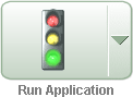
The Run Application icon resembles a large traffic light and displays on the Application home page. Clicking the Run Application icon runs an entire application.
The Run Page icon resembles a small, light green traffic light and displays in the upper right corner of many pages within Application Builder. Clicking the Run Page icon runs the current page.
To run an entire application from the Application Builder home page:
On the Workspace home page, click the Application Builder icon.
From the View list, select Details and click Go.
Locate the application in the Applications list.
Click the Run icon in the far right column.
To run an entire application from the Application home page:
On the Workspace home page, click the Application Builder icon.
The Application Builder home page appears.
Select on application.
Click the Run Application icon at the top of the page.
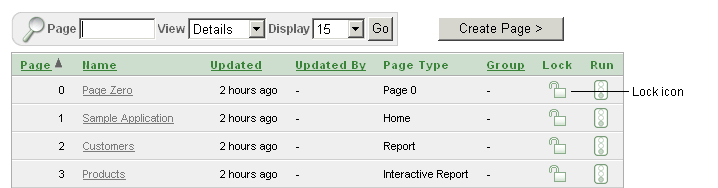
You can control how the Application home page displays by making a selection from the View list on the navigation bar at the top of the page. Selecting Details displays each page as a line in a report. Each line includes the page number, the page name, when the page was last updated, who last updated the page, a lock icon, and a Run icon.
To run a page from the Pages list:
On the Workspace home page, click the Application Builder icon.
Select an application.
From the View list, select Details and click Go.
From the Pages list, locate the page you want to run and click the Run icon in the far right column.
See Also:
"Locking and Unlocking a Page"You can make the pages within your application easier to access by organizing them into page groups. To use page groups, you create a group and then assign pages to the group.
Page groups do not have any function other than to help developers organize their application pages.
Topics in this section include:
The section describes different ways to view page groups.
To access the Page Groups page:
On the Workspace home page, click the Application Builder icon.
Select the application.
On the Tasks List on the right side of the page, click Page Groups.
The Page Groups page appears.
Use the Navigation bar at the top of the page to search for a page group by name or change the page display. You can change the default display by making a selection from View list. Available options include:
Icons (the default) displays each group as a large icon. To edit a group, click the appropriate icon.
Details displays each group as a line in a report. To edit a group, click the name.
To view the pages associated with a group, click Report Page Groups on the Tasks list.
Note:
The Tasks list only appears if groups currently exist.To edit the group name and description, click the group name.
To view page groups from the Application home page:
On the Workspace home page, click the Application Builder icon.
On the Application Builder home page, select an application.
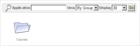
From the View list, select by Group and click Go.
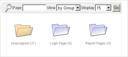
Any defined groups appear. Pages not associated with a group are filed in the Unassigned folder.
To view the pages within a group, click the group name.
To view page groups from the Page Definition:
Navigate to the Page Definition. See "Accessing a Page Definition".
From the View list, select Groups and click Go.
Make a selection from the Tasks list on the right side of the page.
To create a page group:
On the Workspace home page, click the Application Builder icon
Select an application.
On the Tasks List on the right side of the page, click Page Groups.
On the Page Groups page, click Create.
Enter a name, a description (optional), and click Create.
When you create page group you specify a name and description.
To edit the Page Group definition:
On the Workspace home page, click the Application Builder icon
Select an application.
On the Tasks List on the right side of the page, click Page Groups.
Page Groups page appears.
Select a page group.
On the Page Group page, edit the name or description and click Apply Changes.
To move to the next Page Group definition, click the Previous (<) and Next (>) buttons and repeat the previous step.
To assign pages to a group:
On the Workspace home page, click the Application Builder icon.
Select an application.
On the Tasks List on the right side of the page, click Page Groups.
On the Tasks list, click Manage Unassigned.
The Manage Page Group Assignments page appears. Clicking a page number takes you to the Page Attributes page. Clicking the page Name links to the Page Definition.
From the New Group list, select a group to which you want to assign pages and click Go.
Select the pages to be assigned and click Assigned Checked.
To reassign a page to a page group:
On the Workspace home page, click the Application Builder icon.
Select an application.
On the Tasks List on the right side of the page, click Page Groups.
On the Tasks list, click Manage Assignments.
The Manage Page Group Assignments page appears. Clicking the page number takes you to the Page Attributes page. Clicking the page Name links to the Page Definition.
From the Group list, select a group and click Go.
From New Group, select a group to which you want to assign pages.
Select the pages to be reassigned and click Assigned Checked.
To remove a page to a page group:
On the Workspace home page, click the Application Builder icon.
Select an application.
On the Tasks List on the right side of the page, click Page Groups.
On the Tasks list, click Manage Assignments.
The Manage Page Group Assignments page appears. Clicking the page number takes you to the Page Attributes page. Clicking the page Name links to the Page Definition.
From the Group list, select a group and click Go.
Under Name, locate the Group list and select - Unassign -.
Select the page to be removed.
Click Apply Changes.
To remove a page group:
Remove all pages from the group to be deleted. See "Removing a Page from a Page Group".
Access the Page Group page. See "Accessing a Page Group Definition".
Click Delete.
A confirmation page appears.
Confirm your request.
To view pages by page group:
On the Workspace home page, click the Application Builder icon.
Select an application.
On the Tasks List on the right side of the page, click Page Groups.
On the Tasks list, click Report Page Groups.
The Pages by Page Group report appears. Clicking the page number takes you to the Page Attributes page. Clicking the Page Name links to the Page Definition.
To view a page group, make a selection from the Group list and click Go.
You can prevent conflicts during application development by locking pages in your application. By locking a page, you prevent other developers from editing it.
Topics in this section include:
A lock icon indicates whether a page is currently locked. If a page is unlocked, the icon appears as an open padlock. If the page is locked, the icon appears as a locked padlock. A lock icon appears on the Application home page and on the Page Definition.
To view the lock icon on the Application home page, select Details from the View list. A list of pages appears. The lock icon appears under the Lock column.
The lock icon also appears on the Action Bar on the Page Definition. See "About the Action Bar".
You can lock pages from the Page Locks page, the Pages list, and from a Page Definition.
To lock a page from the Page Locks Page:
On the Workspace home page, click the Application Builder icon.
Select an application.
On the Tasks List on the right side of the page, click Page Locks.
The Page Locks page appears.
Select the appropriate pages and click Lock Checked.
Enter a comment in the Comment field.
Click Lock Page(s).
To lock a page from the Details view:
On the Workspace home page, click the Application Builder icon.
Select an application.
From the View list, select Details and click Go.
In the Pages list, locate the page you want to lock and click the Lock icon.
Enter a comment in the Comment field.
Click Lock Page(s).
To lock a page from the Page Definition:
Navigate to the appropriate Page Definition. See "Accessing a Page Definition".
Click the Lock icon in the Action bar. See "About the Action Bar".
Select the selected page and click Lock Checked.
Enter a comment in the Comment field.
Click Lock Page(s).
Only the developer who locked a page can unlock it. However, a developer with administrative privileges can unlock pages locked by other developers.
To unlock a page from the Page Locks page:
On the Workspace home page, click the Application Builder icon.
Select the application.
On the Tasks List on the right side of the page, click Page Locks.
The Page Locks page appears.
Select the appropriate pages.
Click UnLock Checked.
To unlock a page from the Details view:
On the Workspace home page, click the Application Builder icon.
Select an application.
From the View list, select Details and click Go.
In the Pages list, locate the page you want to unlock and click the Lock icon.
The Edit Lock Comment page appears.
Click UnLock.
To unlock pages from the Page Definition:
Navigate to the appropriate Page Definition. See "Accessing a Page Definition".
Click the Lock icon in the upper right corner above Shared Components.
The Page Locks page appears.
Select the page you want to unlock and click Unlock Checked.
You can access a number of different views of Locked Pages on the Locked Pages page.
To access different views of locked pages:
On the Workspace home page, click the Application Builder icon.
Select the application.
On the Tasks List on the right side of the page, click Page Locks.
On the Tasks list, click one of the following:
Show Locked Pages displays only locked pages within the current application.
Show All Pages displays all pages within the current application.
Show Unlocked Pages displays only unlocked pages within the current application.
Administer Locks enables an administrator to unlock any pages locked by a developer.
You can delete a page from the Page Definition or while editing page attributes.
Topics in this section include:
To delete a page from the Page Definition:
Navigate to the appropriate Page Definition. See "Accessing a Page Definition".
Verify the page name.
Click the Delete button at the top of the page.
Follow the on-screen instructions.
See Also:
"Editing a Page Definition" for information about editing page attributesTo delete a page while editing page attributes:
Navigate to the Page Definition. See "Accessing a Page Definition".
Under Page Rendering, locate the Page section.
Click the Edit page attributes icon to link to Page Attributes page. This icon resembles a small page with a pencil on top of it.
The Edit Page appears.
Verify the page number and page name.
Click Delete.
Follow the on-screen instructions.
You can add comments concerning an entire application on the Application Comments page. You could add a description of the application or track the developers involved in working on the application.
Topics in this section include:
See Also:
"Adding Developer Comments"To create an application comment:
Navigate to the Workspace home page.
Click the Application Builder icon.
Select an application.
On the Application home page, click Shared Components.
The Shared Components page appears.
Under Application, click Comments.
The Application Comments page appears.
Enter comments in the Comments field and click Apply Changes.
To view reports specific to an application:
Navigate to the Workspace home page.
Click the Application Builder icon.
Select an application.
The Application home page appears.
On the Tasks list, click Application Reports.
Click Shared Components and then Application Comments.
You can add developer comments to an application, a page, or a group of pages using the Developer Comment icon. The Developer Comment icon resembles a green balloon. This icon displays on the Action bar.
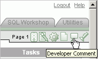
You can use developer comments to communicate application changes, report issues, or record developer suggestions.
This section contains the following topics:
See Also:
"Adding Application Comments"The Developer Comment icon displays on any page in Application Builder that is related to a specific application or application page. You can add developer comments to an application, a page, or a group of pages.
To add a developer comment:
On the Workspace home page, click the Application Builder icon.
Select an application.
Click the Developer Comment icon.
The Create Comment page displays in a separate window.
In Relevant Page(s), specify the pages to which the comment applies. To enter a comment that:
Applies to a specific page, enter the page number.
Applies to multiple pages, enter a comma-delimited list of pages. For example:
1, 2, 3
Does not apply to a page or group of pages, leave this field blank.
In Comment, enter up to 4000 characters of text.
Click Create or Create Another.
To edit a developer comment:
On the Workspace home page, click the Application Builder icon.
Select an application.
Click the Developer Comment icon.
The Create Comment page displays in a separate window.
Click View Comments.
The View Comments page appears. See "About the Navigation Bar on the View Comments Page".
To edit a comment, click the Edit icon.
The Edit Comment page appears.
In Relevant Page(s), specify the pages to which the comment applies. To enter a comment that:
Applies to a specific page, enter the page number.
Applies to multiple pages, enter a comma-delimited list of pages. For example:
1, 2, 3
Does not apply to a page or group of pages, leave this field blank.
In Comment, enter up to 4000 characters of text.
Click Apply Changes.
A navigation bar appears at the top of the View Comments page and contains the following controls:
Page. Search for a page number. Enter a page number and click Go. To view all pages, leave the field blank and click Go.
Comment. Search for comments. Enter a case insensitive query for comment text and click Go. To view all comments, leave the field blank and click Go.
Developer. Limit the display to a specific developer. Select a developer to display and click Go.
Display. Determines how comments display. To increase or decrease the number of comments that appear, make a selection from the Display list and click Go.
You can delete developer comments on the Edit Comment page or on the Manage Comments page.
Topics in this section include:
To delete a developer comment:
On the Workspace home page, click the Application Builder icon.
Select an application.
Click the Developer Comment icon.
The Create Comment page displays in a separate window.
Click View Comments.
Locate the comment to be deleted. See "About the Navigation Bar on the View Comments Page".
Click the Edit icon.
The Edit Comment page appears.
Click Delete.
To delete multiple developer comments:
On the Workspace home page, click the Application Builder icon.
Select an application.
Click the Developer Comment icon.
The Create Comment page displays in a separate window.
Click Manage Comments.
Select one of the following actions:
Delete all comments
Delete comments created by a developer
Delete comments by date
Follow the on-screen instructions.
You can also view, edit, and manage developer comments from the Developer Comments report.
Topics in this section include:
To access the Developer Comments report:
On the Workspace home page, click the Application Builder icon.
Select an application.
On the Application home page, click Application Reports on the Tasks list.
Click Shared Components
Under Application Reports, click Developer Comments.
The Developer Comments report appears.
A navigation bar appears at the top of the page and contains the following controls:
Page. Search for a page number. Enter a page number and click Go. To view all pages, leave the field blank and click Go.
Comment. Search for comments. Enter a case insensitive query of comment text and click Go. To view all, leave the field blank and click Go.
Developer. Limit the display to a specific developer. Select a developer to display and click Go.
Date. Limit the display to a specific date. Select a date and click Go.
Display. Determine how comments display. To increase or decrease the number of comments that appear, make a selection from the Display list and click Go.
To edit a comment from the Developer Comments report:
Navigate to the Developer Comments report. See "Accessing the Developer Comments Report".
The Developer Comments report appears.
Locate the comment to be edited.
Click the Edit icon.
The Edit Comment page displays in a separate window.
In Relevant Page(s), specify the pages to which the comment applies. To enter a comment that:
Applies to a specific page, enter the page number.
Applies to multiple pages, enter a comma-delimited list of pages, for example:
1, 2, 3
Does not apply to a page or group of pages, leave this field blank.
In Comment, enter up to 4000 characters of text.
Click Apply Changes.
To delete a comment from the Developer Comments report:
Navigate to the Developer Comments report. See "Accessing the Developer Comments Report".
The Developer Comments report appears.
Locate the comment to be deleted.
Click the Edit icon.
The Edit Comment page displays in a separate window.
Click Delete.
To delete multiple comments from the Developer Comments report:
Navigate to the Developer Comments report. See "Accessing the Developer Comments Report".
The Developer Comments report appears.
Locate the comment to be deleted.
Click the Edit icon.
The Edit Comment page displays in a separate window.
Click Manage Comments.
Select one of the following actions:
Delete all comments
Delete comments created by a developer
Delete comments by date
Follow the on-screen instructions.
Click Apply Changes.
You can download the Developer Comments report as a comma-delimited file (.csv) file by clicking the Export link.
To download the Developer Comments report:
Navigate to the Developer Comments report. See "Accessing the Developer Comments Report".
The Developer Comments report appears.
Click the Export link at the bottom of the page.
Follow the on-screen instructions.
You can organize your applications by assigning them to application groups. To use application groups, create a group by clicking the Create button and then assign applications to it.
Topics in this section include:
The section describes different ways to view application groups.
To access the Application Group page:
On the Workspace home page, click the Application Builder icon.
On the Tasks List on the right side of the page, click Application Groups.
The Application Group page appears.
Use the Navigation bar at the top of the page to search for a page group by name or change the page display. You can change the default display by making a selection from View list. Available options include:
Icons (the default) displays each group as a large icon. To edit a group, click the appropriate icon.
Details displays each group as a line in a report. To edit a group, click the name.
To view the applications associated with a group, you click the group name.
Note:
The Tasks list only appears if groups currently exist.To view page groups from the Application Builder home page:
On the Workspace home page, click the Application Builder icon.
From the View list, select By Group and click Go.
Any defined groups appear.
To view or edit a page group, click the group name.
To create an application group:
On the Workspace home page, click the Application Builder icon
On the Tasks List on the right side of the page, click Application Groups.
On the Application Group page, click Create.
Enter a name, a description (optional), and click Create.
When you create page group you specify a name and description.
To edit an application group definition:
On the Workspace home page, click the Application Builder icon
On the Tasks List on the right side of the page, click Application Groups.
Application Group page appears.
Select an application group.
On the Application Group page, edit the name or description and click Apply Changes.
To assign applications to a group:
On the Workspace home page, click the Application Builder icon.
On the Tasks List on the right side of the page, click Application Groups.
On the Tasks list, click Manage Unassigned.
The Manage Application Group Assignments page appears.
From the New Group list, select a group.
Select the applications to be assigned and click Assigned Checked.
Tip:
You can also assign an application to an application group by editing the application definition. Select the group from the Application Group list. See "Configuring the Application Definition".To remove an application from an application group:
On the Workspace home page, click the Application Builder icon.
On the Tasks List on the right side of the page, click Application Groups.
On the Tasks list, click Manage Unassigned.
The Manage Application Group Assignments page appears.
From the New Group list, select Unassign.
Select the pages to be unassigned and click Assigned Checked.
Tip:
You can also remove an application from an application group by editing the application definition. Select Unassigned from the Application Group list. See "Configuring the Application Definition".To remove an application group:
On the Workspace home page, click the Application Builder icon.
On the Tasks List on the right side of the page, click Application Groups.
Assign all applications in the group to Unassign. See "Removing an Application from an Application Group".
Return to the Application Groups page.
Select the application group to be deleted.
On the Application Group page, click Delete.
A confirmation page appears.
Confirm your request.
Application Builder includes over 100 reports that provide a comprehensive view of your application from various perspectives. You can use application reports to achieve consistency among shared components and page components within your application. For example, you can view details about buttons used on all pages within your application. Additionally, many reports are updatable so you can standardize components, such as item and region labels, without navigating to a specific page.
Topics in this section include:
To view reports specific to an application:
Navigate to the Workspace home page.
Click the Application Builder icon.
Select an application.
The Application home page appears.
On the Tasks list, click Application Reports.
Select a type of report to view:
Shared Components. See "Shared Components Reports".
Page Components. See "Page Components Reports".
Activity. "Activity Reports".
Cross Application. "Cross Application Reports".
See Also:
"Identifying At Risk Password Items"Shared Components reports offer information on common elements that can display on every page within an application. Reports are grouped by the following categories: including Application, Logic, Security, Globalization, Conditional Components, Navigation, User Interface, and Files. Report examples include Developer Comments, Database Object Dependencies, Application Items, Application Computations, Authentication Schemes, Breadcrumb Entries, and Shortcuts.
The Database Object Dependencies report identifies database objects referenced by the current application. Review this report to determine what objects to move when deploying an application.
See Also:
"How to Move an Application to Another Development Instance" and "Viewing Application Reports"To view the Database Object Dependencies report:
Navigate to the appropriate application.
From the Workspace home page, click the Application Builder icon.
Select an application.
On the Tasks list, click Application Reports.
Click Shared Components.
Under Application, click Database Object Dependencies.
Click Compute Dependencies.
To view the components that reference a specific database object, select the Reference Count number.
Page Components reports offer detailed information on controls and logic that execute when a page is rendered (for example, branches, buttons, computations, items, and regions).
Use the Search Region Source report to search through all region source in your application.
To view the Search Region Source report:
Navigate to the Workspace home page.
Click the Application Builder icon.
Select an application.
On the Tasks list, click Application Reports.
Click Page Components.
Under Regions, click Search Source.
To view the Page Definition for a region, select the page number.
To view region attributes for a region, select the region name.
Activity reports offer details about developer activity within the current application. Available reports are grouped into the following categories: Page Views, Caching, Developer Activity, and Sessions.
Tip:
You can also access the Activity page by clicking the Activity link on the Developer toolbar. See "About the Developer Toolbar".Cross Application reports offer information that apply to multiple applications. Available reports include Application Attributes, Application Comments, Build Options, Build Status and Application Status, Page Component Counts, Security Profiles, Authentication Schemes, and Template Defaults by Application.
Use the Application Comparison report to compare two applications.
To view the Application Comparison report:
Navigate to the Workspace home page.
Click the Application Builder icon.
Select an application.
On the Tasks list, click Application Reports.
Click Cross Application.
The Application Comparison page appears.
In the navigation bar, specify the following:
Application 1 - Select the first application to compare.
Application 2 - Select the second application to compare.
Component - Select the components to include in the report.
Page - Identify a specific page number to compare.
Show - Select the number of differences to display on each page.
Click Go.
To view only differences, select Show Differences Only and click Go.
To view details, select Show Details and click Go.
An item is part of an HTML form. An item can be a text field, text area, password, select list, check box, and so on. Item attributes affect the display of items on a page. For example, these attributes can impact where a label displays, how large an item is, and if the item will display next to or below the previous item.
Topics in this section include:
See Also:
"Understanding Application-Level Items", "How Item Attributes Affect Page Layout", "Understanding Substitution Strings", and "About the Item Finder"There are two types of items: page items and application items. Page items are placed on a page and have associated user interface properties, such as Display As, Label and Label Template. Examples of page-level items include a check box, date picker, display as text, file browse field, popup list of values, select list, or a text area. Application items are not associated with a page and therefore have no user interface properties. You can use an application item as a global variable.
See Also:
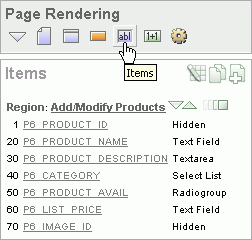
"Understanding Application-Level Items"You create and edit page-level items on the Page Definition. The Items section appears in the Page Rendering area.
You can temporarily hide all other subsections by clicking the Items icon. To restore the view, click Show All. The Show All icon resembles an inverted triangle.
The following icons display next to the section title:
Edit All. The Edit All icon resembles a small grid with a pencil on top of it. Use this icon to edit all items at once. See "Using the Edit All Icon to Edit Multiple Items".
Copy. The Copy icon resembles two small overlapping pages. Use this icon to make a copy of an existing item.
Create. The Create icon resembles a plus (+) sign overlapping a small page. Click this icon to create an item.
Items are organized by region. To edit an item, click the item name.
You can quickly change the appearance of a page by clicking the Drag and drop icon to access the Drag and Drop Layout page. The Drag and drop icon resembles a green rectangle and displays to the right of the Reorder Region Items icon.
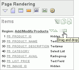
You can use the Drag and Drop Layout page to interactively reorder items within a given region, change select item attributes, create items, or delete existing items. See "Using the Drag and Drop Layout Page".
You can quickly edit the label and position of items in a region by clicking the Reorder Region Items icon on the Page Definition. This icon resembles a light green down or up arrow.
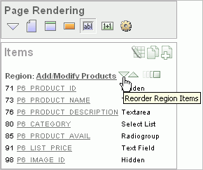
See Also:
"Using the Reorder Region Items Icon"You can create page-level items by running the Create Item Wizard.
Topics in this section include:
You create a page-level item by running the Create Item Wizard from the Page Definition.
To create a page-level item:
Navigate to the appropriate Page Definition. See "Accessing a Page Definition".
If necessary, create an HTML region. See "Understanding Regions".
Under Items, click the Create icon.
Select an item type. See "About Item Types".
Follow the on-screen instructions.
To learn more about a specific field, click the field label.
When help is available, the item label changes to red when you pass your cursor over it, and the cursor changes to an arrow and question mark. See "About Field-Level Help".
When specifying an item name, remember the following rules. Item names must:
Be unique within an application
Not have quotation marks
Begin with a letter or a number, and subsequent characters can be letters, numbers, or underscore characters
Be case-insensitive
Should not exceed 30 characters
Cannot contain letters outside the base ASCII character set
When you create an item, you specify an item type. Once you create an item, these types appear on the Display As list on the Edit Page Item page. Table 6-2 describes available item types.
Table 6-2 Available Item Types
| Item Type | Description |
|---|---|
|
Displayed using a list of values. A list of values is required for items displayed as check boxes. The value corresponding to a checked box is returned in a single colon-delimited string. The following example demonstrates how to create a single check box that returns SELECT NULL display_text, 'YES' return_value FROM DUAL; This example includes the additional text Click to select. SELECT 'Click to select' display_text, 'YES' return_value FROM DUAL; See Also: "APEX_UTIL" in Oracle Application Express API Reference for information about breaking up returned values |
|
|
Displays a text field with a Calendar icon next to it. When clicked, this icon displays a small calendar where the user can select a date and a time (optional). If the format you need is not included in the Display As list, select Date Picker (use application format mask) or Date Picker (use item format mask). The latter uses the value from the Format Mask field in the Source section of the Edit Page Item page. |
|
|
Available Display As Text subtypes include:
|
|
|
Displays a text field with a Browse... button. The Browse button enables the user to locate a file on a local file system and upload it. Oracle Application Express provides a table for these files to be uploaded to and an API to retrieve the files. See Also: "Securing File Uploads" |
|
|
Renders an HTML hidden form element. Session state can be assigned and referenced just like a text field. |
|
|
Renders an HTML hidden form element. Session state can be assigned and referenced just like a text field. For maximum security use Hidden and Protected instead of Hidden unless your page has client-side behavior, for example, JavaScript that alters the item value after the page is rendered by Oracle Application Express. |
|
|
Based on a list of values. This item enables you to manage a list of items by selecting and adding to a list. The list of values display as a popup. |
|
|
Renders as a multiselect HTML form element. When submitted, selected values are returned in a single colon-delimited string. You can break up the values using the See Also: "Working with a Multiple Select List Item" and "APEX_UTIL" in Oracle Application Express API Reference |
|
|
Renders as an HTML password form element. Available password types include:
The Password and Password (submits when Enter pressed) save the password in a database table when the page is submitted. Use these password item types only when the password is needed in session state for use by other pages during the session. Password (does not save state) and Password (submits when Enter pressed, does not save state) do not save the password in a database table. Use these password item types when the submitted password value is used only by after-submit page processing on the same page and is never needed again during the session. If you must reference and retrieve the value of a password in your application then you set the Store value encrypted in session state attribute to Yes. To learn more, see "About Session State and Security". |
|
|
Renders as a text field with an icon. When the user clicks the icon, a popup window appears with one of these, depending on the popup selection you make:
With the exception of the color picker, you control popup lists of values through templates. You can only specify one popup list of values (LOV) template for each application. A popup LOV is a good choice for lists of values that are too large to return on a single page. There are two types of Popup LOVs: one that fetches a set of rows when the window pops up and one that does not. Available popup LOVs include:
Popup LOVs must be based on a query that selects two columns with different column aliases. For example: SELECT ename name, empno id FROM emp If one of the columns is an expression, remember to use an alias. For example: SELECT ename||' '||job display_value, empno FROM emp |
|
|
Renders as an HTML radio group form element, based on a list of values. Choose Radiogroup with Submit to have the page submitted when the radio button is selected. The following example displays employee names ( SELECT ename, empno FROM emp |
|
|
Displays using a list of values. A list of values is required for items displayed as a select list. Select lists are rendered using the HTML form element The following example would return employee names ( SELECT ename display_text, empno return_value FROM emp Oracle Application Express provides additional enhancements to a standard HTML select list:
Note: Long select lists can cause errors. If you have a long select list that generates an error, try using a Popup List of Values instead. |
|
|
Renders as a multiple select list that includes two boxes containing lists. The left list displays a source list of values. Users use the shuttle control icons and buttons to select list items and move them from the left (source) list to the right (destination) list. Each shuttle has five controls:
The right destination list includes the sort controls Move to top, Move up, Move down, and Move to bottom. Note: In order to create this item type, you must define a list of values. See "Creating a Static List of Values", "Creating Lists of Values", and "Working with a Multiple Select List Item". |
|
|
Displays as an HTML text field containing a maximum of 30,000 bytes of text. You control the maximum length and display width by editing the Height and Width item attribute. Available Text display options include:
|
|
|
Renders as an HTML text area. There is no maximum length for an item displayed as a text area. You control the height and width by editing the Height and Width item attribute. Additional available Text Area Display As options include:
|
|
|
Forces the close of an HTML table using the Note that a Stop and Start Table item only displays its label. You can prevent the label from displaying at all by setting it to null. To do this, you simply remove the default label. |
To create multiple items simultaneously:
Navigate to the appropriate Page Definition. See "Accessing a Page Definition".
If necessary, create an HTML region. See "Understanding Regions".
Under Items, click the Create icon.
The Create Item wizard appears.
At the bottom of the page, click the Create multiple Items Using Tabular Form link.
On the Create Multiple Items page, specify the following:
Create Item(s) in Region - Select the region to contain the items.
Item Template - Select an item template.
For each item, enter the Sequence, Name, Label, Type and specify whether the item should be cached.
Click Create Multiple Items.
See Also:
"About the Drag and Drop Icon"To create multiple items using the Drag and Drop Layout page:
Navigate to the appropriate Page Definition. See "Accessing a Page Definition".
If necessary, create an HTML region. See "Understanding Regions".
Under Items, click the Create icon.
The Create Item wizard appears.
At the bottom of the page, click the Create multiple Items Using Drag and Drop Layout link.
The Drag and Drop Layout page appears.
Select an item from the palette on the left side of the page and drag it to the appropriate position on the page.
Edit the item attributes at the of the page.
Display Name - Enter an item name. Use this name retrieve the value of the item. Item names longer than 30 characters cannot be referenced using bind variable syntax.
Label - Enter the label for this item. You may include HTML, JavaScript, and shortcuts. You can also use the substitution string #CURRENT_ITEM_NAME# to obtain the name of the item associated with this label.
Display Type - Select a display type (if applicable). See "About Item Types".
To edit an existing item, edit the Item Name and Label fields, or select a new Display Type at the top of the page.
Click Next.
Optionally, edit the each item's Name and Label.
Click Apply Changes.
See Also:
"Using the Drag and Drop Layout Page"One way to create a static list of values is to edit an item's List of Values definition. Note that this type of list of values is not reusable. As a best practice, create a list of values as a shared component whenever possible.
See Also:
"Creating Lists of Values"To create a static list of values:
Navigate to the appropriate Page Definition. See "Accessing a Page Definition".
Under Items, select the item name.
The Edit Page Item page appears.
Under Name, specify how the item will be rendered. Make a selection from the Display As list.
Under List of Values, create a static list of values:
From Named LOV, select Select Named LOV.
In List of values definition, enter a definition using the following syntax:
STATIC[2]:Display Value[;Return Value],Display Value[;Return Value]
Where:
The first keyword may be STATIC or STATIC2.
STATIC results in the values being sorted alphabetically by display value. STATIC2 results in the values being displayed in the order they are entered in the list.
A semicolon separates the display value from the return value in each entry.
Return Value is optional. If a Return Value is not included, the return value is the same as the display value.
To learn more, see item Help. To view help for a specific item on a page, click the item label.
When help is available, the item label changes to red when you pass your cursor over it and the cursor changes to an arrow and question mark. See "About Field-Level Help".
Click Apply Changes.
The examples that follow demonstrate syntax for three different static LOVs.
In this example, the list of values has four values (Cow, Dog, Cat, and Lion) that display in alphabetical order. The return value of each entry equals the display value.
STATIC:Cow,Dog,Cat,Lion
In this example, the list of values has ten values that display in the order listed in the definition. The return value of each entry equals the display value.
STATIC2:10,15,20,25,50,100,200,500,1000,10000
In this example, the list of values has two values: Yes and No (the display value Yes and its return value Y, and the display value No and its return value N).
STATIC:Yes;Y,No;N
See Tutorial:
"How to Control Form Layout" in Oracle Application Express Advanced TutorialsYou can edit page-level items by editing page item attributes or using the Edit All or Reorder Items icons.
Topics in this section include:
See Also:
"Using the Drag and Drop Layout Page"Once you create a page item, you can edit it on the Edit Page Item page.
To edit page item attributes:
Navigate to the appropriate Page Definition. See "Accessing a Page Definition".
Under Items, select the item name.
The Edit Page Item page appears.
To learn more about a specific attribute on a page, click the attribute label.
When help is available, the item label changes to red when you pass your cursor over it, and the cursor changes to an arrow and question mark. See "About Field-Level Help".
Click Apply Changes.
See Also:
"How Item Attributes Affect Page Layout" and "Understanding Cross-Site Scripting Protection"The Edit Page Item page is divided into the following sections: Name, Displayed, Label, Element, Source, Default, List of Values, Security, Conditions, Read Only, Help Text, Configuration, and Comments.
You can access these sections by scrolling down the page, or by clicking a navigation button at the top of the page. When you select a button at the top of the page, the selected section appears and all other sections are temporarily hidden. To view all sections of the page, click Show All.
You can edit multiple items at once by clicking the Edit All icon on the Page Definition. The Edit All icon resembles a small grid with a pencil on top of it.
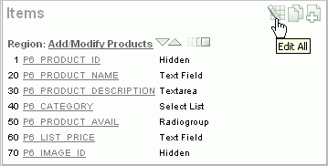
Clicking the Edit All icon displays a series of pages that enable you to edit multiple items simultaneously or view a history of recent changes.
Topics in this section include:
See Also:
"How Item Attributes Affect Page Layout"Item attributes control how items display on a page. You can use the Page Items page to edit the sequence, field label, template, region, and overall position for all items on a page.
A Navigation bar displays at the top of the page. Use the Page field to navigate to another page. To limit the display to just items in a specific region, make a selection from Show Regions list.
See Also:
"Editing Page Item Attributes"The Page Items page displays items in an editable report. Table 6-3 describes each editable attribute.
Table 6-3 Editable Attributes on Page Items
| Attribute | Description |
|---|---|
|
Sequence |
Specify the display sequence for this component. The sequence determines the order of evaluation. |
|
Prompt |
Enter the label for this HTML form element. You may include HTML, JavaScript, and shortcuts. You can also use the substitution string #CURRENT_ITEM_NAME# to obtain the name of the item associated with this label. |
|
Field Template |
Determines the label template. Label templates enable you to define the user interface attributes in a central place and share that definition among many labels. |
|
Region |
Defines the region in which the item displays. All items must be in a region. |
|
New Line |
Determines whether this item displays on the same line as the previous item or whether it displays on the next line. Items are laid out in an HTML table. Select Yes to have an item display as the first field in a new row in the table. |
|
Width |
Specifies the length (in characters) of the form element that displays for this item. |
|
Height |
Specifies the height (in lines) for text areas and multi select lists. |
|
Column Span |
Items are laid out in HTML tables. This property defines the value to be used for the |
|
Row Span |
Items are laid out in HTML tables. The attribute determines the value to be used for the |
Edit the appropriate attributes and click Apply Changes.
Use the Item Help page to edit item help for all items on a page. You can avoid repeating the same Help text in multiple locations by subscribing to another item.
See Also:
"Creating a Help Page"To edit item Help:
Navigate to the appropriate Page Definition. See "Accessing a Page Definition".
Under Items, click the Edit All icon.
Click Item Help.
The Item Help page appears.
Use the Navigation bar at the top of the page to narrow or broaden the display. Available options include:
Page - Select or enter a new number and click Go.
Search - Enter a case insensitive query and click Go.
Show - Select whether to display All, Subscribed, or Unsubscribed Help text.
All Pages - Select to run the search query on all pages in the application.
Current Page - Select to restrict the search query to the current page.
You can also use the arrows in the Navigation bar to scroll through the application pages.
To subscribe to an existing Help item, make a selection from Subscribed To.
To edit help for a specific item, click the item name.
On the Edit Help page:
Reference Master Item Help From - (Optional) Select a existing item Help topic to subscribe to.
Help Text - Enter or edit the Help text for this item.
Click Apply Changes.
Click Apply Changes.
Use the Reassign Region Items page to assign items to a new region.
To Reassign Region Items page:
Navigate to the appropriate Page Definition. See "Accessing a Page Definition".
Under Items, click the Edit All icon.
Click Reassign Region Items.
The Reassign Region Items page appears.
Use the Navigation bar at the top of the page to narrow or broaden the display. Available options include:
Page - Select or enter a new number and click Go.
Show Regions - Select a region to display and click Go.
To reassign an item to another region:
Select the items to reassign.
From Assign to Region, select a new region.
Click Reassign Region Items.
Use the Delete Multiple Items page to delete multiple items at once.
To delete multiple items:
Navigate to the appropriate Page Definition. See "Accessing a Page Definition".
Under Items, click the Edit All icon.
Click Delete Multiple Items.
The Delete Multiple Items page appears.
Use the Navigation bar at the top of the page to narrow or broaden the display. Available options include:
Page - Select or enter a new number and click Go.
Show Regions - Select a region to display and click Go.
Forward (>) and Next (<) buttons - Display the previous and next page.
To reassign an item to another region:
Select the items to reassign.
From Assign to Region, select a new region.
Click Reassign Region Items.
You can quickly edit the label and position of items in a region by clicking the Reorder Region Items icon on the Page Definition. This icon resembles a light green down or up arrow.
To use the Reorder Region Items icon:
Navigate to the appropriate Page Definition. See "Accessing a Page Definition".
Under Items, click the Reorder Region Items icon.
The Reorder Region Items page appears with items laid out in tables. You can edit the position of an item by selecting values for New Line, New Field, Column Span, and Label Alignment attributes. Note that a graphical representation of how the items display appears at the bottom of the page.
To edit an item label, enter a new title in the Label field.
To change the position of an item, edit the following attributes:
New Line. Determines if the item displays on the same line as the previous item, or displays on the next line. Select Yes to have an item display as the first field in a new row in the table.
New Field. Determines if the item displays in the next column or in the same column as the previous item. Select Yes to have the label and value for the item display in a new HTML table cell. Use this attribute in combination with the New Line and Span attributes to control layout.
Column Span. Defines the value to be used for the COLSPAN attribute in the table cell. The COLSPAN attribute defines the number of columns that it spans across the table.
To change label alignment, make a selection from the Label Alignment list.
To change the order in which items display, click the up and down arrows in the far right column. Clicking the arrow moves the item one row up or down.
Note that the order you specify here translates to sequence number in the Sequence attribute on the Edit Page Item page. See "Editing Page Item Attributes".
Click Apply Changes.
Tip:
You can also use the Drag and Drop Layout feature to reorder items. See "Using the Drag and Drop Layout Page".Note:
To change the region in which an item resides, you must edit the item attributes. See "Editing Page Item Attributes".You can use the Drag and Drop Layout page to interactively reorder items within a given region, change select item attributes, create items, or delete existing items.
Topics in this section include:
You access the Drag and Drop Layout page by either:
Clicking the Drag and drop icon on the Page Definition. See "About the Drag and Drop Icon".
Clicking the Reorder Regions Items icon and selecting the Drag and Drop Layout tab. See "Using the Reorder Buttons Icon".
The Drag and Drop Layout page is divided into two sections: Item palette and Layout region.
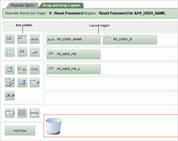
The Item palette displays on the left side of the page. You add items by clicking an item type on the palette and dragging it to the correct position in the Layout region. Note that when you position the cursor over an item type, a tooltip appears.
Use the right side of the page (or Layout region) to position items. To move an item vertically, click the Add Row button to insert an empty row. Then drag and drop the item into the empty row.
See Also:
"Deleting Items"To create a new item on the Drag and Drop Layout page:
Navigate to the Drag and Drop Layout page. See "Accessing the Drag and Drop Layout Page".
Click an item type in the Item palette on the left side of the page and drag it to the appropriate location in the Layout region.
Note that when you position the cursor over an item type, a tooltip appears.
You can reposition the item:
To move an item horizontally, select the item and drag it to the appropriate position on the page.
To insert an existing or new item between two existing rows, click the Add Row button and drag it between the existing rows. This creates an empty row where you can then move the item.
Edit the item attributes at the of the page.
Display Name - Enter an item name. Use this name to retrieve the value of the item. Item names longer than 30 characters cannot be referenced using bind variable syntax.
Label - Enter the label for this item. You may include HTML, JavaScript, and shortcuts. You can also use the substitution string #CURRENT_ITEM_NAME# to obtain the name of the item associated with this label.
Display Type - Select a display type (if applicable). Note that the select list is restricted to options corresponding to the type of item you are creating. See "About Item Types".
Click Next.
Optionally, edit the each item's Name and Label.
Click Apply Changes.
If you create an item that requires a list of values (LOV), the Drag and Drop Layout Wizard creates a static inline LOV for you. Note you must edit and fix this LOV once you complete the layout process.
See Also:
"Creating a Static List of Values"To edit an existing item on the Drag and Drop Layout page:
Navigate to the Drag and Drop Layout page. See "Accessing the Drag and Drop Layout Page".
To reposition the item:
To move an item horizontally, select the item and drag it to the appropriate position on the page.
To insert an existing or new item between two existing rows, click the Add Row button and drag it between the existing rows. This creates an empty row where you can then move the item.
If required, select an item and edit its attributes at the of the page.
Display Name - Enter an item name. Use this name retrieve the value of the item. Item names longer than 30 characters cannot be referenced using bind variable syntax.
Label - Enter the label for this item. You may include HTML, JavaScript, and shortcuts. You can also use the substitution string #CURRENT_ITEM_NAME# to obtain the name of the item associated with this label.
Display Type - Select a display type (if applicable). Note that the select list is restricted to options corresponding to the type of item you are creating. See "About Item Types". See "About Item Types".
Click Next.
Optionally, edit the each item's Name and Label.
Click Apply Changes.
Note:
To change the region in which an item resides, you must edit the item attributes. See "Editing Page Item Attributes".To delete an item, click it and drag it to the Recycle box at the bottom of the page. If you delete an existing item, it appears in the Recycle box and can be retrieved until you click Apply Changes on the next page. Note that if you drop a new item you have just created in the Recycle box, it instantly disappears and cannot be retrieved.
You can reference item values stored in session state in regions, computations, processes, validation, and branches. Table 6-4 describes the supported syntax for referencing item values.
See Also:
"Managing Session State Values"Table 6-4 Syntax for Referencing Item Values
| Type | Syntax | Description |
|---|---|---|
|
SQL |
|
Standard bind variable syntax for items whose names are no longer than 30 bytes. Use this syntax for references within a SQL query and within PL/SQL. |
|
PL/SQL |
|
PL/SQL syntax referencing the item value using the See Also: Oracle Application Express API Reference |
|
PL/SQL |
|
Standard PL/SQL syntax referencing the numeric item value using the See Also: Oracle Application Express API Reference |
|
Static Text |
|
Static text. |
|
Static Text (exact) |
|
Static text. Exact Substitution. |
You can set the value of an item in your application using any of the following methods:
For page-level items, use the Source Attribute to set the item value.
From the Page Definition, select the item name to view the Edit Page Item page. Scroll down to Source and edit the appropriate fields.
You can also set the value of an item in any region based on PL/SQL or a process using the following syntax:
BEGIN
 :MY_ITEM :=  'new value';
END;
Pass the value on a URL reference using f?p syntax. For example:
f?p=100:101:10636547268728380919::NO::MY_ITEM:ABC
Set the value using a computation. Computations are designed to set item values. For example:
TO_CHAR(SYSDATE,'Day DD Month, YYYY');
Use the PL/SQL API to set an item value within a PL/SQL context. For example:
APEX_UTIL.SET_SESSION_STATE('MY_ITEM',SYSDATE);
You can choose to have an item display conditionally or as read-only by editing attributes on the Edit Pages Item page.
To display a conditional or read-only item:
Create the item. See "Creating Page-Level Items".
Navigate to the appropriate Page Definition. See "Accessing a Page Definition".
Under Items, select the item name.
The Edit Page Item page appears.
To display an item conditionally:
Scroll down to Conditions.
Make a selection from the Condition Type list.
Enter an expression in the fields provided.
To make an item read-only:
Scroll down to Read Only Display Settings.
Make a selection from the Read Only Condition Type list.
Enter an expression in the fields provided.
Click Apply Changes.
A multiple select item renders as a multiple select list form element which can be either a Multiselect List or Shuttle item type. When submitted, selected values are returned in a single colon-delimited string. You can handle values in this format in two ways:
Using the INSTR function
Using the APEX_UTIL.STRING_TO_TABLE function
Suppose you had a report on the EMP and DEPT tables that is limited by the departments selected from a Department multiple select list. First, you create the multiple select item, P1_DEPTNO, using the following query:
SELECT dname, deptno
FROM dept
Second, you return only those employees within the selected departments as follows:
SELECT ename, job, sal, comm, dname
FROM emp e, dept d
WHERE d.deptno = e.deptno
AND instr(':'||:P1_DEPTNO||':',':'||e.deptno||':') > 0
Next, assume you want to programmatically step through the values selected in the multiple select item, P1_DEPTNO. To accomplish this, you would convert the colon-delimited string into a PL/SQL array using the APEX_UTIL.STRING_TO_TABLE function. The following example demonstrates how to insert the selected departments into an audit table containing the date of the query.
DECLARE
    l_selected APEX_APPLICATION_GLOBAL.VC_ARR2;
BEGIN
  --
  -- Convert the colon separated string of values into
  -- a PL/SQL array

  l_selected := APEX_UTIL.STRING_TO_TABLE(:P1_DEPTNO);

  --
  -- Loop over array to insert department numbers and sysdate
  --

  FOR i IN 1..l_selected.count
  LOOP
    INSERT INTO report_audit_table (report_date, selected_department)
        VALUES (sysdate, l_selected(i));
  END LOOP;
END;
See Also:
"STRING_TO_TABLE Function" in Oracle Application Express API ReferenceApplication-level items do not display, but are used as global variables to the application. You can use an application item as a global variable.
Topics in this section include:
To create an application-level item:
Navigate to the Workspace home page.
Click the Application Builder icon.
Select an application.
When Application Builder appears, click Shared Components.
Under Logic, select Application Items.
The Application Items page appears.
To create an application item, click Create.
Follow the on-screen instructions.
Once you create a application item, it appears on the Application Items page. You control how the Application Items page displays by making a selection from the View list. Available options include:
Icons (the default) displays each application item as a large icon. To edit an application item, click the appropriate icon.
Details displays each application item as a line in a report. To edit an application item, click the name.
You can view a history of changes to application items by clicking History at the top of the Application Items page.
Once you create an application-level item, you can edit it on the Create/Edit Application Item page.
To edit application-level item attributes:
Navigate to the Workspace home page.
Click the Application Builder icon.
Select an application.
When Application Builder appears, click Shared Components.
Under Logic, select Application Items.
The Application Items page appears.
Select an application item.
The Create/Edit Application Item page appears.
To learn more about a specific item on a page, click the item label.
When Help is available, the item label changes to red when you pass your cursor over it and the cursor changes to an arrow and question mark. See "About Field-Level Help".
Click Apply Changes.
The Create/Edit Application Item page is divided into the following sections: Name, Security, Configuration, and Comments.
You can access these sections by scrolling down the page, or by clicking a navigation button at the top of the page. When you select a button at the top of the page, the selected section appears and all other sections are temporarily hidden. To view all sections of the page, click Show All.
|
 Copyright © 2003, 2012, Oracle and/or its affiliates. All rights reserved. Legal Notices |
|