| Oracle® Application Express Application Builder User's Guide Release 3.2 Part Number E11947-02 |
|
|
PDF · Mobi · ePub |
| Oracle® Application Express Application Builder User's Guide Release 3.2 Part Number E11947-02 |
|
|
PDF · Mobi · ePub |
This section describes how to use Application Builder to add pages to an application and add other components (reports, charts, or forms), page controls (buttons, items, list of values), and shared components (breadcrumbs, lists, or tabs).
This section contains the following topics:
In Oracle Application Express, a report is the formatted result of a SQL query. You can generate reports by selecting and running a built-in query, or by defining a report region based on a SQL query.
Topics in this section include:
Application Builder includes a number of built-in wizards for generating reports.
To create a report using a wizard:
On the Workspace home page, click the Application Builder icon.
Select the application.
Click Create Page and click Next.
Select Report.
Select a report type and click Next:
SQL Report - Creates a report based on a custom SQL SELECT statement or a PL/SQL function returning a SQL SELECT statement that you provide. For assistance in writing the SQL query, click the Query Builder button.
Interactive Report - Creates an interactive report based on a custom SQL SELECT statement you provide. For assistance in writing the SQL query, click the Query Builder button. End users can customize the report layout and data displayed by selecting options on the Actions menu.
Report on Web Service Result - Creates a report based on a Web service result. To learn more, see "Implementing Web Services".
Wizard Report - Creates a classic report without requiring any SQL knowledge. Select the appropriate schema, table, columns, and result set display.
Follow the on-screen instructions. To learn more about a specific field, click the item label.
When Help is available, the item label changes to red when you pass your cursor over it and the cursor changes to an arrow and question mark. See "About Field-Level Help".
See Tutorials:
"How to Create a Drill Down Report" and "How to Create a Parameterized Report" in Oracle Application Express Advanced TutorialsOracle Application Express includes two main report types, an interactive report and a classic report. The main difference between these two report types is that interactive reports enable the user to customize the appearance of the data through a searching, filtering, sorting, column selection, highlighting, and other data manipulations.
The following is an example of an interactive report.
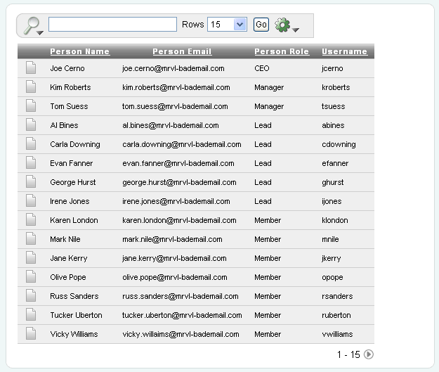
Notice that the interactive report includes a Search Bar, Column Heading Menu links, and Link Column icons in the first column of each row. For a complete description of these components, see "Using Interactive Reports".
In contrast, a classic report does not include any of these customization features. The following is an example of a classic report built on top of the same data.
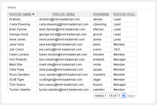
Classic reports do not include a Search Bar and the links at the top of each column only support basic sorting.
Interactive reports include components that enable users to alter the layout of report data. Users can select columns, create filters, apply highlighting, sort columns, define break groups, aggregate columns, create charts, and define computations. Once customized, users can then save an interactive report as named report and download the data to various file formats.
See Also:
"Editing Interactive Reports"Topics in this section include:
A search bar displays at the top of every interactive report and includes the following features:
Search columns icon - Resembles a magnifying glass. Click this icon to narrow your search to only specific columns. To search all columns, select All Columns.
Text area - Enter case insensitive search criteria (wild card characters are implied) and then click Go.
Rows - Selects the number of rows to display per page.
Go button - Executes a search.
Actions menu - Displays the Actions menu. See "About the Actions Menu".
Clicking the Search columns icon (resembles a magnifying glass) displays a listing of all columns in the current report.
To use the Search columns icon:
Click the Search columns icon and select a column.
The column name displays to the right of the Search columns icon.
Enter keywords in the Text area and click Go.
Notice the filter Person Role contains 'manager' has been added to the Report Settings area above the report.
To disable the filter, select the Enable/Disable Filter check box.
To delete the filter, click the Remove Filter icon.
See Also:
"Selecting Columns to Display"To edit an existing filter:
Click the filter name.
The filter appears.
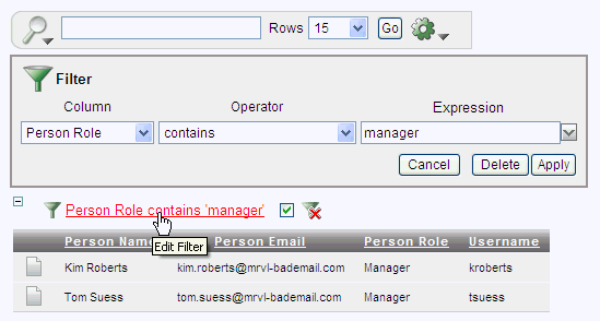
Edit the the Column, Operator, and Expression fields.
Click Apply.
Link Column icons display on the far left of each row in an interactive report. A Link Column can link to a single row view, a custom target, or be excluded from the report. To learn more about customizing this interactive report attribute, see "Understanding Link Columns" and "Creating a Column Link in an Interactive Report".
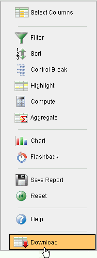
The Actions menu appears to the right of the Go button on the Search bar. Use this menu to customize an interactive report.
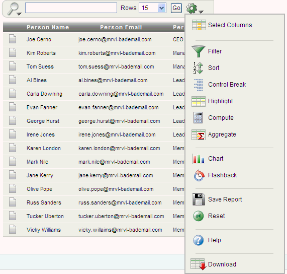
The Actions menu contains the following options:
Select Columns specifies which columns to display and in what order. See "Selecting Columns to Display".
Filter focuses the report by adding or modifying the WHERE clause on the query. See "Adding a Filter".
Sort specifies which columns to sort on and the sort order (that is, ascending or descending). See "Selecting Columns and Sort Order".
Control Break creates a break group on one or several columns. See "Creating a Control Break".
Highlight defines a filter that highlights the rows that meet the filter criteria. See "Adding Highlighting".
Compute enables users to add computed columns to a report. See "Computing Columns".
Aggregate enables users to perform mathematical computations against a column. See "Aggregating a Column".
Chart displays the report data as a chart. See "Creating a Chart".
Flashback performs a flashback query enabling users to view the data as it existed at a previous point in time. See "Executing a Flashback Query".
Save Report saves the current customized report settings so they can be used in the future. See "Saving a Report".
Reset enables users to reset the report back to the default report settings. See "Resetting a Report".
Help provides detailed descriptions of how to use the interactive report components to customize your reports.
Download enables users to download a report. Available download formats depend upon your installation and report definition. See "Downloading a Report".
To customize a report to include specific columns, select Select Columns on the Actions menu.
To use the Select Columns option:
Click the Actions menu and select Select Columns.
The Select Columns region appears.
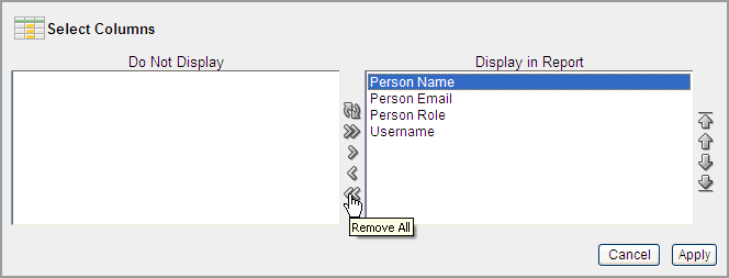
Select the columns you wish to move. Cclick the arrows in the center of region to move a column from the Display in Report box to the Do Not Display in Report box. To select multiple columns at once, press and hold the CTRL key.
To change the order of the columns, click the Top, Up, Down, and Bottom arrows on the right.
Click Apply.
A revised report appears.
See Also:
"Resetting a Report"You can create a filter to focus a report by selecting Filter on the Actions menu. This option enables you to add or modify the WHERE clause in the query.
To add a filter:
Click the Actions menu and select Filter.
The Filter region appears.
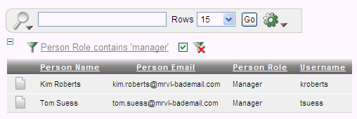
Select a column, an operator, and expression.
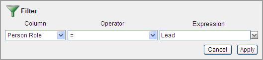
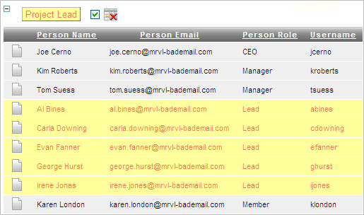
In the previous example, the filter will display all people who have the Person Role of Lead.
Click Apply.
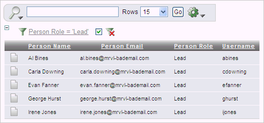
Notice the filter Person Role contains 'Lead' has been added to the Report Settings area above the report.
To revise the filter:
Click the filter name (in this example, Person Role contains 'Lead').
Edit your selections and click Apply.
To disable the filter, select the Enable/Disable Filter check box.
To delete the filter, click Remove Filter.
You can specify which columns to display and the sort order (ascending or descending) by selecting Sort on the Actions menu.
To sort by column:
Click the Actions menu and select Sort.
The Sort region appears.
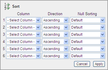
Select a column, the sort direction (Ascending or Descending), and Null Sorting behavior (Default, Nulls Always Last, or Nulls Always First).
Click Apply.
You can create a break group of one or several columns by selecting Control Break from the Actions menu. Creating a break group pulls the columns out of the interactive report and displays them as a master record.
To create a break group:
Click the Actions menu and select Control Break.
The Control Break region appears.
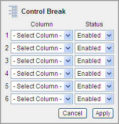
Select a column and then a status (Enable or Disable)
Click Apply.
One or more break groups display in Report Settings area above the report.
To expand the break group, click the plus (+) sign.
To enable the Control Break filter, select the Enable/Disable Filter check box.
To delete the filter, click Remove Filter.
You can customize the display to highlight specific rows in a report by selecting Highlight on the Actions menu.
To create highlighting:
Click the Actions menu and select Highlight.
The Highlight region appears.
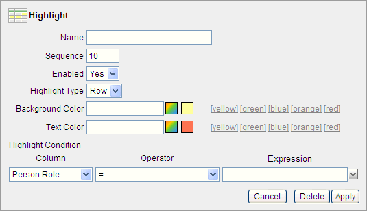
Enter the following information:
Name - Enter a name to define this filter.
Sequence - Enter numeric value to identify the sequence in which the rules are evaluated.
Highlight Type - Select Cell or Row. If Cell is selected, the column referenced in the Highlight Condition is highlighted.
Background Color - Select a new color for the background of the highlighted area.
Text Color - Select a new color for the text in the highlighted area.
Select a column, an operator, and expression.
Click Apply.
Notice a new filter appears in the Report Settings area above the report.
To revise the filter:
Click the filter name (in this example, Project Lead).
Edit your selections and click Apply.
To disable the filter, select the Enable/Disable Filter check box.
To delete the filter, click Remove Filter.
You can add computations to columns by selecting Compute from the Actions menu.
To create a computation:
Click the Actions menu and select Compute.
The Compute region appears.
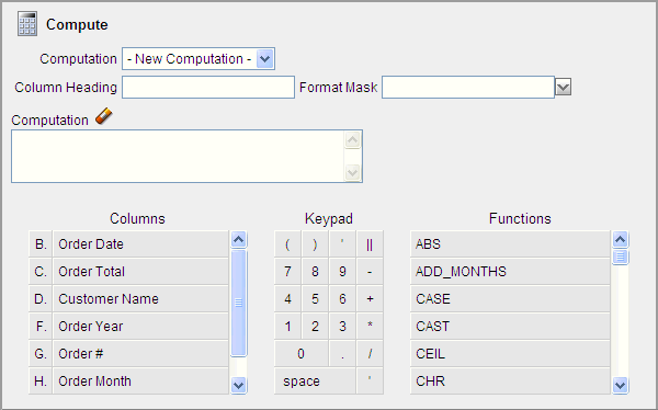
From Computation, select a previously defined computation or select New Computation.
For Column Heading, enter a heading for the new column.
For Format Mask, select an Oracle format mask to be applied to the new column.
Next, create the computation. Use the Columns, Keypad, and Functions sections to create a computation.
To create the computation:
Columns - Select the column name or alias to be added to the computation.
Keypad - Click the appropriate options. This section provides shortcuts for commonly used keys.
Functions - Select the appropriate function.
Click Apply.
You can define a mathematical computation against a column (or aggregate) by selecting Aggregate from the Actions menu. Aggregates are displayed after each control break and at the end of the report within the column in which they are defined.
To aggregate columns:
Click the Actions menu and select Aggregate.
The Aggregate region appears.
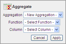
From Aggregation, select a previously defined aggregation or select New Aggregation.
For Function, select one of the following: Sum; Average, Count, Minimum, Maximum, or Median.
For column, select a column name or alias.
Click Apply.
The computation appears at the bottom of the report.
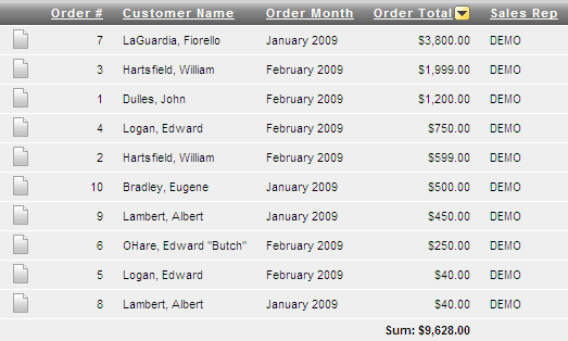
In this example, the aggregate shows the sum of all amounts in the Order Total column.
To remove the aggregate:
Select Aggregate from the Actions menu.
The Aggregate region appears.
To create a chart, select Chart on the Actions menu. You can create one chart for each interactive report. Once defined, you can switch between the chart and report views using links on the Search bar.
To create a chart:
Click the Actions menu and select Chart.
The Chart region appears.
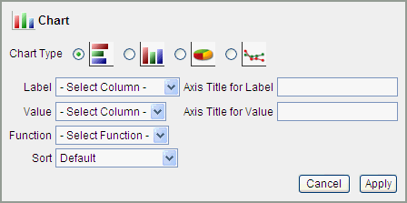
In the Chart region, specify the following:
Chart Type - Select the type of chart you wish to create.
Label - Select the column to be used as the label.
Axis for Title for Label - Enter title to be displayed on the axis associated with the column selected for Label (not available for pie chart).
Value - Select the column to be used as the Value. If your function is a COUNT, a Value does not need to be selected.
Axis Title for Value - Enter the title to display on the axis associated with the column selected for Value (not available for pie chart).
Function - (Optional) Select a function to be performed on the column selected for Value.
Edit Chart and View Chart links appear beneath the Search bar.
To alter the chart, click Edit Chart.
To return to the report, click View Report.
To delete the chart, click Edit Chart and then Delete.
You can execute a flashback query by selecting Flashback from the Actions menu. A flashback query enables you to view the data as it existed at a previous point in time. The default amount of time that you can flashback is 3 hours (or 180 minutes) but the actual amount will differ for each database.
To execute a flashback query:
Click the Actions menu and select Flashback.
In the Flashback region, enter the number of minutes.
Click Apply.
You can save a customized report by selecting Save Report from the Actions menu. You can choose to save a Named Report or Default Report Settings.
Tip:
The Save Report option does not display if an authentication scheme is not defined for the current application. See "Establishing User Identity Through Authentication".To save an interactive report:
Run the report.
From the Actions menu, select Save Report.
In Save Report:
Save - Select As Named Report.
Name - Enter a name for the report.
Description - Enter an optional description.
Click Apply.
Tip:
To save a named report saved to a new page, disable Show Saved Reports as Tabs under Advanced Attributes. See "Configuring Advanced Attributes for Interactive Reports"Default report settings determine the way a report initially displays to end users. End users can then modify any of the settings.
To save default report settings:
Click the Actions menu and select Save Report.
From Save, select As Default Report Settings.
Click Apply.
You can reset a report back to the default settings by selecting Reset from the Actions menu. Resetting a report removes any customizations you have made.
To reset a report:
Click the Actions menu and select Reset.
Click Apply.
You can download an interactive report back by selecting Download from the Actions menu. Available download formats depend upon your installation and report definition but may include comma-delimited file (CSV) format, Microsoft Excel (XLS) format, Adobe Portable Document Format (PDF), and Microsoft Word Rich Text Format (RTF).
To download a report:
Click the Actions menu and select Download.
Select a report download format and follow the provided instructions.
By default, an interactive report includes a Search Bar, Column Heading Menu links, and Link Column icons. Users can use these components to alter the layout of report data by selecting columns, applying filters, highlighting, and sorting. This section describes how developers can customize an interactive report by editing report attributes.
Topics in this section include:
Removing or Customizing a Search Bar in an Interactive Report
Defining a Column as a List of Values in an Interactive Report
See Also:
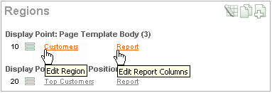
"Using Interactive Reports"You can access the Interactive Report Attributes page by clicking the Interactive Report link next to the report region you want to edit on the Page Definition. You can also navigate to the Report Attributes page by clicking the region name and then selecting the Report Attributes tab.
To access the Report Attributes page:
On the Workspace home page, click the Application Builder icon.
Select the application.
Select a page.
The Page Definition appears.
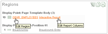
Under Regions, click Interactive Report next to the name of the report region you want to edit.
The Report Attributes page appears and is divided into the following sections:
Column Attributes control the report layout. See "Editing Interactive Report Column Attributes".
Column Groups attributes enable you to group columns together on the single row view. See "Creating Column Groups".
Default Report Settings displays the initial way a report displays to end users. See "Saving Default Report Settings".
Pagination attributes control report pagination. See "Controlling Interactive Report Pagination".
Sorting attributes enable you to define images and image attributes for images that display in report headings to sort values. See "Managing Interactive Report Column Sorting".
Search Bar contain attributes that enable you to define a search bar within an interactive report. See "Removing or Customizing a Search Bar in an Interactive Report".
Download enables you to add a download option to the Actions menu and export the report as CSV, XLS, PDF, or RTF file. See "Adding a Download Option to the Actions Menu".
Link Column attributes enable you to add a link to a column. See "Creating a Column Link in an Interactive Report".
Advanced Attributes enable you to define a report alias, send a user a saved view of a report, show saved reports as tabs, prevent execution of queries that take a specified amount of time to execute, and define items to set into session state. See "Configuring Advanced Attributes for Interactive Reports".
To learn more about a specific attribute, click the item label.
When Help is available, the item label changes to red when you pass your cursor over it and the cursor changes to an arrow and question mark. See "About Field-Level Help".
See Also:
"Creating a Column Link in a Classic Report" and "Defining an Updatable Column in a Classic Report", and "Defining a Column as a List of Values in a Classic Report", and "Controlling When Columns Display in a Classic Report"The Report Attribute page is divided into these sections: Column Attributes, Groups, Default Report, Pagination, Sorting, Search Bar, Download, Link Column, Advanced, and Description.
You can access these sections by scrolling down the page, or by clicking a navigation button at the top of the page.
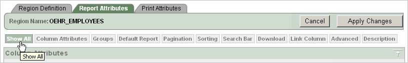
When you select a button at the top of the page, the selected section appears and all other sections are temporarily hidden. To view all sections of the page, click Show All.
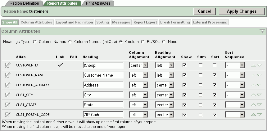
You can use the Column Attributes section of the Report Attributes page to precisely control the report layout. For example, you can use these attributes to alter column heading text, change column positioning, or hide a column.
To access Column Attributes:
On the Workspace home page, click the Application Builder icon.
Select the application.
Select a page.
The Page Definition appears.
Under Regions, click Interactive Report next to the name of the report region you want to edit.
The Interactive Report Attributes page appears with the Column Attributes section at the top of the page.
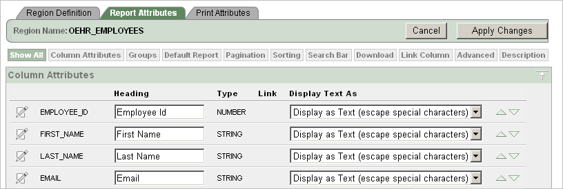
Use the Column Attributes section to control report column appearance and functionality.
Heading displays the heading text to be included in the report. Type indicates the type of query column. The Link column indicates if a link column is currently defined.
Table 7-1 describes common report column edits.
Table 7-1 Common Report Column Edits for Interactive Reports
| Description | Developer Action |
|---|---|
|
Alter column display sequence. |
Click the up and down arrows to change the column display sequence. |
|
Change column group assignment. |
If Column Groups are defined, individual columns can be assigned under Column Group. |
|
Change column heading text. |
Under Heading, enter different heading text. |
|
Change how columns display. |
Select an option from Display Text As. |
You can further refine the attributes of a specific column on the Column Attributes page.
To access the Column Attributes page, click the Edit icon next to the appropriate column Alias.
You can control whether users can sort, filter, control breaks, aggregate, and create computations or chart, by selecting the appropriate check boxes under Allow Users To.
Under Column Definition, Allow Users To, select the appropriate check boxes.
To learn more about a specific attribute, click the item label.
Use column groups to group columns together on a single row view.
To create a column group:
Navigate to the Interactive Report Attributes page. See "Accessing the Interactive Report Attributes Page".
The Interactive Report Attributes page appears.
Scroll down to Column Groups.
Click Add Group.
Under Column Group:
Sequence - Enter the display sequence for this column group. This attribute determines the order in which the column groups display in the detail view.
Group Name - Enter a column group name. This name displays in the region header in detailed view.
Description - Enter an optional description for the column group. This description never displays to the end user.
Click Create.
You control how pagination displays by making selections from Pagination attributes on the Interactive Report Attributes page.
To access the Pagination section of the Report Attributes page:
Navigate to the Interactive Report Attributes page. See "Accessing the Interactive Report Attributes Page".
The Interactive Report Attributes page appears.
Scroll down to Pagination.
You use the Pagination attributes to select a pagination style, determine where pagination occurs, specify the maximum number of rows to query, and messages to display when more than the maximum number of rows are returned or if no rows are returned. Table 7-2 describes the available Pagination attributes.
Table 7-2 Pagination Attributes
| Attribute | Description |
|---|---|
|
Pagination Type |
Select a pagination type. Pagination provides the user with information about the number of rows and the current position within the result set. Pagination can be displayed above or below the report (or both) and can be positioned on the left or right. Available pagination options include:
|
|
Pagination Display Position |
Defines where pagination occurs. Pagination can be display on the left side, right side, at the bottom, or above the report. |
|
Show Null Values as |
Enter the text you want to display for null columns. The default value is |
|
Maximum Row Count |
Defines the maximum number of rows to query, for example, rows 1 - 10 or 456. If you set this attribute to 200, the result would appear as follows:
Note that this attribute impacts performance. Counting fewer rows can improve performance and counting thousands of rows can degrade performance. |
|
When more than maximum row data found message |
Defines the text message that displays when more than maximum row count are returned. |
|
When No Data Found Message |
Defines the text message that displays when the query does not return any rows. |
You manage column sorting on the Interactive Report Attributes page.
To manage column sorting:
Navigate to the Interactive Report Attributes page. See "Accessing the Interactive Report Attributes Page".
The Interactive Report Attributes page appears.
Under Column Attributes, click the Edit icon for the column for which you want to enable sorting.
Under Column Definition, select Sort and click Apply Changes.
The Interactive Report Attributes page appears.
Scroll down to Sorting.
Specify ascending and descending image attributes, or click set defaults.
Search bars display above the report.
To remove a search bar in your report:
Navigate to the Interactive Report Attributes page. See "Accessing the Interactive Report Attributes Page".
The Interactive Report Attributes page appears.
Scroll down to Search Bar.
For Include Search Bar, select Yes or No. Selecting No removes the following default components:
Search Field - Displays a text field in the search bar in which to enter search criteria.
Finder Drop Down - Enables users to search on a selected column or against all columns.
Rows Per Page Selector - Displays a select list to enable users to select the number of rows to display per page.
Actions Menu - Enables the user to customize the report based on selected Actions.
To customize the Actions Menu, select the Action functions to include.
For Button Template, select a template for buttons that display in the search region and in the dialogs.
For Finder Image, specify an image. If no image is defined, #IMAGE_PREFIX#/htmldb/builder/builder_find.png is used.
For Actions Menu Image, specify an image. If no image is defined, #IMAGE_PREFIX#/ws/action_dropdown.gif is used.
For Search Button Label, enter the text to be used as the search button label.
For Maximum Rows Per Page, enter the maximum number to display in the Rows Per Page Selector in the search bar.
Click Apply Changes.
You can add a Download option to the Actions menu to enable users to export an interactive report as a comma-delimited file (CSV) format, Microsoft Excel (XLS) format, Adobe Portable Document Format (PDF), and Microsoft Word Rich Text Format (RTF).
To add a download link to a report you must enable the CSV output option.
See Also:
"Automatic CSV Encoding"To enable the Enable CSV output option:
Navigate to the Interactive Report Attributes page. See "Accessing the Interactive Report Attributes Page".
The Interactive Report Attributes page appears.
Scroll down to Search Bar.
For Include Search Bar, select Yes and Actions Menu.
Under Include in Actions menu, select Download.
Scroll down to Download.
From Download Formats, select CSV - Comma-delimited file (CSV) file format.
Tip:
The Download option will not display in the Actions menu if no file formats are selected.In the CSV Separator, define the column separator. If no value is entered, a comma or semicolon is used depending on your current NLS settings.
In the CSV Enclosed By, enter delimiter character. This character is used to delineate the starting and ending boundary of a data value. Default delimiter is double quotation marks (" ").
In Filename, enter a name for the downloaded document. Do not specify a file extension, the extension is added automatically. If you leave this blank, the region name is used as the file name.
Click Apply Changes.
A Link Column displays on the left side of an interactive report. It can link to a single row view, a custom target, or be excluded from the report. Note that a Link Column cannot be sorted, hidden, or moved by an end user and does not interact with the standard column link defined on the Column Attributes page.
To link to a single row view:
Navigate to the Interactive Report Attributes page. See "Accessing the Interactive Report Attributes Page".
The Interactive Report Attributes page appears.
Scroll down to Link Column.
For Link Column, select Link to Single Row View.
From Single Row View, select the appropriate options:
Allow Exclude Null Values - Excludes columns with null values.
Allow Displayed Columns - Displays only the columns shown in the report.
For Uniquely Identify Rows by, select ROWID or Unique Column.
If you select, Unique Column, specify the column in the Unique Column field.
For Link Icon, select an icon.
For Link Attributes (Optional), specify additional column link attributes to be included in the <a href= > tag (for example, a link target, classes, or styles).
Click Apply Changes.
To link to a specific page:
Navigate to the Interactive Report Attributes page. See "Accessing the Interactive Report Attributes Page".
The Interactive Report Attributes page appears.
Scroll down to Link Column.
For Link Column, select Link to Custom Target.
For Link Icon, select an icon.
For Link Attributes (Optional), specify additional column link attributes to be included in the <a href= > tag (for example, a link target, classes, or styles).
For Target, select Page in this Application.
For Page, select the target page number. To reset the pagination for this page, select Reset Pagination.
For Request, specify the request to be used.
For Clear Cache, specify the pages (that is, the page numbers) on which to clear cache. You can specify multiple pages by listing the page numbers in a comma-delimited list. See "Linking to Interactive Reports".
For Name and Value, specify session state for a specific item.
Click Apply Changes.
To link to a URL:
Navigate to the Interactive Report Attributes page. See "Accessing the Interactive Report Attributes Page".
The Interactive Report Attributes page appears.
Scroll down to Link Column.
For Link Column, select Link to Custom Target.
For Link Icon, select an icon.
For Link Attributes (Optional), specify additional column link attributes that to be included in the <a href= > tag (for example, a link target, classes, or styles).
From Target, select URL.
In URL, enter the appropriate address.
For Checksum - Select one of the following:
Use default
Application Level - Link reusable by any user
User Level - Link reusable by current user
To learn more about each option, see item Help.
Click Apply Changes.
To exclude a column link:
Navigate to the Interactive Report Attributes page. See "Accessing the Interactive Report Attributes Page".
The Interactive Report Attributes page appears.
Scroll down to Link Column.
For Link Column, select Exclude Link Column.
Click Apply Changes.
Use Column Attributes to create a link from a report to another page in your application or to a URL.
To create a column link to another page:
Navigate to the Interactive Report Attributes page. See "Accessing the Interactive Report Attributes Page".
The Interactive Report Attributes page appears.
Under Column Attributes, locate the column to contain the link.
Click the Edit icon next to the column name.
The Column Attributes page appears.
Scroll down to Column Link.
To create a column link to another page:
From Target, select Page in this Application.
(Optional) In Link Attributes, specify additional column link attributes to be included in the <a href= > tag (for example, a link target, classes, or styles).
In Link Text, enter the text to be displayed as a link, specify an image tag, or pick from the list of default images.
In Page, specify the target page number. To reset the pagination for this page, select Reset Pagination.
In Request, specify the request to be used.
In Clear Cache, specify the pages (that is, the page numbers) on which to clear cache. You can specify multiple pages by listing the page numbers in a comma-delimited list.
Use the Name and Value fields to specify session state for a specific item.
For Checksum - Select one of the following:
Use default
Application Level - Link reusable by any user
User Level - Link reusable by current user
To learn more about each option, see item Help.
Click Apply Changes.
To create a column link to a URL:
Navigate to the Interactive Report Attributes page. See "Accessing the Interactive Report Attributes Page".
The Interactive Report Attributes page appears.
Access the Column Attributes page by clicking the Edit icon next to the appropriate column.
The Column Attributes page appears.
Scroll down to Column Link.
Under Column Link, specify the following:
From Target, select URL.
In Link Text, enter the text to be displayed as a link and select a substitution string.
(Optional) In Link Attributes, specify additional column link attributes to be included in the <a href= > tag (for example, a link target, classes, or styles).
In URL, enter the appropriate address.
Click Apply Changes.
In interactive reports you can use a list of values to improve the speed of built-in filter tools.
To define a report column as a list of values:
Navigate to the Interactive Report Attributes page. See "Accessing the Interactive Report Attributes Page".
The Interactive Report Attributes page appears.
Access the Column Attributes page by clicking the Edit icon next to the appropriate column.
The Column Attributes page appears.
Scroll down to List of Values.
From Column Filter List of Values, specify how to create a list of values as a filter on the report column list. Available options include:
None - Disable filter on list of values.
Default Based on Column Type - STRING and NUMBER columns derive list of values from distinct column values. DATE columns derive list of values from predefined date ranges.
Use Defined List of Values - Derive list of values from defined list of values SQL Query.
List of values definition - If you select Use Defined List of Values, enter a SQL query that selects the distinct column values. Entering a SQL query can improve performance in some reports. This list of values will be displayed when a user clicks on a column header.
Click Apply Changes.
Use the Advanced Attributes section to define a report alias, send a user a saved view of a report, show saved reports as tabs, prevent execution of queries that take a specified amount of time to execute, and define items to set into session state.
To configure Advanced Attributes:
Navigate to the Interactive Report Attributes page. See "Accessing the Interactive Report Attributes Page".
The Interactive Report Attributes page appears.
Scroll down to Advanced Attributes.
Table 7-3 describes the available Advanced Attributes.
| Attribute | Description |
|---|---|
|
Report Alias |
Enter an alphanumeric alias for this interactive report. You may use an alias to reference an interactive report in an API call (for example, to change the columns displayed). The alias must be unique within the application. |
|
Report ID Item |
This attribute enables you to send a user directly to a saved view of the report. You specify an item whose value stores the report ID of the saved view. Report ID's can be retrieved from the |
|
Show Saved Reports as Tabs |
If saved versions of the report exist, this attribute specifies if they should be displayed as tabs. To create a separate page with a list of reports, disable this attribute. |
|
Page Items to Submit |
Enter a comma separated list of items to be set into session state when the user clicks the Go button on the search bar. Only items on the current page will be set. |
Unlike classic reports which typically use page items as report parameters, the data in an interactive report is driven by declarative filters. However, the developer may desire to set these report parameters by modifying interactive report settings for an end user. These settings only affect the end user's working report and will not affect any saved report settings.
To reset an interactive report in a link, use the string "RIR" in the Clear-Cache section of a URL. This is equivalent to the end user choosing the Reset option from the interactive report actions menu on the target page. The report is returned to the default report settings specified by the developer or saved by the user.
To create a Row text contains filter on an interactive report, use the string IR_ROWFILTER in the Item Names section of the URL. Adding this string passes the filter value in the corresponding location in the Item Values section of the URL.
To create a filter on an interactive report in a link, use the string IR<operator>_<target column alias> in the Item Names section of the URL, and pass the filter value in the corresponding location in the Item Values section of the URL.
Valid operators include:
EQ = Equals (this is the default)
NEQ = Not Equals
LT = Less than
LTE = Less then or equal to
GT = Greater Than
GTE = Greater than or equal to
LIKE = SQL Like operator
N = Null
NN = Not Null
C = Contains
NC = Not Contains
Consider the following examples:
f?p=...:IR_ENAME:KING
The previous example is equivalent to the end user creating a filter on the target page: ENAME = KING. Note that when an operator is not provided, EQ is used because it is the default.
f?p=...:IRGT_SAL:3000
The previous example is equivalent to the end user creating a filter on the target page: SAL > 3000.
You can control report layout, pagination, column sorting, error messages, export links, and column break of SQL and Classic reports using the Report Attributes page.
Tip:
With the addition of interactive reports in Oracle Application Express release 3.1, all previous report types are referred to as classic reports. See "Editing Interactive Reports".Topics in this section include:
See Tutorials:
Oracle Application Express Advanced TutorialsYou can access the classic Report Attributes page by clicking the Report link next to the report region you want to edit on the Page Definition. You can also navigate to the Report Attributes page by clicking the region name and then selecting the Report Attributes tab.
To access the Report Attributes page:
On the Workspace home page, click the Application Builder icon.
Select the application.
Select a page.
The Page Definition appears.
Under Regions, click Report next to the name of the report region you want to edit.
The Report Attributes page appears and is divided into the following sections:
Column Attributes control the report layout. See "Altering Classic Report Layout Using Column Attributes".
Layout and Pagination attributes control report pagination. See "Controlling Classic Report Pagination".
Sorting attributes enable you to define images and image attributes for images that display in report headings to sort values. See "Enabling Column Sorting in a Classic Report".
Messages contain attributes that enable you to define messages that display if no data is found or more data is found than can be displayed.
Report Export attributes enable you to add download link to a report or export a report as either an XML file or CSV file. See "Adding a Download Link to a Classic Report" and "Exporting a Classic Report as an XML File or a CSV File".
Break Formatting attributes enable you to control if a specific column repeats and how column breaks appear when printed. See "Controlling Column Breaks in a Classic Report".
To learn more about a specific attribute, click the item label.
When Help is available, the item label changes to red when you pass your cursor over it and the cursor changes to an arrow and question mark. See "About Field-Level Help".
Click Apply Changes.
See Also:
"Creating a Column Link in a Classic Report" and "Defining an Updatable Column in a Classic Report", and "Defining a Column as a List of Values in a Classic Report", and "Controlling When Columns Display in a Classic Report"The Report Attribute page is divided into these sections: Column Attributes, Layout and Pagination, Sorting, Messages, Report Export, Break Formatting, and External Processing.
You can access these sections by scrolling down the page, or by clicking a navigation button at the top of the page.
When you select a button at the top of the page, the selected section appears and all other sections are temporarily hidden. To view all sections of the page, click Show All.
You can use the Column Attributes section of the Report Attributes page to precisely control the report layout. For example, you can use these attributes to alter column heading text, change column positioning, hide a column, create a sum of a column, or select a sort sequence.
To access the Column Attributes:
On the Workspace home page, click the Application Builder icon.
Select the application.
Select a page.
The Page Definition appears.
Under Regions, click Report next to the name of the report region you want to edit.
The Report Attributes page appears with the Column Attributes section at the top of the page.
Use the Column Attributes section to control report column appearance and functionality.
Heading Type identifies how the heading is generated for the report. The Link column indicates if a column link is currently defined. The Edit column indicates whether a column is currently updatable.
Table 7-4 describes common report column edits.
Table 7-4 Common Report Column Edits for Classic Reports
| Description | Developer Action |
|---|---|
|
Alter column display sequence. |
Click the up and down arrows to change the column display sequence. |
|
Alter heading alignment. |
Under Column Alignment, select a column alignment. |
|
Change column heading text. |
Under Heading, enter different heading text. |
|
Control which columns display. |
Click Show to indicate a column should display. |
|
Enable a unique sort sequence. |
Click Sort and select a sequence number from Sort Sequence. Any number of columns can be sort enabled. However, at least one column must have a Sort Sequence defined. |
|
Enable the sum of a column. |
Click Sum to enable the sum of a column. |
You can further refine the attributes of a specific column on the Column Attributes page.
To access the Column Attributes page, click the Edit icon next to the appropriate column Alias.
To learn more about a specific attribute, click the item label.
When Help is available, the item label changes to red when you pass your cursor over it and the cursor changes to an arrow and question mark. See "About Field-Level Help".
You control report pagination by:
Including a pagination substitution string in the report template
Making selections from the Layout and Pagination section on the Report Attributes page
You control how pagination displays by making selections from the Layout and Pagination attributes on the Report Attributes page.
Topics in this section include:
To access the Layout and Pagination section of the Report Attributes page:
Create a report. See "Creating a Report Using a Wizard".
Navigate to the appropriate Page Definition. See "Accessing a Page Definition".
Under Regions, click the appropriate Report attributes link.
The Report Attributes page appears.
Scroll down to Layout and Pagination.
You use the Layout and Pagination attributes to select a pagination style, determine where pagination occurs, and specify the number of rows that display on each page. Table 7-5 describes the most commonly used Layout and Pagination attributes.
To learn more about a specific attribute, click the item label. When Help is available, the item label changes to red when you pass your cursor over it and the cursor changes to an arrow and question mark. See "About Field-Level Help".
Table 7-5 Layout and Pagination Attributes
| Attribute | Description |
|---|---|
|
Report Template |
Specifies a template to be applied to this report. Report templates provide control over the results of a row from your SQL query. You can choose from a number of default templates, or pick a custom build template. |
|
Report Attributes Substitution |
Enter a value to be in place of the |
|
Show Null Values as |
Enter the text you want to display for null columns. The default value is |
|
Pagination Scheme |
Specifies a pagination scheme for this report. Pagination provides the user with information about the number of rows and the current position within the result set. Pagination also defines the style of links or buttons used to navigate to the next or previous page. For more information, see the Help information for this attribute. |
|
Enable Partial Page Refresh |
If enabled, this attribute refreshed the report region when paginating forward and backward in your result set. |
|
Display Position |
Defines where pagination occurs. If you choose to display pagination above a report, the selected report template needs to support that type of display. |
|
Number of Rows |
Defines the maximum number of rows to display on each page. |
|
Number of Rows (Item) |
Defines the number of rows displayed by default per page for SQL queries (obtained dynamically from an item). Identify the item in this attribute. |
|
Maximum Row Count |
Defines the maximum number of rows to query, for example, rows 1 - 10 of 456. If you set this attribute to 200, the result would appear as follows:
Note that this attribute impacts performance. Counting fewer rows can improve performance and counting thousands of rows can degrade performance. |
|
Strip HTML |
Specify whether to remove HTML tags from the original column values for HTML expressions, column links and report data exported as CSV files. If you select values from the database that contain HTML tags, then those tags can cause conflicts with the HTML generated for your columns links or HTML expressions. When this option is enabled, only the actual data portion of your column value is used. |
|
Sort Nulls |
For reports with column heading sorting, specify if you want null valued columns to sort first or last. |
To include pagination after the rows in a report:
Create a report. See "Creating a Report Using a Wizard".
Next, select the appropriate Layout and Pagination attributes.
Navigate to the Report Attributes page:
Navigate to the Page Definition. See "Accessing a Page Definition".
Under Regions, click the appropriate Report attributes link.
The Report Attributes page appears.
Under Layout and Pagination, select the following:
Report Template - Select a report template (optional).
Pagination Scheme - Select a pagination scheme.
Display Position - Select a display position.
Number of Rows - Specify how many rows display on each page.
Click Apply Changes.
Edit the report template:
Navigate to the Page Definition. See "Accessing a Page Definition".
Under Templates, select the report template name.
Include the #PAGINATION# substitution string in the After Rows attribute.
Click Apply Changes.
Run the page.
To include pagination before the rows in a report:
Create a report. See "Creating a Report Using a Wizard".
Next, select the appropriate Layout and Pagination attributes.
Navigate to the Report Attributes page:
Navigate to the Page Definition. See "Accessing a Page Definition".
Under Regions, click the appropriate Report attributes link.
The Report Attributes page appears.
Under Layout and Pagination:
Report Template - Select a report template (optional).
Pagination Scheme - Select a pagination scheme.
Display Position - Select a position that contains the word top.
Number of Rows - Specify how many rows display on each page.
Click Apply Changes.
Edit the report template.
Navigate to the Page Definition. See "Accessing a Page Definition".
Under Templates, select the report template name.
Include the #TOP_PAGINATION# substitution string in the Before Rows attribute.
Click Apply Changes.
Run the page.
You enable column sorting on the Report Attributes page.
To enable column sorting:
Navigate to the Report Attributes page. See "Editing SQL and Wizard Reports".
Under Column Attributes, select the Sort check box next to the columns to be sorted.
From Sort Sequence, select a sequence number.
Sort Sequence is optional. However, if there are one or more sort enabled columns, then at least one column needs a defined Sort Sequence.
Scroll down to Sorting.
Specify ascending and descending image attributes or click set defaults.
Click Apply Changes.
Tip:
Note that column sorting must be enabled if you want columns with null values to display at the top or end of the report. To learn more about the Sort Nulls attribute, see "Accessing and Understanding Layout and Pagination Attributes".You can create a link within a report that enables users to export the report as a comma-delimited file (.csv) file. To add a CSV link to a report you must enable the CSV output option. When using the CSV output option, the report template is not important. You can include a CSV link with any report template that has the CSV export substitution string defined.
See Also:
"Automatic CSV Encoding"To use the enable the Enable CSV output option:
Navigate to the appropriate Report Attributes page. See "Editing SQL and Wizard Reports".
Scroll down to Report Export.
From Enable CSV output, select Yes.
(Optional) In the Separator and Enclosed By fields, define the separator and delimiter.
The default Enclosed By by characters are a double quotation marks (" "). The default delimiter is either a comma or a semicolon depending upon your current NLS settings.
In the Link Label field, enter link text. This text will display in your report and enable users to invoke a download.
(Optional) To specify a default export file name, enter a name in the Filename field.
By default, the Application Express engine creates an export file name by taking the region name and adding the appropriate file name extension (.csv or .xml).
Click Apply Changes.
You can export a report as an XML file by selecting a report template.
To export a report as a file:
Navigate to the appropriate Report Attributes page. See "Editing SQL and Wizard Reports".
Scroll down to Layout and Pagination.
From the Report Template list, select export: XML or export: CSV.
Selecting export: XML prevents the Application Express engine from rendering the page and dumps the content to an XML file.
Click Apply Changes.
Use the Column Link attributes to create a link from a report to another page in your application or to a URL.
To create a column link to another page:
Navigate to the appropriate Report Attributes page. See "Editing SQL and Wizard Reports".
Under Column Attributes, locate the column to contain the link.
Click the Edit icon next to the column name.
The Column Attributes page appears.
Scroll down to Column Link.
To create a column link to another page:
From Target, select Page in this Application.
(Optional) In Link Attributes, specify additional column link attributes to be included in the <a href= > tag (for example, a link target, classes, or styles).
In Link Text, enter the text to be displayed as a link, specify an image tag, or pick from the list of default images.
In Page, specify the target page number. To reset the pagination for this page, select Reset Pagination.
In Request, specify the request to be used.
In Clear Cache, specify the pages (that is, the page numbers) on which to clear cache. You can specify multiple pages by listing the page numbers in a comma-delimited list. See "Linking to Interactive Reports".
Use the Name and Value fields to specify session state for a specific item.
Click Apply Changes.
To create a column link to a URL:
Navigate to the appropriate Report Attributes page. See "Editing SQL and Wizard Reports".
Access the Column Attributes page by clicking the Edit icon next to the appropriate column.
The Column Attributes page appears.
Scroll down to Column Link.
Under Column Link, specify the following:
From Target, select URL.
In Link Text, enter the text to be displayed as a link and select a substitution string.
(Optional) In Link Attributes, specify additional column link attributes to be included in the <a href= > tag (for example, a link target, classes, or styles).
In URL, enter the appropriate address.
Click Apply Changes.
You can make a column updatable by editing Tabular Form Element attributes on the Column Attributes page. Note that the Application Express engine can only perform updates if:
A multirow update is defined
A PL/SQL process is implemented to process updated data
When using the built-in tabular form elements and display types, then the report has to be defined using the type SQL Query (updatable report)
To define updatable column attributes:
Navigate to the appropriate Report Attributes page. See "Editing SQL and Wizard Reports".
Access the Column Attributes page by clicking the Edit icon next to the appropriate column.
The Column Attributes page appears.
Scroll down to Tabular Form Element.
Under Tabular Form Element, specify the following:
Display As - Select a type of updatable column.
Use this option to make a column updatable. Updates can only be performed if a multirow update is defined, or a PL/SQL process is implemented to process updated data.
Date Picker Format Mask - Make a selection if you selected the Display As type of Date Picker.
Element Width - Specify the width of the form item.
Number of Rows - Specify the height of a form item (applicable to text areas).
Element Attributes - Define a style or standard form element attribute.
Element Option Attributes - Specify form element attributes for items in a radio group or check box.
Primary Key Source Type - Identify the default type.
Primary Key Source - Identify the default source.
If the current column is part of the primary key defined in an MRU process, only the primary key source type and source appear.
Otherwise, Default and Default Type appear. Use Default and Default Type to establish a relationship between two master records in a master detail form, or to set the default values for new rows.
Reference Table Owner - Identify the owner of the referenced table. Use this attribute to build User Interface Defaults for reports.
Reference Table Name - Identify the table or view that contains the current report column.
Reference Column Name - Identify the column name that this report column references.
Click Apply Changes.
Report columns can be rendered as lists of values. For example, a column can be rendered using a select list or a popup list of values. Or, a column can be rendered as read-only text based on a list of values.
This last approach is an effective strategy when creating display lookup values and is particularly useful in regular, nonupdatable reports. This approach enables you to display the value of a column without having to write a SQL JOIN statement.
To render a report column as a list of values:
Navigate to the appropriate Report Attributes page. See "Editing SQL and Wizard Reports".
Access the Column Attributes page by clicking the Edit icon next to the appropriate column.
The Column Attributes page appears.
Scroll down to List of Values.
From Named LOV, make a selection from the List of Values repository. See "Creating Lists of Values".
To include a null value in a list of values:
In Display Null, select Yes.
In Null Text, specify the value that displays.
A column can also have a value that does not display in its list of values.
To define a value that does not display in the list of values:
From Display Extra Value, select Yes.
The extra value is used if the actual column value is not part of the LOV. In that situation, the actual value is shown. If you do not display extra values, you may end up with the wrong value and unintentionally update your data incorrectly.
In Null Value, specify the value that displays.
If you have not selected a Named LOV, enter the query used to display a select list in the LOV Query field.
If you have not selected a Named LOV, enter the query used to display a select list in LOV Query.
Click Apply Changes.
See Tutorials:
"How to Create a Tabular Form" in Oracle Application Express Advanced TutorialsYou can use the Authorization and Condition attributes to control when a column displays.
Authorization enables you to control access to resources (such as a report column) based on predefined user privileges. For example, you could create an authorization scheme in which only managers can view a specific report column. Before you can select an authorization scheme, you must first create it.
A condition is a small unit of logic that enables you to control the display of a column based on a predefined condition type. The condition evaluates to true or false based on the values you enter in the Expressions fields.
To specify Authorization and Condition attributes:
Navigate to the appropriate Report Attributes page. See "Editing SQL and Wizard Reports".
Access the Column Attributes page by clicking the Edit icon next to the appropriate column.
The Column Attributes page appears.
Under Authorization, make a selection from the Authorization Scheme list.
Under Conditions, make a selection from the Condition Type list, and depending upon your selection, enter an expression or value in the appropriate Expression fields.
If the authorization is successful and the condition type display evaluates to true, the column displays.
You can control if a specific column repeats and how column breaks appear when printed using Break Formatting attributes. For example, suppose your report displays employee information by department number. If multiple employees are members of the same department, you can increase the readability by specifying the department number only appears once.
To create this type of column break:
Navigate to the appropriate Report Attributes page. See "Editing SQL and Wizard Reports".
Scroll down to Break Formatting.
Make a selection from the Breaks list.
You can configure a classic report region to print by exporting it to a number of different formats. Oracle BI Publisher supports Adobe Portable Document Format (PDF), Microsoft Word Rich Text Format (RTF), or Microsoft Excel format (XLS), or Extensible Markup Language (XML). The supplied OC4J with Apache FOP alternative only supports PDF and XML. If you choose to use other third-party rendering engines, other output formats can also be configured.
By taking advantage of region report printing, your application users can view and print reports that have a predefined orientation, page size, column headings, and page header and footer. Interactive reports also have the ability to export to PDF, RTF, Microsoft Excel and Comma Separated Values (CSV). Note that for interactive reports, it is not possible to define a custom report layout.
Topics in this section include:
Tip:
If you are running Oracle Application Express with Oracle Database 11g Release 1 (11.1), you must enable network services in order to use report printing. See "Enabling Network Services in Oracle Database 11g"See Also:
"How to Create a Master Detail PDF Report" in Oracle Application Express Advanced TutorialsWhen printing to a PDF, the report data is transformed using an externally defined report server. When the application end user clicks a print link, a request is sent to the Application Express engine. The Application Express engine then generates the report data in XML format and report template in XSL-FO or RTF format. The external reporting engine then transforms the data and the template into a PDF which displays to the end user using the conversion servlet that ships with BI Publisher 10.1.3.2 (formerly known as Oracle XML Publisher). Fortunately, this architectural complexity is transparent to both end users and developers. End users just click a print link, and developers just declaratively set regions to support PDF printing. Output to other formats operates in the same manner using the necessary conversion servlet.
Your report server can be Oracle BI Publisher, OC4J with Apache FOP, or another standard XSL-FO processing engine. Oracle BI Publisher provides a higher level of functionality and facilitates "high fidelity" output requirements including master-detail reports, charts, and so on. To accommodate the difference in functionality, Oracle Application Express provides two report printing configuration options:
Standard Support. Enables you to print report regions and report queries using either the built-in templates (provided with a standard XSL-FO processing engine), or other XSL-FO compatible formats you provide. This setting does not support RTF.
Standard Support provides declarative formatting of report regions and report queries with basic control over page attributes, including page orientation, page size, column heading formats, page header, and page footer.
Advanced Support. Requires a valid license of Oracle BI Publisher (also known as Oracle XML Publisher). This setting, provides you with all the capabilities of the Standard configuration plus the ability to define RTF-based report layouts developed using the BI Publisher Word Template Builder.
To learn more about installing and configuring Oracle BI Publisher, see PDF Printing in Application Express 3.1. Go to:
http://www.oracle.com/technetwork/developer-tools/apex/overview/index.html
Note:
To use the full functionality of report printing, your Oracle Application Express service administrator must enable it for your site. See "Configuring Report Printing" in Oracle Application Express Administration Guide.There are two ways to print classic report regions:
Configure Printing Attributes for a Report Region. You can print a report region by configuring the Printing Attributes for the region. See "Configuring Classic Report Region Print Attributes".
Create a Report Query. You can print a report by defining a report query as a Shared Component. See "About Report Queries".
Both report regions and report queries can be downloaded in the following formats:
PDF - Adobe Portable Document Format.
RTF - Microsoft Word Rich Text Format.
XLS - Microsoft Excel format. Note that this is not a true .xls file because the content is HTML-based.
HTML
XML - Extensible Markup Language.
To format either a report region or report query, you associate it with a report layout. To learn more, see "About Report Layouts".
You can print a report region by defining a report query as a Shared Component. A report query identifies the data to be extracted. Unlike SQL statements contained in regions, report queries contain SQL statements that are validated when you save the query. Note that report queries must be SQL statements, not functions returning SQL statements.
You can associate a report query with a report layout and download it as a formatted document. If no report layout is selected, a generic layout is used. The generic layout is intended to be used to test and verify a report query. When using the generic layout option and multiple source queries are defined, only the first result set is included in the print document. The reports can include session state of the current application.
To make these reports available to end users, you then integrate them with an application. For example, you can associate a report query with a button, list item, branch, or other navigational component that enables you to use URLs as targets. Selecting that item then initiates the printing process.
Topics in this section include:
Note that the availability of the report query options depends on how your service administrator configures report printing for your instance. All options described in these steps may not be available to you.
To create a report query:
Navigate to the Shared Components page. See "Accessing the Shared Components Page".
Under Reports, click Report Queries.
Click Create.
For Query, specify the following information:
Report Query Name - Enter a name to identify the report query. When referencing a report query as a link target, the report query name is part of the request string.
Output Format - Select the report output format. Valid options include:
PDF - Adobe Portable Document Format.
Word - Microsoft Word Rich Text Format.
Excel - Microsoft Excel format. Note that this is not a true .xls file because the content is HTML-based.
HTML
XML - Extensible Markup Language.
Item - Select the item to hold the format value. This can be used to determine the output format at runtime.
View File As - Select how the Web browser opens the report query document. Options include:
Attachment - Displays a File Open/Save dialog box when the user clicks the report query download button.
Inline - Displays the report query document inside the Browser window.
Session State - Select this check box to reference session state values, such as the values of page items in the XML structure of your report.
Click Next.
For SQL Query, enter a SQL statement directly or click Query Builder to build a SQL statement by clicking and pointing.
To reference applications and page items in the SQL statement, reference them as bind variables. Click Set Bind Variables to be able to enter in values for each bind variable and test the query to ensure the expected output is returned.
For Download Definition, specify the following:
Data Source for Report Layout - Use this option to download a report definition export file. Select XML Data or XML Schema and then click Download.
XML Schema creates XSD file (that is, a XML schema definition of your XML structure.)
Add Query - Click this button to add another query to the report query. Adding another query enables the production of complex reports with more than one output component (for example, a chart and a report based on two different queries).
Create Report Query - Click this button to exit the wizard early. The Report Layout Source will default to use the generic report layout.
Click Next.
For Upload Report Layout, specify the following:
Report Layout Source - Specify how the report layout is derived. If you choose the report based file layout then the layout name and report layout file must be provided.
Layout Name - Enter a layout name (optional). The default is the report query name.
Report Layout File - Click Browse and select a Rich Text Format (RTF).
Click Next.
For Confirm:
Query Name - Identifies the query.
Report Layout - Identifies the report layout you selected.
Output Format - Identifies the format for this report query.
Derive from Item - Identifies the item to hold the format information.
URL - To integrate this report with your application, use the displayed URL as the target for a button, list item, link, or other navigational component. End users can click a button, for example, to start the printing process.
Test Report - Click this to preview your report. If you have chosen to use a generic report layout then the Test Report will not produce an output.
Click Finish.
The Report Query is created and saved to Shared Components.
To edit a report query:
Navigate to the Shared Components page. See "Accessing the Shared Components Page".
Under Reports, click Report Queries.
On the Report Queries page, you can use the Navigation bar at the top of the page to search for a query by name or change the page display. For example, you can change the default display by making a selection from View list. Available options include:
Icons (the default) displays each query as a large icon. To edit a query, click the appropriate icon.
Details displays each query as a line in a report. To edit a query, click the name.
Select the appropriate report query. On the Edit Report Query page, edit the information.
Click Apply Changes.
To copy a report query:
Navigate to the Shared Components page. See "Accessing the Shared Components Page".
Under Reports, click Report Queries.
On the Report Queries page, click Copy.
On the Copy Report Query, select the query you want to copy, enter a name for the report query, and click Copy.
The copy appears in the query list.
To format either a classic report region or report query, you associate it with a report layout. Using report layouts renders the data in a printer-friendly format. If you do not select a report layout, a default XSL-FO layout is used. The default XSL-FO layout is always used for rendering Interactive Report regions.
When creating and using report layouts, you can:
Take advantage of the default layouts for report regions and generic layouts for report queries provided with Oracle Application Express.
Utilize the built-in XSL-FO-based layouts for report regions by copying and customizing the code. You can edit a number of attributes for report regions that control page size, fonts, colors, and so on.
Create RTF or XSL-FO report layouts to customize the report look and feel. To use RTF report layouts, your Oracle Application Express service administrator must select the Advanced setting for your site. See "Configuring Report Printing" in Oracle Application Express Administration Guide.
Topics in this section include:
You can create a report layout based on one of these options:
Generic Columns - A generic report layout works with most query result sets. With this layout, the number of columns is automatically adjusted when generating the printable document.
A number of report layout attributes can be defined declaratively for report regions using the built-in XSL-FO default layout. This step allows for creating customizable copies of the built-in default XSL-FO layout, if additional control over the report layout is needed.
Named Columns - A named column report layout is a query-specific report layout designed to work with a defined list of columns in the query result set. This type of layout is used for custom-designed layouts when precise control of the positioning of page items and query columns is required.
Note that the availability of the Report Layout options depends on how your site administrator configured the report printing settings at your site. All options described in these steps may not be available to you.
See Also:
"Configuring Report Printing" in Oracle Application Express Administration Guide.To create a report layout:
Navigate to the Shared Components page. See "Accessing the Shared Components Page".
Under Reports, click Report Layouts.
Click Create.
The Create Report Layout wizard appears.
For Report Layout Type, select an option and click Next:
Generic Columns (XSL-FO) - This layout is pre-populated with a default template, which you can edit to fit your needs.
Named Columns (RTF) - This layout is uploaded as an RTF file.
Named Columns (XSL-FO) - This layout is uploaded as an XSL-FO file.
For Layout Source, review and edit the appropriate information. The options that appear on this page depend on the layout type you select:
If you selected Generic Columns:
Report Layout Name - Enter a name to identify the report layout when associating it with a report query or report region.
Report Layout - The report layout is the XSL-FO based definition of the page formatting. All attributes defining page size, orientation, fonts, styles, and so on, are defined in this section.
To see a list of valid substitution strings and other information, click the item label, Report Layout. This opens a separate Help window.
Report Column Heading - Defines the look of each cell in the report heading row.
Report Column - Defines the look of each cell for all report rows.
Report Column Width - This width is computed at runtime time or can be derived from the report column definition of a report region.
If you selected Named Columns:
Layout Name - Enter a name to identify the report layout when associating it with a report query or report region.
8.b) Report Layout File - Upload the file containing the report layout.
You can edit a generic column report layout directly in Application Express. However, to edit a named column report layout, you must download the current file, edit it, and then upload it again.
To edit a report layout:
Navigate to the Shared Components page. See "Accessing the Shared Components Page".
Under Reports, click Report Layouts.
On the Report Layouts page, select the layout you want to edit.
For generic column layouts, edit the layout directly on the Edit Report Layout page and then click Apply Changes.
For named column layouts, click Download and save the file to your computer.
Edit the file and then upload the updated version as a new report layout.
You can copy a report layout to edit and save.
To copy a report layout:
Navigate to the Shared Components page. See "Accessing the Shared Components Page".
Under Reports, click Report Layouts.
On the Report Layouts page, click Copy.
On the Copy Report Layout page, select the layout you want to copy, enter a name for the copy, and click Copy.
The copy appears in the layout list.
One approach to printing a report region is to configure Print Attributes. Once configured, these attributes only apply only to current region and cannot be used outside the context of the region.
If the printing feature is set up for your instance, you can configure a report region to print in various formats.
See Also:
"About Classic Report Printing Methods" and "Configuring Report Printing" in Oracle Application Express Administration GuideTo configure a classic report region for printing:
In your application, select the page containing the classic report region you want to print.
The Page Definition appears.
Under Regions, click Report next to the region you want to print.
Click the Print Attributes tab.
Under Printing, specify the appropriate information:
Enable Report Printing - Select Yes.
Link Label - Enter the text for the link that starts the printing process.
Response Header - Specify whether the response header generated by Oracle Application Express is based on your Report Settings or the Print Server. The response header is the information the server sends back to the Web browser in response to receiving an HTTP request. It contains the date, size and type of file that the server is sending back to the client and also data about the server itself. To specify content disposition (using the attribute View File As) and file name, the response header needs to be based on Report Settings.
View File As - Select how the Web browser opens the report query document. Options include:
Attachment - Displays a File Open/Save dialog box when the user clicks the report query download button.
Inline - Displays the report query document inside the Browser window.
(Optional) File Name - Enter a name for the downloaded file. If you leave this blank, the region name is used as the file name.
Output Format - Select an output option.
Item - Determines the output format at runtime. Select the application or page item that holds format value.
Report Layout - Select Default Report Layout to use the built-in generic report layout, or an available report layout you or your administrator created. See item Help for a listing of the supported substitution strings available when building custom XSL-FO report layouts.
Print Server Overwrite - Specify an alternate print server. A print server is typically configured centrally for all workspaces in Oracle Application Express Administration Services. See "Configuring Report Printing" in Oracle Application Express Administration Guide.
Configuring an alternative print server at the report level makes debugging and diagnosis of potential printing problems easier and supports the use of specific custom built end points to perform custom XSLT transformations.
Print URL - Report regions can be printed using the standard print link or using a page button. To use a button, remove the Link Label, create a button on your page, and use the URL shown in this attribute as the button target.
In the remaining sections, define page size, paper orientation, page headers and footers, fonts, text color, and background color.
Under Report Columns, specify the width for each column.
The default is to make each column the same width. The Total Width is a display only field that shows the sum of all column width values. When changing the width for an individual column the Total Width is automatically recalculated. If Column Width Units is set to Percentage, rather than Points, then the total column width must be less than or equal to 100.
Use the Reset Column Width button to reset the Column Width Units to Percentage and change all column widths back to their default value. The Recalculate button maintains the current ratios between column widths but reduce all column widths such that the Total Width is less than or equal to 100%.
Click Apply Changes.
Unlike classic reports, the Interactive Report Print Attributes can only utilize the default XSL-FO layout and is initiated from the Report Attributes, Download section rather than directly from this screen. Once configured, these attributes only apply only to the current region and cannot be used outside the context of the region.
If the printing feature is set up for your instance, you can configure a report region to print in various formats
To configure a interactive report region for printing:
In your application, select the page containing the interactive report region you want to print.
The Page Definition appears.
Under Regions, click Interactive Report next to the region you want to print.
Click the Print Attributes tab.
Under Printing, specify the appropriate information:
Response Header - Specify whether the response header generated by Oracle Application Express is based on your Report Settings or the Print Server. The response header is the information the server sends back to the Web browser in response to receiving an HTTP request. It contains the date, size and type of file that the server is sending back to the client and also data about the server itself. To specify content disposition (using the attribute View File As) and file name, the response header needs to be based on Report Settings.
Content Disposition - Select how the Web browser opens the report query document. Options include:
Attachment - Displays a File Open/Save dialog box when the user clicks the report query download button.
Inline - Displays the report query document inside the Browser window.
Print Server Overwrite - Specify an alternate print server. A print server is typically configured centrally for all workspaces in Oracle Application Express Administration Services. See "Configuring Report Printing" in Oracle Application Express Administration Guide.
Configuring an alternative print server at the report level allows for easier debugging and diagnosis of potential printing problems and supports the use of specific custom built end points to perform custom XSLT transformations.
In the remaining sections, define page size, paper orientation, page headers and footers, fonts, text color, and background color.
Click Apply Changes.
You can include a variety of different types of forms in your applications. You can include forms that enable users to update just a single row in a table or multiple rows at once. Application Builder includes a number of wizards you can use to create forms automatically, or you can create forms manually.
Topics in this section include:
The easiest way to create a form is to use a wizard. For example, the Form on Table or View Wizard creates one item for each column in a table. It also includes the necessary buttons and processes required to insert, update, and delete rows from the table using a primary key. Each region has a defined name and display position; all other attributes are items, buttons, processes, and branches.
To create a form using a wizard:
On the Workspace home page, click the Application Builder icon.
Select an application.
Click Create Page.
Select Form and click Next.
Under Forms, select a type of form page as described in Table 7-6.
| Form Page Type | Description |
|---|---|
|
Builds a form based on stored procedure arguments. Use this approach when you have implemented logic or data manipulation language (DML) in a stored procedure or package. |
|
|
Creates a form that enables users to update a single row in a database table. |
|
|
Creates two pages. One page displays a report. Each row provides a link to the second page to enable users to update each record. Note: This wizard does not support tables having more than 127 columns. Selecting more than 127 columns generates an error. |
|
|
Creates a form that displays a master row and multiple detail rows within a single HTML form. With this form, users can query, insert, update, and delete values from two tables or views. See Also: "Creating a Master Detail Form" |
|
|
Creates a form in which users can update multiple rows in a database. See Also: "Creating a Tabular Form" |
|
|
Creates a form based on the columns returned by a SQL query such as an |
|
|
Creates a read-only version of a form. Typically used to provide a confirmation page at the end of a wizard. |
|
|
Creates a page with items based on a Web service definition. This wizard creates a user input form, a process to call the Web service, and a submit button. See Also: "Creating a Form on a Web Service" |
|
|
Creates a page with items based on a Web service definition. This wizard creates a user input form, a process to call the Web service, a submit button, and displays the results returned in a report. See Also: "Creating an Input Form and Report on a Web Service" |
Follow the on-screen instructions. To learn more about a specific field, click the item label.
When Help is available, the item label changes to red when you pass your cursor over it and the cursor changes to an arrow and question mark. See "About Field-Level Help".
A tabular form enables users to update multiple rows in a table. The Tabular Form Wizard creates a form to perform update, insert, and delete operations on multiple rows in a database table.
To create a tabular form:
On the Workspace home page, click the Application Builder icon.
Select an application.
Click Create Page.
Select Form and click Next.
Select Tabular Form and click Next.
The Tabular Form Wizard appears.
For Table/View Owner:
Specify the table or view owner on which you want to base your tabular form.
Select the operations to be performed on the table (for example, Update, Insert and Delete).
Click Next.
For Table/View Name, select a table and click Next.
For Displayed Columns:
Select the columns (updatable and nonupdatable) to include in the form.
Note that you can modify the column order or your SQL query after you create the page.
Click Next.
For Primary Key, select the Primary Key column and a secondary Primary Key column (if applicable) and click Next.
For Primary Key Source, select a source type for the primary key column and click Next. Valid options include:
Existing trigger - Select this option if a trigger is defined for the table. You can also select this option if you plan on specifying the primary key column source later after completing the form.
Custom PL/SQL function - Select this option if you want to provide a PL/SQL function to generate returning key value.
Existing sequence - Select this option if you want to pick the sequence from a list of sequences available in the selected schema.
On Updatable Columns, select which columns should be updatable and click Next.
On Page and Region Attributes:
Specify page and region information.
Select a region template.
Select a report template.
Click Next.
On Tab, specify a tab implementation for this page and click Next.
On Button Labels, enter the display text to appear for each button and click Next.
On Branching, specify the pages to branch to after the user clicks the Submit and Cancel buttons and click Next.
Click Finish.
Note:
Any modification of the select list of a SQL statement of a tabular form after it has been generated is not recommended. If you do modify the query, make sure the values of the updateable columns are not altered after being queried from the database by the Application Express engine.See Also:
"Managing User Interface Defaults"See Tutorial:
"How to Create a Tabular Form" in Oracle Application Express Advanced TutorialsA master detail form reflects a one-to-many relationship between two tables in a database. Typically, a master detail form displays a master row and multiple detail rows within a single HTML form. With this form, users can insert, update, and delete values from two tables or views.
To create a master detail form:
On the Workspace home page, click the Application Builder icon.
Select an application.
Click Create Page.
Select Form and click Next.
Select Master Detail Form and click Next.
The Master Detail Wizard appears.
On Master Table:
Select the table or view owner.
Select a table or view name.
The columns in that object appear under Available Columns.
Select the columns to display in the form and then click the arrow keys to move them to Displayed Columns.
Click Next.
On Detail Table:
Specify whether to show only related tables by selecting Yes or No.
Select the table or view owner.
Select a table or view name.
The columns in that object appear under Available Columns.
Select the columns to display in the form and then click the arrow keys to move them to Displayed Columns.
Click Next.
On Primary Key:
Primary Key(s) of Master Table - Select the primary key (or keys) of the master table. You can select maximum of two primary keys for master table.
Primary Key(s) of Detail Table - Select the primary key (or keys) of the detail table. You can select maximum of two primary keys for detail table.
Click Next.
On Master Detail Link, define the relationship between the master and detail tables and click Next.
On Primary Key Source, select the primary key column for the master table and click Next. Then select the primary key column for the detail table and click Next. Options include:
Existing trigger - Select this option if a trigger is defined to populate the primary key, or if the user will be expected to enter the primary key value manually. Detail tables do not support user entered primary key values.
Custom PL/SQL function - Select this option if you want to provide a PL/SQL function to populate the primary key.
Existing sequence - Select this option if an existing sequence will be used to generate the primary key.
On Master Options, specify whether to include master row navigation and click Next.
If you include master row navigation, define navigation order columns. If a navigation order column is not defined, the master update form navigates by the primary key column.
On Layout, specify how to build the master detail and click Next. Options include:
Edit detail as tabular form on same page creates a two page master detail. Edit detail on separate page creates a three page master detail.
Edit detail on separate page creates a three page master detail.
On Page Attributes, review and edit the master page and detail page information and then click Next.
On Tab, specify whether to include a tab set and click Next.
Click Create.
You can also create a form manually by performing the following steps:
Create an HTML region (to serve as a container for your page items)
Create items to display in the region
Create processes and branches
To create a form manually by creating and HTML region:
Navigate to the appropriate Page Definition. See "Accessing a Page Definition".
Create an HTML region:
Under Regions, click the Create icon.
Select the region type HTML.
Follow the on-screen instructions.
Start adding items to the page:
Under Items, click the Create icon.
Follow the on-screen instructions.
Once you create a form, the next step is to process the data a user types by inserting into or updating the underlying database tables or views. There are three ways to process a form:
One common way to implement a form is to manually create an Automatic Row Processing (DML) process. This approach offers three advantages. First, you are not required to provide any SQL coding. Second, Oracle Application Express performs DML processing for you. Third, this process automatically performs lost update detection. Lost update detection ensures data integrity in applications where data can be accessed concurrently.
To implement this approach you need to:
Add items, define the Item Source Type as Database Column, and specify a case-sensitive column name.
Select the option Always overrides the cache value.
To create an Automatic Row Processing (DML) process:
Navigate to the appropriate Page Definition. See "Accessing a Page Definition"
Under Processes, click the Create icon.
Select the process Data Manipulation.
Select the process category Automatic Row Processing (DML).
Specify the following process attributes:
In the Name field, enter a name to identify the process.
In the Sequence field, specify a sequence number.
From the Point list, select the appropriate processing point. In most instances, select Onload - After Header.
From the Type list, select Automated Row Processing (DML).
Follow the on-screen instructions.
In this approach to form handling, you create one or more processes to handle insert, update, and delete actions. Instead of having the Application Express engine handling everything transparently, you are in complete control.
For example, suppose you have a form with three items:
P1_ID - A hidden item to store the primary key of the currently displayed row in a table.
P1_FIRST_NAME - A text field for user input.
P1_LAST_NAME - A text field for user input.
Assume also there are three buttons labeled Insert, Update, and Delete. Also assume you have a table T that contains the columns id, first_name, and last_name. The table has a trigger that automatically populates the ID column when there is no value supplied.
To process the insertion of a new row, you create a conditional process of type PL/SQL that executes when the user clicks the Insert button. For example:
BEGIN
  INSERT INTO T ( first_name, last_name )
     VALUES  (:P1_FIRST_NAME, :P1_LAST_NAME);
END;
To process the updating of a row, you create another conditional process of type PL/SQL. For example:
BEGIN
    UPDATE T
       SET first_name = :P1_FIRST_NAME,
           last_name = :P1_LAST_NAME
    WHERE ID = :P1_ID;
END;
To process the deletion of a row, you create a conditional process that executes when the user clicks the Delete button. For example:
BEGIN
    DELETE FROM T
    WHERE ID = :P1_ID;
END;
For certain types of applications, it is appropriate to centralize all access to tables in a single or a few PL/SQL packages. If you created a package to handle DML operations, you can call procedures and functions within this package from an After Submit PL/SQL process to process insert, updates, and delete requests.
Oracle Application Express populates a form either on load or when the Application Express engine renders the page. You can populate a form in the following ways:
Create a process and define the type as Automated Row Fetch.
Populate the form manually by referencing a hidden session state item.
To create an Automated Row Fetch process:
Navigate to the appropriate Page Definition. See "Accessing a Page Definition".
Under Processes, click Create.
Select the process type Data Manipulation.
Select the process category Automatic Row Fetch.
Specify the following process attributes:
In the Name field, enter a name to identify the process.
In the Sequence field, specify a sequence number.
From the Point list, select the appropriate processing point.
From the Type list, select Automated Row Fetch.
Follow the on-screen instructions.
You can also populate a form manually by referencing a hidden session state item. For example, the following code in an Oracle Application Express process of type PL/SQL would set the values of ename and sal. The example also demonstrates how to manually populate a form by referencing a hidden session state item named P2_ID.
FOR C1 in (SELECT ename, sal
FROM emp WHERE ID=:P2_ID)
LOOP
     :P2_ENAME := C1.ename;
     :P2_SAL := C1.sal;
END LOOP;
In this example:
C1 is an implicit cursor.
The value of P2_ID has been set.
The process point for this process would be set to execute (or fire) on or before Onload - Before Regions.
You can use validations to check data a user enters before processing. Once you create a validation and the associated error message, you can associate it with a specific item. You can choose to have validation error messages display inline (that is, on the page where the validation is performed) or on a separate error page.
Creating an inline error message involves these steps:
Create a validation and specify error message text.
Associate the validation with a specific item.
To create a validation:
Navigate to the appropriate Page Definition. See "Accessing a Page Definition".
Under Validations, click the Create icon.
When the Create Validations Wizard appears, follow the on-screen instructions.
Validation Types are divided into two categories:
Item. These validations start with the term Item and provide common checks you may want to perform on the item with which the validation is associated.
Code. These validations require that you provide either a piece of PL/SQL code or SQL query that defines the validation logic. Use this type of validation to perform custom validations that require verifying values of more than one item or accessing additional database tables.
Follow the on-screen instructions.
Note:
Validations cannot contain more than 3,950 characters.To associate an item with a validation and specify error message text:
Navigate to the appropriate Page Definition. See "Accessing a Page Definition".
Under Validations, select the validation item you want to associate.
The attributes page for the validation appears.
Scroll down to Error Message:
In Error message display location, verify the display location.
In Associated Item, select the item you want to associate with this validation.
Click Apply Changes.
Error message display location identifies where a validation error message displays. Validation error messages can display on an error page or inline within the existing page. Inline error messages can display in a notification area (defined as part of the page template) or within the field label.
To create a hard error that stops processes, including any remaining validations, you must display the error on an error page.
Application Builder includes a built-in wizard for generating a calendar with monthly, weekly, and daily views. Once you specify the table on which the calendar is based, you can create drill-down links to information stored in specific columns. Note that Oracle Application Express supports the creation of only one calendar per page.
Topics in this section include:
Application Builder supports two calendar types:
Easy Calendar creates a calendar based on schema, table, and columns you specify. The wizard prompts you to select a date column and display column.
SQL Calendar creates a calendar based on a SQL query you provide. The SQL SELECT statement you provide must include at least two columns: a date column and display column.
See Also:
"Calendar Display"Application Builder supports a number of date format substitution strings. You can view a complete list of supported substitution strings on the Calendar Templates page.
To view a list of supported substitution strings for calendars:
Navigate to the appropriate calendar template.
View the Substitution Stings list on the right side of the page.
See Also:
"Managing Themes"How you create a calendar depends on if you are adding a calendar to an existing page or adding a calendar on a new page. When creating calendars remember:
You can only create one calendar for each page. The calendar includes daily, weekly, and monthly views.
The date column determines which days on the calendar will contain entries.
The display column defines a specific row that will display a calendar date.
Topics in this section include:
Tip:
In Oracle Application Express release 3.1, the Create Calendar Wizard includes a new Display Type option. Standard submits the page along with the associated request. Partial Page Refresh only refreshes the Calendar region. Once the calendar is created, the display type cannot be changed. To change the display type, you must delete the calendar and then re-create it.Oracle Application Express supports the creation of one calendar per page.
To add a calendar to an existing page:
Navigate to the Page Definition. See "Accessing a Page Definition".
Under Regions, click the Create icon.
Select Calendar and click Next.
Select the type of calendar you want to create and click Next:
Easy Calendar creates a calendar based on the date column and display column you specify.
SQL Calendar creates a calendar based on a SQL query you provide.
Follow the on-screen instructions.
To create a calendar on a new page:
Navigate to the Workspace home page.
Click the Application Builder icon.
Select an application.
Click Create Page.
Select Calendar and click Next.
Select the type of calendar you want to create and click Next:
Easy Calendar creates a calendar based on the date column and display column you specify.
SQL Calendar creates a calendar based on a SQL query you provide.
Follow the on-screen instructions.
See Also:
"Editing Calendar Attributes"The title that appears at the top of calendar corresponds to the region title.
To alter the region title:
Navigate to the Page Definition. See "Accessing a Page Definition".
Under Regions, select the region name.
The Region Definition appears.
Under Identification, enter a title.
Click Apply Changes.
Once you create a calendar, you can alter the display by editing attributes on the Calendar Attributes page.
Note that to disable a view of a calendar, you must delete the Monthly, Weekly, or Daily buttons on the calendar page.
Topics in this section include:
To access the Calendar Attributes page:
Navigate to the appropriate Page Definition. See "Accessing a Page Definition".
Under Regions, click Calendar next to the region name.
The Calendar Attributes page appears.
Edit the appropriate attributes. To learn more about a specific item on a page, click the item label.
When Help is available, the item label changes to red when you pass your cursor over it and the cursor changes to an arrow and question mark.
Click Apply Changes.
The Calendar Attribute page is divided into sections.
You can access these sections by scrolling down the page, or by clicking a navigation button at the top of the page. When you select a button at the top of the page, the selected section appears and all other sections are temporarily hidden. To view all sections of the page, click Show All.
The topics that follow describe specific sections of the Calendar Attributes page. You can use these attribute to specify general calendar formatting, define the dates included in the calendar, or create a link on the column or a day in the calendar.
Use Calendar Display to specify a calendar template, date columns, and general calendar formatting.
Calendar Template determines what template is used when the Application Express engine renders a calendar. Date Column defines the column from the table or query containing the dates to be placed on the calendar. Date Item defines the item which holds the date on which the calendar is based. Calendar Type Column specifies the item which holds the calendar type. Display Type defines the display type. Options include: Column, Custom, or No Display Value. Display Column defines a specific row that displays on a calendar date. If Display Type is set to Column, use Display Column to select the column to display in the day cell of the monthly calendar.
To select another Display Column:
Navigate to the appropriate Calendar Attributes page.
Locate the Calendar Display section.
To specify another display column, make a selection from the Display Column list.
Click Apply Changes.
To specify a custom Display Column:
Navigate to the appropriate Calendar Attributes page.
Locate the Calendar Display section.
From Display Type, select Custom.
In Column Format, enter a custom column format. You can use an HTML expression and supported substitution strings.
Click Apply Changes.
Use Display Attributes to define the dates that are included in the calendar.
Begin at Start of Interval determines when the calendar should start. Selecting this option creates a calendar that spans an entire interval (such as a month). For example:
If Begin at Start of Interval is selected, the date is June 15th, and the display is monthly, the resulting calendar spans from June 1st to June 30th.
If Begin at Start of Interval is not selected, the date is June 15th, and the display is monthly, the resulting calendar spans from June 15th to June 30th.
The next two attributes define which items hold the calendar start date and end date. You can use these attributes to create calendars that span multiple months at a time. Note that the format of the date of either item must be YYYYMMDD:
Item Containing Start Date points to an item that holds the start date of the calendar.
Item Containing End Date points to an item that holds the end date of the calendar.
Start of Week for Monthly Calendar determines the day on which the calendar starts for the monthly view.
Start Day for Weekly Calendar determines the day on which the calendar starts for the weekly view.
End Day for Weekly Calendar determines the day on which the calendar ends for the weekly view.
Time Format determines if the time displays in a 12-hour or 24-hour format.
Start Time and End Time determine the start and end times to display in the weekly and daily calendar views.
Use Column link to create a link on the column in the calendar.
To create a column link to another page:
Navigate to the appropriate Calendar Attributes page.
Scroll down to Column Link.
From Target is a, select Page in this Application.
In Page, specify the target page number. To reset the pagination for this page, select reset pagination for this page.
In Request, specify the request to be used.
In Clear Cache, specify the pages (that is, the page numbers) on which to clear cache. Specify multiple pages by listing the page numbers in a comma-delimited list.
You can set session state (that is, give a listed item a value) using the next two attributes: the Set these items attribute and the With these values attribute.
To set session state:
Set these items - Enter a comma-delimited list of item names for which you would like to set session state.
With these values - Enter a comma-delimited list of values for the items specified in the previous step.
You can specify static values or substitution syntax (for example, &APP_ITEM_NAME.). Note that item values passed to f?p= in the URL cannot contain a colon (:). Additionally, item values cannot contain commas unless you enclose the entire value in backslashes (for example, \1234,56\).
Click Apply Changes.
To create a column link to a URL:
Navigate to the appropriate Calendar Attributes page.
Scroll down to Column Link.
From Target is a, select URL.
In URL, enter the appropriate address.
Click Apply Changes.
Use Day link to create a link on a day in the calendar. This attribute creates a link on an actual number (or day) on the calendar.
To create a day link to another page:
Navigate to the appropriate Calendar Attributes page.
Scroll down to Day Link.
From Target is a, select Page in this Application.
In Page, specify the target page number.
To reset the pagination for this page, select reset pagination for this page.
In Request, specify the request to be used.
In Clear Cache, specify the pages (that is, the page numbers) on which to clear cache. Specify multiple pages by listing the page numbers in a comma-delimited list.
You can set session state (that is, give a listed item a value) using the next two attributes: Set these items and With these values.
To set session state:
Set these items - Enter a comma-delimited list of item names for which you would like to set session state.
With these values - Enter a comma-delimited list of values for the items specified in the previous step.
You can specify static values or substitution syntax (for example, &APP_ITEM_NAME.). Note that item values passed to f?p= in the URL cannot contain a colon (:). Additionally, item values cannot contain commas unless you enclose the entire value in backslashes (for example, \1234,56\).
Click Apply Changes.
To create a day link to a URL:
Navigate to the appropriate Calendar Attributes page.
Scroll down to Day Link.
From Target is a, select URL.
In URL, enter the appropriate address.
Click Apply Changes.
By default, calendars you create in Oracle Application Express 3.0 include daily, weekly, and monthly views. To update calendars created in a previous release to include these views, you can either:
Create a calendar:
Create a calendar page and integrate the SQL query from your previous calendar.
Replace the previous calendar page with the new one in your application.
Upgrade the theme:
Change the identification number of the existing theme. See "Changing a Theme Identification Number".
Re-create the theme. See "Creating a Theme".
Apply the new theme to your application. See "Switching the Active Theme".
Creating an Easy Calendar is the simplest way to create a calendar. However, if you find the resulting calendar does not meet your needs, you can quickly convert it to a SQL Calendar.
To convert an Easy Calendar to a SQL Calendar:
Navigate to the Page Definition. See "Accessing a Page Definition".
Under Regions, click Calendar next to the region name.
The Calendar Attributes page appears.
On the Tasks list, click Convert to SQL Based calendar.
Converting an Easy Calendar to a SQL Calendar adds a Region Source section to the Region Definition. The Region Source contains the original SQL query that creates the calendar. By accessing the Region Source, you can edit the query to meet your needs.
Application Builder includes built-in wizards for generating HTML, Scalable Vector Graphics (SVG), and Flash charts. Oracle Application Express supports only those three types of graphical charts.
Topics in this section include:
See Tutorial:
"How to Create a Stacked Bar Chart" in Oracle Application Express Advanced TutorialsOracle Application Express supports three types of graphical charts: HTML, Scalable Vector Graphics (SVG), and Flash.
Flash chart support in Oracle Application Express is based on the Anychart Flash Chart Component. Anychart is a flexible Macromedia Flash-based solution that enables developers to create animated, compact, interactive flash charts. Flash charts are rendered by a browser and require Flash player 8 or later. Flash charts used in interactive reports require Flash Player 9 or later. For more information about Anychart, go to
http://www.anychart.com
SVG is an XML-based language for Web graphics from the World Wide Web Consortium (W3C). SVG charts are defined using an embed tag. When evaluating whether an SVG chart is the appropriate chart type for your application, remember that:
Some Web browsers do not support SVG charts.
Most Web browsers that support SVG charts require that users download an SVG plug-in.
The Adobe SVG plug-in can handle data encoded in UTF-8, UTF-16, ISO-8859-1, and US-ASCII. Encoding of an SVG chart is determined by the database access descriptor (DAD) database character set. If the DAD character set is not UTF8, AL32UTF8, AL16UTF16, WE8ISO8859P1, or US7ASCII, SVG charts may not render properly in the Adobe SVG plug-in.
You define a chart in Application Builder using a wizard. For most chart wizards, you select a chart type and provide a SQL query using the following syntax:
SELECT link, label, value
FROM   ...
Where:
link is a URL.
label is the text that displays in the bar.
value is the numeric column that defines the bar size.
For example:
SELECT null, last_name, salary
FROM   employees
WHERE  DEPARTMENT_ID = :P101_DEPARTMENT_ID
Note:
Do not change the type of an existing chart. Instead, delete the existing chart and then re-create it.To create a dial chart, select a dial chart type and provide a SQL query using the following syntax:
SELECT value , maximum_value [ ,low_value [ ,high_value] ]
FROM   ...
Where:
value is the starting point on the dial.
maximum_value is the possible highest point on the dial.
low_value and high_value are the historical low and high values.
For example:
SELECT dbms_random.value(500, 1200), 1300, dbms_random.value(100, 200)
FROM DUAL
Multiple Series Syntax (Flash only)
For column charts and line Flash charts, you can define multiple series in one SQL query. The series names for these chart types are derived from the corresponding column aliases in the query. To define a multiple series Flash chart, use the following syntax:
SELECT link, label, series_1_value [, series_2_value [, ...]]
FROM   ...
Range Chart Syntax (Flash only)
Range charts require two values for each bar. To create a range chart, create a Flash chart and provide a SQL query using the following syntax:
SELECT link, label, low_value, high_value
FROM   ...
Scatter Chart Syntax (Flash only)
Scatter charts require an x value and y value for each point. To create a range chart, create a Flash chart and provide a SQL query using the following syntax:
SELECT link, label, x_value, y_value
FROM   ...
Candlestick Chart Syntax (Flash only)
Candlestick charts require open, low, high, and close values for each candlestick. To create a candlestick chart, create a Flash chart and provide a SQL query using the following syntax:
SELECT link, label, open, low, high, close
FROM   ...
How you create a chart depends upon whether you are adding the chart to an existing page, or adding a chart on a page. This chart type creates a bar chart showing one data series with each data point represented by a bar.
Topics in this section include:
To add an HTML chart to an existing page:
Navigate to the Page Definition. See "Accessing a Page Definition".
Under Regions, click the Create icon.
The Create Region Wizard appears.
Select Chart and click Next.
For Region, select HTML Chart and click Next.
For Display Attributes
Specify the following:
Title
Region Template
Display Point
Sequence
Column
To learn more, click the item label. When Help is available, the item label changes to red when you pass your cursor over it and the cursor changes to an arrow and question mark. See "About Field-Level Help".
Click Next.
For Source:
Specify a query by either:
Entering a SQL query in the field provided. See "About Creating SQL Queries for Charts".
Clicking the Build Query button. When the Build Chart Query Wizard appears, follow the on-screen instructions.
Specify relevant chart attributes. To learn more, click the item label.
Click Create Region.
To create an HTML chart on a new page:
On the Workspace home page, click the Application Builder icon.
Select an application.
Click Create Page.
Select Chart and click Next.
For Region, select HTML Chart and click Next.
For Page Attributes:
Specify the following:
Page Number
Page Name
Region Template
Region Column
Breadcrumb
To learn more, click the item label. When Help is available, the item label changes to red when you pass your cursor over it and the cursor changes to an arrow and question mark. See "About Field-Level Help".
Click Next.
Specify whether to include tabs and click Next.
For Chart Definition:
Specify a query by either:
Entering a SQL query in the field provided. See "About Creating SQL Queries for Charts".
Clicking the Build Query button. When the Build Chart Query Wizard appears, follow the on-screen instructions.
Specify relevant chart attributes. To learn more, click the item label.
Click Next.
Click Finish.
Oracle Application Express supports a number of different SVG charts. To see a complete listing, see "About SVG Chart Types".
How you create a chart depends upon whether you are adding the chart to an existing page, or adding a chart on a new page. This chart type creates a bar chart showing one data series with each data point represented by a bar.
Topics in this section include:
To add a SVG chart to an existing page:
Navigate to the Page Definition. See "Accessing a Page Definition".
Under Regions, click the Create icon.
The Create Region Wizard appears.
Select Chart and click Next.
For Region, select SVG Chart.
For Region, select a chart type and click Next. See "About SVG Chart Types".
For Display Attributes
Specify the following:
Title
Region Template
Display Point
Sequence
Column
To learn more, click the item label. When Help is available, the item label changes to red when you pass your cursor over it and the cursor changes to an arrow and question mark. See "About Field-Level Help".
Click Next.
For Source:
Specify a query by either:
Entering a SQL query in the field provided. See "About Creating SQL Queries for Charts".
Clicking the Build Query button. When the Build Chart Query Wizard appears, follow the on-screen instructions.
Specify relevant chart attributes. To learn more, click the item label.
Click Create Region.
To create a SVG chart on a new page:
On the Workspace home page, click the Application Builder icon.
Select an application.
Click Create Page.
Select Chart and click Next.
Select SVG Chart.
Select a chart type and click Next. See "About SVG Chart Types".
For Page Attributes:
Specify the following:
Page Number
Page Name
Region Template
Region Name
Chart Color Theme
Breadcrumb
To learn more, click the item label. When Help is available, the item label changes to red when you pass your cursor over it and the cursor changes to an arrow and question mark. See "About Field-Level Help".
Click Next.
Specify whether to include tabs and click Next.
For Query:
Specify a query by either:
Entering a SQL query in the field provided. See "About Creating SQL Queries for Charts".
Clicking the Build Query button. When the Build Chart Query Wizard appears, follow the on-screen instructions.
Specify the remaining attributes. To learn more, click the item label.
Click Next.
Click Finish.
Table 7-7 describes the SVG chart types available in Application Builder.
Table 7-7 Available SVG Chart Types
| Chart Type | Description |
|---|---|
|
Bar, Horizontal |
Single series-based bar chart oriented horizontally with each data point in the series represented by a bar. SVG-based. Requires an SVG plug-in. |
|
Bar, Vertical |
Single series-based bar chart oriented vertically with each data point in series represented by a bar. SVG-based. Requires an SVG plug-in. |
|
Cluster Bar, Horizontal |
Multiple series-based bar chart oriented horizontally and clustered by a common variable with each data point in the series represented by a bar (for example, Department sales total clustered by month of year). SVG-based. Requires an SVG plug-in. |
|
Cluster Bar, Vertical |
Multiple series-based bar chart oriented vertically clustered by a common variable with each data point in series represented by a bar (for example, Department sales total clustered by month of year). SVG-based. Requires an SVG plug-in. |
|
Dial - Sweep |
Also known as an angular gauge; this chart shows either percentage of maximum value or absolute value compared to a maximum value represented as a solid area. SVG-based. Requires an SVG plug-in. |
|
Dial |
Also known as angular gauge; this chart shows either percentage of maximum value or absolute value compared to maximum value represented as a line. SVG-based. Requires an SVG plug-in. |
|
Line |
Multiple series-based line chart oriented with each line representing all data points in the series. SVG-based. Requires an SVG plug-in. |
|
Pie |
Single series-based pie chart with each slice representing a data point in the series. SVG-based. Requires an SVG plug-in. |
|
Stacked Bar, Horizontal |
Multiple series-based bar chart oriented horizontally with each data point being an absolute value in the series representing a segment of a single bar. SVG-based. Requires an SVG plug-in. |
|
Stacked Bar, Vertical |
Multiple series-based bar chart oriented vertically with each data point being an absolute value in the series representing a segment of a single bar. SVG-based. Requires an SVG plug-in. |
|
Stacked Percentage Bar, Horizontal |
Multiple series-based bar chart oriented horizontally with each data point being a percentage of 100% of the series represented by a segment of a single bar. SVG-based. Requires an SVG plug-in. |
|
Stacked Percentage Bar, Vertical |
Multiple series-based bar chart oriented vertically with each data point being a percentage of 100% of the series represented by a segment of a single bar SVG-based. Requires an SVG plug-in. |
When you create a new chart, Oracle Application Express renders it based on cascading style sheet (CSS) classes associated with the current theme. You can change the appearance of a chart by referencing another CSS or by overriding individual classes in the CSS section of the Edit Attributes page
The following sample contains the CSS classes for the dial chart in Sample Application. This example contains all the available CSS classes. Class names appear in boldface.
text{font-family:Verdana, Geneva, Arial, Helvetica, sans-serif;fill:#000000;}
tspan{font-family:Verdana, Geneva, Arial, Helvetica, sans-serif;fill:#000000;}
text.title{font-weight:bold;font-size:14;fill:#000000;}
text.moredatafound{font-size:12;}
rect.legend{fill:#EEEEEE;stroke:#000000;stroke-width:1;}
text.legend{font-size:10;}
#background{fill:#FFFFFF;stroke:none;}
rect.chartholderbackground{fill:#ffffff;stroke:#000000;stroke-width:1;}
#timestamp{text-anchor:start;font-size:9;}
text.tic{stroke:none;fill:#000000;font-size:12}
line.tic{stroke:#000000;stroke-width:1px;fill:none;}
#dial{stroke:#336699;stroke-width:2px;fill:#336699;fill-opacity:.5;}
#dial.alert{fill:#FF0000;fill-opacity:.5;}
#dialbackground{stroke:#000000;stroke-width:none;fill:none;filter:url(#MyFilter);}
#dialcenter{stroke:none;fill:#111111;filter:url(#MyFilter);}
#dialbackground-border{stroke:#DDDDDD;stroke-width:2px;fill:none;filter:url
(#MyFilter);}#low{stroke-width:3;stroke:#336699;}
#high{stroke-width:3;stroke:#FF0000;}
#XAxisTitle{letter-spacing:2;kerning:auto;font-size:14;fill:#000000;text-anchor:middle;}
#YAxisTitle{letter-spacing:2;kerning:auto;font-size:14;fill:#000000;text-anchor:middle;writing-mode:tb;}
.XAxisValue{font-size:8;fill:#000000;}
.YAxisValue{font-size:8;fill:#000000;text-anchor:end;}
.nodatafound{stroke:#000000;stroke-width:1;font-size:12;}
.AxisLine{stroke:#000000;stroke-width:2;fill:#FFFFFF;}
.GridLine{stroke:#000000;stroke-width:0.3;stroke-dasharray:2,4;fill:none;}
g.dataholder rect{stroke:#000000;stroke-width:0.5;}
.legenditem rect{stroke:#000000;stroke-width:0.5;}
Table 7-8 describes all supported CSS classes. Note that certain classes only apply to specific chart types.
Table 7-8 Available SVG Chart CSS Classes
| Class | Description |
|---|---|
|
|
Defines the appearance of text that displays in a chart. |
|
|
Defines the appearance of text that displays in a chart. |
|
|
Overrides the default chart text. Use this class for title text. |
|
|
Defines the appearance of more datafound text. |
|
|
Creates the rectangular box that holds the chart legend. To remove the legend border, change rect.legend{fill:#CCCC99;stroke:none;}
|
|
|
Defines the text that appears in the chart legend. |
|
|
Creates the entire background for the SVG plug-in. For a solid white background with no border, change #background{fill:#FFFFFF;stroke:#FFFFFF;stroke-width:2;}
|
|
|
Not applicable to pie and dial charts. Creates the background of the rectangle that holds the chart data. For a clear background, change rect.chartholderbackground(display:none;) |
|
|
Only applicable if the Asynchronous Update chart attribute is set to Yes. Controls the appearance of the update timestamp test. To disable the display of the timestamp, use defines "#timestamp{display:none;}"
See Also: "Enabling Asynchronous Updates" |
|
|
Dial charts only. Defines the numbers on a dial chart. |
|
|
Dial charts only. Defines the graduation mark that displays directly beneath the number on a dial chart. |
|
|
Dial charts only. Defines the value that displays on the dial chart. |
|
|
Dial charts only. Defines a value (called an alert value) that renders in a dial chart using a different display. |
|
|
Dial charts only. Creates the background of a dial chart. |
|
|
Dial charts only. Creates the center of the dial on a dial chart. |
|
|
Dial charts only. Works with |
|
|
Dial charts only. Defines the historical low watermark of the data being displayed on a chart. |
|
|
Dial charts only. Defines the historical high watermark of the data being displayed on a chart. |
|
|
Defines the title that appears on the x-axis |
|
|
Defines the title that appears on the y-axis. |
|
|
Defines the value that appears on the x-axis. |
|
|
Defines the value that appears on the y-axis. |
|
|
Similar to the axis value. |
|
|
Defines the text element that displays if no information is available. |
|
|
Indicates zero on charts that have negative values. |
|
. |
Creates the horizontal and vertical lines on the chart. |
|
|
Applies a blanket style to all data that displays in the chart. |
|
|
Applies a blanket style to all rectangular items in the legend. |
You can reference a custom cascading style sheet for a chart using the CSS section of the Chart Attributes page. When you reference an external CSS, you can reference it entirely or simply override specific styles.
To reference a custom chart CSS:
Upload the CSS to Application Builder. See "Uploading Cascading Style Sheets".
Create a chart. See "Creating a SVG Chart".
Navigate to the Page Definition. See "Accessing a Page Definition".
Under Regions, click Chart next to the region name.
The Chart Attributes page appears.
Scroll down to the CSS section.
From Use Custom CSS, select Yes.
To reference an external CSS exclusively:
In Custom CSS, Link, enter a link to a custom CSS. For example:
#IMAGE_PREFIX#themes/theme_4/svg.css
Specify that the CSS should be used exclusively. In Custom CSS, Inline enter the following:
/**/
To reference a custom CSS and override specific styles:
In Custom CSS, Link, enter a link to a custom style sheet. For example:
#IMAGE_PREFIX#themes/theme_4/svg.css
In Custom CSS, Inline, enter the custom CSS styles you want to override.
You can override specific styles within the default CSS, using the Custom CSS, Inline attribute on the Chart Attributes page.
To override specific styles within the default CSS:
Create a chart. See "Creating a SVG Chart".
Navigate to the Page Definition. See "Accessing a Page Definition".
Under Regions, click Chart next to the region name.
The Chart Attributes page appears.
Scroll down to CSS.
From Use Custom CSS, select Yes.
In Custom CSS, Inline, enter the custom CSS styles you want to override.
How you create a flash chart depends upon whether you are adding the chart to an existing page, or adding a chart on a new page.
Tip:
Note that in order to view Flash charts, you must install Flash Player 8 or later. Flash charts used in interactive reports require Flash Player 9 or later.Topics in this section include:
To add a flash chart to an existing page:
Navigate to the Page Definition. See "Accessing a Page Definition".
Under Regions, click the Create icon.
The Create Region Wizard appears.
Select Chart and click Next.
For Region, select Flash Chart.
For Display Attributes
Specify the following:
Title
Region Template
Display Point
Sequence
Column
To learn more, click the item label. When Help is available, the item label changes to red when you pass your cursor over it and the cursor changes to an arrow and question mark. See "About Field-Level Help".
Click Next.
On Chart Preview, configure the chart attributes. Click Update to refresh the preview image.
Click Next.
For Source:
Specify a query by either:
Entering a SQL query in the field provided. See "About Creating SQL Queries for Charts".
Clicking the Build Query button. When the Build Chart Query Wizard appears, follow the on-screen instructions.
Specify relevant chart attributes. To learn more, click the item label.
Click Create Region.
To create a flash chart on a new page:
On the Workspace home page, click the Application Builder icon.
Select an application.
Click Create Page.
Select Chart and click Next.
Select Flash Chart.
For Page Attributes:
Specify the following:
Page Number
Page Name
Region Template
Region Name
Breadcrumb
To learn more, click the item label. When Help is available, the item label changes to red when you pass your cursor over it and the cursor changes to an arrow and question mark. See "About Field-Level Help".
Click Next.
Specify whether to include tabs and click Next.
For Chart Preview, configure the chart attributes. Click Update to refresh the preview image.
Click Next.
For Query:
Specify a query by either:
Entering a SQL query in the field provided. See "About Creating SQL Queries for Charts".
Clicking the Build Query button. When the Build Chart Query Wizard appears, follow the on-screen instructions.
Specify the remaining attributes. To learn more, click the item label.
Click Next.
Click Finish.
You can automatically migrate single or multiple SVG charts to Flash.
Note that SVG charts are migrated with the following restrictions:
Only number formats defined in axis format strings will be migrated. Date and time formats will be ignored.
Number format elements containing the following will be migrated:
0,9,D,G,, (comma),. (period),$,C,L,FM
The label for each series in the Flash chart will be derived from each series' column alias. This differs from SVG charts, where the label for each series was derived from the Series Name attribute.
Flash Dial charts display actual values instead of percentages.
In SVG charts, only the labels for the first series are used for the x-axis. In Flash charts, this has been enhanced so that all data appears, even if the data's label does not occur in the first series.
To migrate a SVG chart to Flash:
Navigate to the Page Definition. See "Accessing a Page Definition".
Under Regions, click region name. The region name displays to the left of SVG Chart.
The Region Definition appears.
From the Tasks list, click Migrate SVG Chart to Flash Chart.
Click Migrate.
To migrate all SVG Charts to Flash charts:
Navigate to the Workspace home page.
Click the Application Builder icon.
Select an application.
The Application home page appears.
On the Tasks list, click Application Reports.
Click Page Components.
Under Regions, click Migrate SVG to Flash Charts.
The Migrate SVG to Flash Charts page appears.
To migrate specific charts, select the charts to be migrated and click Migrate Checked.
To migrate all charts, click Migrate All.
Once you have created a chart, you can alter its display by editing chart attributes on the Chart Attributes page.
To access the Chart Attributes page:
Navigate to the Page Definition. See "Accessing a Page Definition".
Under Regions, click the chart type (Chart, SVG Chart, or Flash Chart).
The Chart Attributes page appears.
Edit the appropriate attributes.
To learn more about a specific item on a page, click the item label.
When Help is available, the item label changes to red when you pass your cursor over it and the cursor changes to an arrow and question mark. See "About Field-Level Help".
Click Apply Changes.
Tip:
Removing the chart title of an SVG chart (that is, the Chart Title attribute) may negatively impact the location and display of the chart legend.The Chart Attributes page is divided into sections. You can access these sections by scrolling down the page, or by clicking a navigation button at the top of the page. When you select a button at the top of the page, the selected section appears and all other sections are temporarily hidden. To view all sections of the page, click Show All.
There are additional chart settings that cannot be controlled using the standard attributes on the Chart attributes page. To further control the look and feel of a chart, you can use custom XML.
To use custom XML:
Navigate to the Chart Attributes page:
Navigate to the Page Definition. See "Accessing a Page Definition".
Under Regions, click the chart type, Flash Chart.
The Chart Attributes page appears.
Scroll down to Chart XML.
From Use Custom XML, select Yes.
Note that when you select to use custom XML, regions with attributes that no longer apply are hidden. To display these regions again, select No for Use Custom XML.
Edit the XML.
Click Apply Changes.
Tip:
For more information on supported XML format for charts, see the Online XML Reference at:http://www.anychart.com
You can create SVG and Flash charts that monitor information by enabling the Asynchronous Update attribute on the Chart attributes page. Enabling this attribute updates the chart to reflect changes in the underlying data within a specified time interval.
To enable asynchronous updates:
Create an SVG or Flash chart. See "Creating a SVG Chart" or "Creating a Flash Chart".
Navigate to the Page Definition. See "Accessing a Page Definition".
Under Regions, click Chart next to the region name.
The Chart Attributes page appears.
Scroll down to Refresh.
From Asynchronous Update, select Yes.
In Update Interval (Seconds), enter the interval in seconds between chart updates. For optimal performance, select an interval that is greater than 2 seconds.
When Asynchronous Update is enabled for an SVG chart, a timestamp displays on the chart indicating the last update.
To disable the Asynchronous Update timestamp:
Navigate to the Chart Attributes page.
Locate the CSS section.
From Use Custom CSS, select Yes.
In Custom CSS, Inline edit #timestamp as follows:
#timestamp{display:none;}
To display an SVG chart in another language, you edit the text and tspan classes to reflect the correct language.
To display an SVG chart in another language:
Navigate to the Chart Attributes page. See "Editing Chart Attributes".
Scroll down to CSS.
From Use Custom CSS, select Yes.
In Custom CSS, Inline, edit the text and tspan classes to reflect the correct language. The following example demonstrates how to change a chart to Korean:
text{font-family:Batang;fill:#000000;}
tspan{font-family:Batang;fill:#000000;}
As you design your application, you can use buttons to direct users to a specific page or URL, or to post or process information (for example, by creating Create, Cancel, Next, Previous, or Delete buttons).
Buttons can perform two different types of actions. A button can submit a page and then redirect to a URL. Alternately, a button can branch to a URL without submitting the page, such as for a Cancel button.
Topics in this section include:
See Also:
"Calling a Page from a Button URL"You create and edit buttons on the Page Definition. The Buttons section appears in the Page Rendering area. See "Accessing a Page Definition".
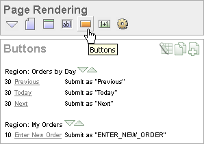
You can temporarily hide all other subsections by clicking the Buttons icon. To restore the view, click Show All. The Show All icon resembles an inverted triangle.
The following icons display next to the section title:
Edit All. The Edit All icon resembles a small grid with a pencil on top of it. Use this icon to edit all buttons at once.
Copy. The Copy icon resembles two small overlapping pages. Use this icon to make a copy of an existing button.
Create. The Create icon resembles a plus (+) sign overlapping a small page. Click this icon to create a new button.
Buttons are organized by region. To edit a button, click the button name.
See Also:
"Editing Buttons"You create a button by running the Create Button Wizard from the Page Definition. Each button resides in a region. A region is an area on a page that serves as a container for content.
To create a button:
Navigate to the appropriate Page Definition. See "Accessing a Page Definition".
If necessary, create an HTML region. See "Understanding Regions".
Under Buttons, click the Create icon.
The Create Button Wizard appears.
Select a region to contain the button and click Next.
Select a position for the button and click Next:
Create a button displayed among this region's items - Select this option to display the button within or between page items (for example, to add a button directly to the right of a form field).
Create a button in a region position - Select this option to place the button in a region position. A region position is a position defined by a region template.
If you select Create a button in a region position:
Specify the Button Name and Label.
Select a Button Type: HTML Button (Default), Image, or Template Driven
Select Button is Reset to create an Undo button. When enabled, this type of button resets the page values to the state they were in when the page was initially rendered.
Select an Action:
Submit page and redirect to URL submits the current page to the Application Express engine whenever a user clicks the button.
Redirect to URL without submitting page avoids submitting the page. Choose this action when submitting the page for processing is not necessary (for example, a Cancel button). This action avoids processing in the database and therefore reduces the load.
Click Next.
If you select Create a button displayed among this region's items:
Specify the Button Name and Sequence.
Specify if the button displays at the beginning of a new line or new field.
Specify a Label.
Enter the value of Request.
Select the Button Style.
Click Next.
Follow the on-screen instructions. To learn more about a specific field, click the item label.
When Help is available, the item label changes to red when you pass your cursor over it and the cursor changes to an arrow and question mark. See "About Field-Level Help".
Buttons can be placed in a predefined region template position or among items in a form. To create an HTML button, select one of the following while running the Create Button Wizard:
Under Task, select Create a button in a region position.
Under Button Type, select a button type and then HTML Button (default).
You can create multiple buttons within the same region at once using the Create Multiple Buttons Wizard.
To create multiple buttons at once:
Navigate to the appropriate Page Definition. See "Accessing a Page Definition".
If necessary, create an HTML region. See "Understanding Regions".
Under Buttons, click the Create icon.
The Create Button Wizard appears.
Select Create Multiple Buttons at the bottom of the page.
The Create Multiple Button Wizard appears.
From Place Buttons in Region, select the region to contain the buttons.
From Template, select a template.
In HTML Attributes, specify HTML attributes for these buttons. This text will be added to the HTML element definition. For example, you could set the class of a text button as follows:
class="myclass"
To quickly populate the remaining fields, make a selection from the Quick Button list on the right side of the page.
Click Create Buttons.
When you want to edit a button, you start from the Buttons section on the Page Definition. You can edit the attributes of a button, edit multiple buttons at once, or change a button position within a region.
Topics in this section include:
See Also:
"About the Edit All Icon"You can edit button attributes on the Edit Pages Buttons page.
To edit attributes for an existing button:
Navigate to the appropriate Page Definition. See "Accessing a Page Definition".
Under Buttons, select the button name.
The attributes page for the button appears.
To learn more about a specific item on a page, click the item label.
When Help is available, the item label changes to red when you pass your cursor over it and the cursor changes to an arrow and question mark. See "About Field-Level Help".
Click Apply Changes.
You can edit multiple buttons at once by clicking the Edit All icon on the Page Definition. The Edit All icon resembles a small grid with a pencil on top of it.
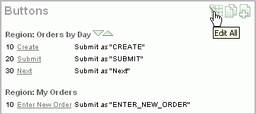
Clicking the Edit all icon displays the Buttons page, which contains a table listing the buttons in the region. Use this icon to edit multiple buttons at once.
From the Buttons page, you can delete multiple buttons or view a history of recent changes.
To edit multiple buttons:
Navigate to the appropriate Page Definition. See "Accessing a Page Definition".
Under Buttons, click the Edit All icon.
The Buttons page appears.
Edit the attributes on the Buttons page, or click the Edit icon to edit the attributes for a single button.
Click Apply Changes.
To delete multiple buttons at once:
Navigate to the appropriate Page Definition. See "Accessing a Page Definition".
Under Buttons, click the Edit All icon.
Click Delete Multiple Buttons.
The Delete Multiple Buttons page appears.
Select the buttons to delete and click Remove Buttons.
You can quickly edit a button label or change a button position within a region by clicking the Reorder Region Buttons icon on the Page Definition. The Reorder Region Buttons icon resembles a light green downward arrow and upward arrow and displays next to the region name.
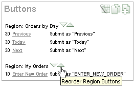
To edit buttons using the Reorder Region Buttons icon:
Navigate to the appropriate Page Definition. See "Accessing a Page Definition".
Under Buttons, click the Reorder Region Buttons icon.
The Reorder Buttons page appears. Use this page to edit the button label, select a region position, or change the button order.
To edit the button label, enter a name in the Label field.
To change the region position, make a selection from the Position list.
To change the order in which buttons display, click the up and down arrows in the far right column.
Note that you can also control the order in which buttons display by editing the Sequence attribute. See "Editing Button Attributes".
Click Apply Changes.
Note:
To change the region where a button resides, you must edit the button attributes. See "Editing Button Attributes".The name you give a button determines the value of the built-in attribute REQUEST. You can reference the value of REQUEST from within PL/SQL using the bind variable :REQUEST. By using this bind variable, you can conditionally process, validate, or branch based on which button the user clicks. You can also create processes that execute when the user clicks a button. And you can use a more complex condition as demonstrated in the following examples:
If :REQUEST in ('EDIT','DELETE') then ...
If :REQUEST != 'DELETE' then ...
These examples assume the existence of buttons named EDIT and DELETE. You can also use this syntax in PL/SQL Expression conditions. Be aware, however, that the button name capitalization (case) is preserved. In other words, if you name a button LOGIN, then a request looking for the name Login will fail. For example:
<input type="BUTTON" value="Finish" onClick="javascript:doSubmit('Finish');">
Note that in this example Finish is the name of the REQUEST and this example is case-sensitive.
Each page can include any number of branches. A branch links to another page in your application or to a URL. The Application Express engine considers branching at different times during page processing. You can choose to branch before processing, before computation, before validation, and after processing. Like any other control in Application Builder, branching can be conditional. For example, you can branch when a user clicks a button. When you create a branch, you associate it with a specific button. The branch will only be considered if a user clicks the button.
See Also:
"Controlling Navigation Using Branches"You can choose to have a button display conditionally by editing attributes on the Edit Pages Button page.
To have a button display conditionally:
Create the button. See "Creating a Button Using a Wizard".
Navigate to the appropriate Page Definition. See "Accessing a Page Definition".
Under Buttons, select the button name.
The attributes page for the button appears.
Scroll down to Conditional Button Display.
Make a selection from the Condition Type list.
Enter an expression in the fields provided.
Click Apply Changes.
See Also:
"About Bind Variable Syntax"A list of values (LOV) is a static or dynamic set of values used to display a specific type of page item, such as popup lists of values, a select list, a check box, a radio group, or multiple select lists.
Creating a LOV as a shared component has a number of advantages:
It can be added to any page within an application.
All LOV definitions are stored in one location, making them easy to locate and update.
Topics in this section include:
You define named (or shared) LOVs at the application level by running the Create LOV Wizard and adding them to the List of Values repository. All LOVs can be defined as static or dynamic. Static lists are based on predefined pairs of display values and return values. Dynamic lists are based on a SQL query you write that selects values from a table.
To create a named LOV:
On the Workspace home page, click the Application Builder icon.
Select an application.
The Application home page appears.
Click the Shared Components icon.
Under User Interface, select Lists of Values.
The Lists of Values page appears.
To create a LOV, click Create.
Follow the on-screen instructions.
New named LOVs are added to the List of Values repository. Note to add the LOV to a page you must edit the appropriate item or column and select the named LOV.
Once you create an LOV, it appears on the List of Values page.
Use the Navigation bar at the top of the page to search for a LOV by name or change the page display. For example, you can change the default display by making a selection from View list. Available options include:
Icons (the default) displays each LOV as a large icon. To edit an LOV, click the appropriate icon.
Details displays each LOV as a line in a report. To edit an LOV, click the name.
Static LOVs are based on a static list of display values and return values you specify when you run the Create LOV Wizard. To create a static LOV, run the Create LOV Wizard and select the LOV type Static. Oracle Application Express stores the display values, return values, and sort sequence you specify in the List of Values repository. Once you add a static LOV to the repository, you can create an item and display it as a check box, radio group, select list, or popup list based on this definition.
To edit an existing LOV, select the LOV on the Lists of Values page.
To edit an LOV:
On the Workspace home page, click the Application Builder icon.
Select an application.
Click Shared Components.
Under User Interface, select Lists of Values.
Select an LOV.
The Edit List of Values page appears.
To learn more about a specific item on a page, click the item label.
When Help is available, the item label changes to red when you pass your cursor over it and the cursor changes to an arrow and question mark. See "About Field-Level Help".
Click Apply Changes.
The Edit List of Values page is divided into the following sections: Name, Subscription, Source, and Comments.
You can access these sections by scrolling down the page, or by clicking a navigation button at the top of the page. When you select a button at the top of the page, the selected section appears and all other sections are temporarily hidden. To view all sections of the page, click Show All.
See Also:
"About the Edit All Icon"You can edit the display values of all static LOVs by clicking the Grid Edit button on the Edit List of Values page.
To perform a bulk edit of static LOVs:
On the Workspace home page, click the Application Builder icon.
Select an application.
Click Shared Components.
Under User Interface, select Lists of Values.
By default, LOVs display as icons.
Change the default display. Select Details from the View list and click Go.
Locate the Static LOV and select the LOV name.
Click the Grid Edit button located under Subscription.
Edit the appropriate display values and click Apply Changes.
You can reference session state by using bind variables. Keep in mind that referencing session state makes an LOV a bit less reusable, but is still a recommended development practice. In the following example, this LOV only works if the item called my_deptno contains a valid department number.
SELECT ename, empno FROM emp WHERE deptno = :P1_DEPTNO
LOVs have a null display value option and a null return value option. The null display value is the value the end user sees in the list indicating the no selection from the proper (non-null) values of the list will be made. When a user selects a null display value, the LOV's null return value is sent to the application when the page is submitted. If the developer has left the null return value unspecified (or empty), the actual value transmitted is not an empty string or an Oracle null, but the literal %null%. The application must be prepared to deal with this literal and treat is as the null selection.
Be aware of this behavior when writing code to evaluate submitted values. For example, suppose a page evaluates the submitted item P1_X and you need to use the PL/SQL expression replace(:P1_X,'%'||'null%',null) to prepare the item for permanent storage in session state or for passing to DML or other APIs.
To avoid problems, be aware of the appropriate way to code %null% in expressions that occur in page computations, processes, and validations. You must break up the string so that the application does not replace %null% with a null value in the page metadata when it is saved. Consider the following example:
'%'||'null%'
Application Builder includes a number of reports designed to help you better manage LOVs.
To access LOV reports:
On the Workspace home page, click the Application Builder icon.
Select an application.
When Application Builder appears, click Shared Components.
Under User Interface, select Lists of Values.
Select one of the following tabs at the top of the page:
Search
Subscription
Utilization
History
Follow the on-screen instructions.
Click Search to display the Search Dynamic Lists of Values page. Use this page to search the queries that make up dynamic LOVs. Enter a query in the Query Contains field and click Go.
Click Subscription to display the List of Values Subscription page. This page displays all subscribed LOVs in your application.
You can use a select list to determine the range of values of another select list on the same page. You can achieve this functionality by having a driving select list submit values to a subsequent select list. You incorporate these values in the subsequent select list as a bind variable in the WHERE clause of its query.
To have one LOV drive another LOV:
Create a basic form.
Define two lists of values. Note that the driving LOV must submit the page after a value is chosen.
Define a branch that branches back to the current page.
Consider the following example. The first LOV enables the user to pick a state:
SELECT state_name d, state_id v
FROM states
The second LOV selects the county name and county ID based on the state selected in the first LOV:
SELECT county_name d, county_id v
  FROM counties
WHERE state_id = :P1_STATE_ID
By using shortcuts you can avoid repetitive coding of HTML or PL/SQL functions. You can use a shortcut to define a page control such as a button, HTML text, a PL/SQL procedure, or HTML. Once defined, you can invoke a shortcut using specific syntax unique to the location in which the shortcut is used. Shortcuts can be referenced many times, thus reducing code redundancy.
This section contains the following topics:
When you create a shortcut, you must specify the type of shortcut you want to create. Oracle Application Express supports the following shortcut types:
Use this type of shortcut to reference a shortcut inside of a JavaScript literal string. This shortcut defines a text string. When the shortcut is referenced, it escapes the single quotation marks required for JavaScript.
Use this type of shortcut to reference a translatable message at run time. Note that since this shortcut does not have a shortcut body, the name of the shortcut must match the corresponding message name. At run time, the name of the shortcut expands to the text of the translatable message for the current language.
Before you can incorporate a shortcut in your application, you must define it and add it to the Shortcuts repository. You reference shortcuts using the following syntax:
"MY_SHORTCUT"
Note that the shortcut name must be capitalized and enclosed in quotation marks.
To define a shortcut:
On the Workspace home page, click the Application Builder icon.
Select an application.
When Application Builder appears, click Shared Components.
Under User Interface, select Shortcuts.
Click Create.
Select one of the following creation methods:
From Scratch
As a Copy of an Existing Shortcut
Follow the on-screen instructions.
New shortcuts are added to the Shortcut repository and are available for use within the following locations:
The Region Source attribute of regions defined as HTML Text (with shortcuts). See "Understanding Regions".
Region Header and Footer Text attribute. See "Specifying a Region Header and Footer".
Item Label attributes and Default Value attribute. See "Items".
Region Templates attributes. See "Customizing Templates".
Once you create a shortcut, it appears on the Shortcuts page. You control how the page displays by making a selection from the View list. Available options include:
Icons (the default) displays each shortcut as a large icon. To edit a shortcut, click the appropriate icon.
Details displays each shortcut as a line in a report. To edit a shortcut, click the name.
Once you create a shortcut, you can alter it by editing attributes on the Edit Shortcut page.
To edit an existing shortcut:
On the Workspace home page, click the Application Builder icon.
Select an application.
Click Shared Components.
Under User Interface, select Shortcuts.
Select a shortcut.
The Edit Shortcut page appears.
To learn more about a specific item on a page, click the item label.
When Help is available, the item label changes to red when you pass your cursor over it and the cursor changes to an arrow and question mark. See "About Field-Level Help".
Click Apply Changes.
The Edit Shortcut page is divided into the following sections: Name, Subscription, Source, Configuration, and Comments.
You can access these sections by scrolling down the page, or by clicking a navigation button at the top of the page. When you select a button at the top of the page, the selected section appears and all other sections are temporarily hidden. To view all sections of the page, click Show All.
Application Builder includes a number of reports designed to help you better manage shortcuts.
To access shortcut reports:
On the Workspace home page, click the Application Builder icon.
Select an application.
When Application Builder appears, click Shared Components.
Under User Interface, select Shortcuts.
Click one of the following tabs:
Subscription
History
Note:
The Subscription and History tabs only appear after you create a shortcut.Click Subscription to display the Subscribed Shortcuts page. This page displays all subscribed shortcuts in your application.
You can search for items, pages, queries, tables, PL/SQL code, images, or cascading style sheets by clicking the Find icon on numerous pages within Application Builder.
This section contains the following topics:
The Find icon resembles a flashlight and often displays to the right of the Run Page and Edit Page icons as shown in the following illustration. The Find icon displays on many pages in Application Builder, including the Application Home page, the Page Definition, application attribute pages, and numerous pages for creating and managing shared components.
See Also:
"About the Application Home Page"In Application Builder, an item can be a text field, text area, password, select list, check box, and so on. You can use the Item Finder to search for items within the current application or within the schema associated with the workspace.
See Also:
"Understanding Page-Level Items"To search for an item using the Item Finder:
Click the Find icon.
The Item Finder appears.
A search bar displays at the top of the page and contains the following controls:
Search. Search for an item name. Enter case insensitive keywords in the Search field and click Go. To view all items, leave the Search field blank and click Go.
Page. Search for pages that contain items. Enter a page number in the Page field or select a page number from the list and click Go. To view all pages containing items, leave the Page field blank and click Go.
Display. Determine how many rows display in the resulting report. To change the number of rows that display, make a selection from the Display list and click Go.
A Item Finder report appears, displaying the item name, label, item type, and associated page number.
To restrict the report to display just items on a specific page, click the appropriate page number in the far right column.
Note the page number you select appears in the Page field at the top of the page. To expand the view to all pages, delete the page number in the Page field and click Go.
To edit a specific item, navigate to the appropriate item. See "Understanding Page-Level Items" and "Using the Edit All Icon to Edit Multiple Items".
A page (or Page Definition) is the basic building block of an application. You can use the Page Finder to search for pages within the current application or within the schema associated with the workspace.
To search for a page:
Click the Find icon.
Select the Pages tab.
The Page Finder appears.
A search bar displays at the top of the page and contains the following controls:
Search. Search for a page name. Enter case insensitive keywords in the Search field and click Go. To view all pages, leave the Search field blank and click Go.
Display. Determine how many rows display in the resulting report. To change the number of rows that display, make a selection from the Display list and click Go.
The Page Finder report appears, displaying the page number, page name, page alias, title, tab set, and counts of the number of items and regions on the page.
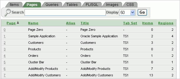
To link to the Items page, click the page number.
You can use the Query Finder to locate a query within your application or within the schema associated with the workspace.
To search for a query using the Query Finder:
Click the Find icon.
Select the Queries tab.
The Query Finder appears.
A search bar displays at the top of the page and contains the following controls:
Search. Search for query statements. Enter case insensitive keywords in the Search field and click Go. To view all queries, leave the Search field blank and click Go.
Display. Determine how many rows display in the resulting report. To change the number of rows that display, make a selection from the Display list and click Go.
The Query Finder report appears, displaying the page number, page name, the region containing the query, and the query source.
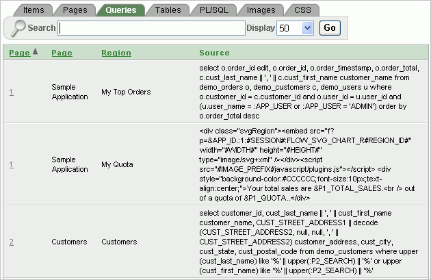
To link to the Items page, click the page number.
You can use the Table Finder to view tables within the schema associated with the workspace.
To view tables associated within the current schema:
Click the Find icon.
Select the Tables tab.
The Table Finder appears.
A search bar displaying the selected schema displays at the top of the page and contains the following controls:
Search. Search for a table name. Enter case insensitive keywords in the Search field and click Go. To view all tables, leave the Search field blank and click Go.
Display. Determine how many rows display in the resulting report. To change the number of rows that display, make a selection from the Display list and click Go.
Views. Select the Views check box and click Go to include views in the resulting report.
The Table Finder report appears displaying the table name, the number of rows, and the object type.
Select a table name.
A table definition appears on the right side of the page.
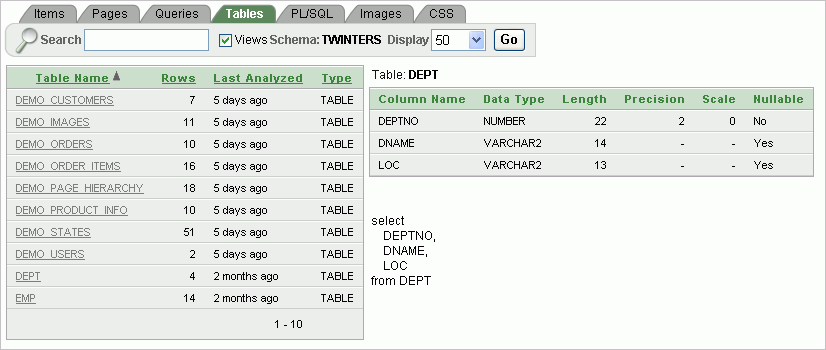
This report displays the column names, data type, length, precision, and scale and the SQL necessary to re-create the table appears at the bottom of the page.
See Also:
"Managing Tables" in Oracle Application Express SQL Workshop and Utilities GuideYou can use the PL/SQL Finder to locate and view details about stored procedures, functions, and packages associated with each object within the schema associated with the workspace.
To search for PL/SQL code in the current schema:
Click the Find icon.
Select the PL/SQL tab.
The PL/SQL Finder appears.
A search bar displays at the top of the page contains the following controls:
Search. Search for procedure, function, or package names. Enter case insensitive keywords in the Search field and click Go. To view all, leave the Search field blank and click Go.
Display. Determine how many rows display in the resulting report. To change the number of rows that display, make a selection from the Display list and click Go.
Procedures, Functions, or Packages. Select at least one check box and click Go to include procedures, functions, and packages in the report. You must select at least one check box to return results.
The PL/SQL Finder report appears.
To view additional details, select the procedure, function, or package name.
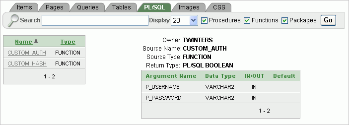
The procedure, package, or function name appears and additional information including the owner, source name, source type, return type, argument names, data types, and IN/OUT parameters.
See Also:
"Managing Database Objects with Object Browser," in Oracle Application Express SQL Workshop and Utilities GuideYou can use the Images Finder to identify images available to the current application.
To view available images:
Click the Find icon.
Select the Images tab.
The Images Finder appears.
A search bar displays at the top of the page and contains the following controls:
Search. Search for image names. Enter case insensitive keywords in the Search field and click Go. To view all, leave the Search field blank and click Go.
Icon Size. Select the size of icon you want to search for and click Go.
Display. Determine how many rows display in the resulting report. To change the number of rows that display, make a selection from the Display list and click Go.
Columns. Select the number of columns to view per row and click Go.
From Show, select the type of images to view. Options include:
Standard Images
Workspace Images
Application Images
See Also:
"Managing Database Objects with Object Browser" in Oracle Application Express SQL Workshop and Utilities GuideYou can use the CSS Finder to view cascading style sheets that are available to any application regardless of theme.
To view available cascading style sheets:
Click the Find icon.
Select the CSS tab.
The CSS Finder appears.
A search bar displays at the top of the page and contains the following controls:
Search. Enter case insensitive keywords in the Search field and click Go. To view all, leave the Search field blank and click Go.
Category. Select a CSS category and click Go. Available options include:
Absolute Sizes
Anchor Tags
Relative Sizes
Display. Determine how many rows display in the resulting report. To change the number of rows that display, make a selection from the Display list and click Go.
You can control access to an application, individual pages, or page components by creating an access control list.
This section contains the following topics:
See Also:
"Building Queries with Query Builder" in Oracle Application Express SQL Workshop and Utilities GuideSee Tutorial:
"How to Build an Access Control Page" in Oracle Application Express Advanced TutorialsYou create an access control list by running the Access Control Wizard. The Access Control Wizard creates a page named Access Control Administration. This page contains a list of application modes and an Access Control List. Once you create the Access Control Administration page, you:
Run the Access Control Administration page.
Select one of the following application modes:
Full access to all, access control list not used.
Restricted access. Only users defined in the access control list are allowed.
Public read only. Edit and administrative privileges controlled by access control list.
Administrative access only.
Add users to the Access Control List.
In addition to creating the Access Control Administration page, the Access Control Wizard also creates:
two tables within the application's default schema to manage the access control
the authorization schemes that correspond to the application mode list options
the privileges available in the Access Control List
You can control access to a specific page or page component by selecting one of these authorization schemes on the page or component attributes pages. Once you create an Access Control, you can customize the page, tables and values to suit the specific needs of your application.
You create an access control list by creating a page. You can create a page on the Application home page, while viewing a Page Definition, or by clicking Create on the Developer toolbar.
Topics in this section include:
To create an access control list from the Application home page:
On the Workspace home page, click the Application Builder icon.
Select an application.
The Application home page appears.
Click Create Page.
For page type, select Access Control and click Next.
The Access Control Wizard appears.
Specify a page number and click Next.
Select a tab option and click Next.
Review the confirmation page and click Finish.
To create an access control list from the Page Definition:
Navigate to the appropriate Page Definition. See "Accessing a Page Definition".
Click the Create button next to the navigation bar at the top of the page.
Select New page and click Next.
For page type, select Access Control and click Next.
The Access Control Wizard appears.
Specify a page number and click Next.
Select a tab option and click Next.
Review the confirmation page and click Finish.
To create an access control list from the Developer toolbar:
Run the application. See "Running a Page or Application".
On the Developer toolbar, click Create.
Select New page and click Next.
For page type, select Access Control and click Next.
The Access Control Wizard appears.
Specify a page number and click Next.
Select a tab option and click Next.
Review the confirmation page and click Finish.
You can control access to an application by running the Access Control Administration page, selecting an application mode, and then adding users to the Access Control list.
This section contains the following topics:
To select an application mode:
Create an access control list. See "Creating an Access Control List".
The wizard creates a page named Access Control Administration.
Run the Access Control Administration page. See "Running a Page or Application".
Select an Application Mode. Options include:
Full access to all, access control list not used.
Select this option to enable all users access to an application.
Restricted access. Only users defined in the access control list are allowed.
Select this option to restrict access to users on the Access Control List. Only users on the Access Control List can view pages and components associated with an authorization scheme.
Public read only. Edit and administrative privileges controlled by access control list.
Provides public access to pages and components associated with the access control - view authorization scheme.
Administrative access only.
Only users with Administrator privileges can access pages or components associated with an authorization scheme.
Click Set Application Mode.
Note that the user interface of your page is dependent upon the theme you selected for your application. See "Managing Themes".
Next, add users to the Access Control List.
To add users to the Access Control List:
Under Access Control List, click Add User.
A new row appears.
Enter a user in the Username field.
Associate a privilege with the user. Available options include:
Administrator
Edit
View
Click Apply Changes.
Repeat steps 1 to 5 for all users.
The Access Control Wizard creates authorization schemes that correspond to the application mode list options and the privileges available in the Access Control List.
You can control access to a specific page or page component by selecting one of the following authorization schemes on the page or component attributes pages:
access control administrator. Only users with Administrator privileges can view the page or component.
access control - edit. Users with both Edit and Administrator privileges can view the page or component. Users with View privileges cannot view the page or component.
access control - view. Users with Administrator, Edit, or View privileges can view the page or component.
Not access control administrator. Users with Administrator privileges cannot view the page or component.
Not access control - edit. Users with both Edit and Administrator privileges cannot view the page or component. Users with View privileges can view the page or component.
Not access control - view. Users with Administrator, Edit, or View privileges cannot view the page or component.
Adding JavaScript to a Web application is a great way to add features that mimic those found in client/server applications without sacrificing all the benefits of Web deployment. Oracle Application Express includes multiple built-in interfaces especially designed for adding JavaScript.
Remember that JavaScript is not appropriate for data intensive validations. For example, to verify that a name is contained within a large database table, you would need to pull down every record to the client, creating a huge HTML document. In general, complex operations are much better suited for server-side Application Express validations instead of JavaScript.
This section contains the following topics:
See Also:
"Understanding Validations"When you reference an item, the best approach is to reference by ID. If you view the HTML source of an Oracle Application Express page in a Web browser, you would notice that all items have an id attribute. This id corresponds to the name of the item, not the item label. For example, if you create an item with the name P1_FIRST_NAME and a label of First Name, the ID will be P1_FIRST_NAME.
Knowing the item ID enables you to use the JavaScript method getElementById() to get and set item attributes and values. The following example demonstrates how to reference an item by ID and display its value in an alert box.
<script language="JavaScript1.1" type="text/javascript">
  function firstName(){
    alert('First Name is ' + document.getElementById('P1_FIRST_NAME').value );
  }
 // or a more generic version would be
  function displayValue(id){
    alert('The Value is ' + document.getElementById(id).value );
  }
</script>

  // Then add the following to the "Form Element Attributes" Attribute of the item:
  onchange="displayValue('P1_FIRST_NAME');"
There are two primary places to include JavaScript functions:
In the HTML Header attribute of the page
In a .js file in the page template
See Also:
"Text with JavaScript Escaped Single Quotes" for information about referencing a shortcut inside of a JavaScript literal stringOne way to include JavaScript into your application is to add it to the HTML Header attribute of the page. This is a good approach for functions that are very specific to a page and a convenient way to test a function before you include it in the .js file.
You can add JavaScript functions to a page by simply entering the code into the HTML Header attribute of the Page Attributes page. In the following example, adding the code would make the test function accessible from anywhere on the current page.
To add JavaScript code in the HTML Header attribute:
On the Workspace home page, click the Application Builder icon.
Select an application.
Select a page.
Under Page, click the Edit page attributes icon.
Scroll down to HTML Header.
Enter code into HTML Header and click Apply Changes.
For example, adding the following would test a function accessible from anywhere on the current page.
<script type="text/javascript">
  function test(){
    window.alert('This is a test.');
  }
</script>
See Also:
"HTML Header"In Oracle Application Express, you can reference a .js file in the page template. This approach makes all the JavaScript in that file accessible to the application. This is the most efficient approach since a .js file loads on the first page view of your application and is then cached by the browser.
The following demonstrates how to include a .js file in the header section of a page template. Note the line script src= that appears in bold.
<!DOCTYPE html PUBLIC "-//W3C//DTD HTML 4.01 Transitional//EN">
<html>
<head>
    <title>#TITLE#</title>
    #HEAD#
    <script src="http://myserver.myport/my_images/custom.js" type="text/javascript"></script>
</head>
<body #ONLOAD#>#FORM_OPEN#
See Also:
"Page Templates"Calling JavaScript from a button is a great way to confirm a request. Oracle Application Express uses this technique for the delete operation of most objects. For example, when you delete a button, a JavaScript message appears asking you to confirm your request. Consider the following example:
<script type="text/javascript">
  function deleteConfirm(msg)
  {
var confDel = msg;
if(confDel ==null)
  confDel= confirm("Would you like to perform this delete action?");
else
  confDel= confirm(msg);

if (confDel== true)
  doSubmit('Delete');
  }
</script>
This example creates a function to confirm a delete action and then calls that function from a button. Note that the function optionally submits the page and sets the value of the internal variable :REQUEST to Delete, thus performing the deletion using a process that conditionally executes based on the value of the request.
Note that when you create the button, you would need to select Action Redirect to URL without submitting page. Then, you would specify a URL target such as the following:
confirmDelete('Would you like to perform this delete action?');
See Also:
"Creating a Button Using a Wizard"You can optimize a page for printing by creating a specific Printer Friendly template and selecting that template on the Create/Edit Theme page. See "Changing the Default Templates in a Theme".
Generally, a Printer Friendly template optimizes a page for printing. For example, a Printer Friendly template might:
Not display tabs or navigation bars
Display items as text instead of as form elements
If the theme you select does not include a printer friendly template, you can create a Printer Friendly template by creating a new page template.
See Also:
"Changing the Default Templates in a Theme", "Creating a Theme", and "Printing Report Regions"Topics in this section include:
To select a Printer Friendly template:
Navigate to the Themes page:
On the Workspace home page, click Application Builder.
Select an application.
Click Shared Components.
Under User Interface, select Themes.
In the Themes list, click the theme name.
The Create/Edit Theme page appears.
Scroll down to Component Defaults and locate the Printer Friendly Page list.
Make a selection from the Printer Friendly Page list.
Click Apply Changes.
Once you create a Printer Friendly template and select it, you can use f?p syntax to toggle to Printer Friendly mode. Including the ninth f?p syntax argument (PrinterFriendly) renders the page in printer friendly mode (optimizing printed output). For example, you could include this argument when coding a link or creating a navigation bar icon.
See Also:
"Using f?p Syntax to Link Pages"Application Builder includes built-in attributes to create Help for your application. Creating Help for your application involves the following steps:
Create a dedicated Help page and Help region.
Define page Help text.
Define item Help text.
Create a navigation bar icon to link to your Help page.
Help created in Application Builder displays on a dedicated Help page. To access Help, users click a link that takes them to a dedicated Help page. This Help page displays page and item Help topics specific to the page they are viewing.
Topics in this section include:
The first step in creating Help for your application is to create a dedicated page and Help Text region.
To create a Help Text region:
Create a page for your Help. See "Managing Pages in an Application".
Navigate to the Page Definition of your Help page. See "Accessing a Page Definition".
Under Regions, the Create icon.
When prompted to select a region type, select Help Text.
Follow the on-screen instructions.
You define Help text for a page or single item by editing attributes. Ideally, you would define these attributes as you create your application. For simplicity, however, the following procedures describe how to define this text after the fact.
See Also:
"Item Help"Topics in this section include:
To define page Help text:
Navigate to the Page Definition for the page for which you want to add page Help. See "Accessing a Page Definition".
Under Page, click the Edit page attributes icon to view the existing page attributes.
Scroll down to Help.
Enter your Help text in the field provided.
Click Apply Changes.
Repeat the previous procedure for each page requiring page Help text.
To define item Help text for an item:
Navigate to the Page Definition for the page for which you want to add item Help. See "Accessing a Page Definition".
Under Items, click the name of the item you want to edit.
Scroll down to Help Text.
Enter your Help text in the field provided.
Click Apply Change.
Repeat the previous procedure for each item requiring Help text.
If you are including item Help in your application, you can edit multiple item Help topics at once using the Bulk Edit Item Help report.
To view the Bulk Edit Item Help report:
On the Workspace home page, click the Application Builder icon.
Select an application.
On the Tasks list, click Application Reports.
Click Page Components.
Under Items, click Item Help Text.
A report displays at the bottom of the page.
In Bulk Item Help Report, you can:
Update existing Help topics. Edit the Help text that appears and click Apply Changes.
Link to the Page Definition containing the item by clicking the page number.
Link to the Page Item by clicking the item name.
If your application does not yet contain item Help, you can perform a mass update of default Help text.
To seed item Help topics:
Access the Bulk Edit Item Help report as described in the previous topic.
Click Seed Item Help Text.
In Default Help Text, enter the default text to appear in all Help topics.
Click Apply Changes.
You can search for existing Help text, or for an item label.
To search for existing item Help topic:
In Help Contains, enter keywords.
Click Go.
To search for an item label:
In Help Contains, enter keywords.
Click Go.
See Also:
"Viewing Application Reports"Once you have created your Help, the next step is to create a navigation bar entry so users can link to it.
To create a navigation bar entry:
Navigate to the Page Definition. See "Accessing a Page Definition".
Under Navigation Bar, click the Create icon.
For Attributes:
Sequence - Specify the sequence for this component. The sequence determines the order of evaluation.
Alt Tag Text - Enter ALT text for navigation icons that are images. If you do not specify an image name, then this text displays.
Icon Image Name - Enter the name of the image that displays.
Image Height - Enter the height of the image.
Image Width - Enter the width of the image.
Text - Enter additional text to display with the image. You can include text or use icons with no text. This attribute is optional and can be translated.
Click Next.
Next, specify the target location.
For Target:
Target is a - Select Page in this application.
Page - Specify the page number of the help page you created in "Creating a Help Page and Region".
Request - Enter the following:
&APP_PAGE_ID.
By specifying substitution string &APP_PAGE_ID as the Request, you are instructing the Application Express engine to display Help text for the current page when the user clicks this icon.
Click Next.
Click Create.
|
 Copyright © 2003, 2012, Oracle and/or its affiliates. All rights reserved. Legal Notices |
|