| Oracle® Application Express Application Builder User's Guide Release 3.2 Part Number E11947-02 |
|
|
PDF · Mobi · ePub |
| Oracle® Application Express Application Builder User's Guide Release 3.2 Part Number E11947-02 |
|
|
PDF · Mobi · ePub |
This section describes different ways you can customize your application's page layout by customizing regions, editing item attributes, and incorporating images.
This section contains the following topics:
The Application Express engine renders pages by combining templates with application components defined by the developer and data in the database.
The overall framework (or structure of a page) is determined by the page template. For example, the page template controls if a page uses tabs and a navigation bar. It can also define if a page includes a bar on the left side that serves as a placeholder for navigation or secondary content. Finally, a page template can include definitions of region positions, which enable precise control over placement of regions using HTML tables or style sheet definitions. The page template itself is composed of HTML combined with substitution strings, which are substituted with the appropriate components at run time.
As a developer, you add content to a page by creating a region. A region is an area of a page that serves as a container for content. Each region contains a different type of content such as HTML, a report, a form, a chart, a list, a breadcumb, PL/SQL, a tree, a URL, or a calendar. You position a region either relative to other regions (that is, based on its sequence number and column), or by using a region position defined in the page template. The style of the region is also controlled by the region template. Like the page template, the region template defines the structure of the area that the region takes up on a page. It defines if the region title is displayed and where it is displayed relative to the main content or the body. A region can also define absolute positions for buttons.
See Also:
"Creating a Region"Page zero of your application functions as a master page. The Application Express engine renders all components you add to page zero on every page within your application. You can further control whether the Application Express engine renders a component or runs a computation, validation, or process by defining conditions.
To create a page zero:
On the Workspace home page, click Application Builder.
Select an application.
The Application home page appears.
Click the Create Page button.
For Select a page type, select Page Zero.
Note that the Page Zero option only appears if the application does not have a page zero.
Click Finish.
A region is a area on a page that serves as a container for content. Each page can have any number of regions. You control the appearance of a region through a specific region template. The region template controls the look of the region, the size, determines whether there will be a border or a background color, and what type of fonts display. A region template also determines the standard placement for any buttons placed in region positions.
You can use regions to group page controls (such as items or buttons). You can create simple regions that do not generate additional HTML, or create elaborate regions that frame content within HTML tables or images.
Regions display in sequence within HTML table columns. You can also explicitly place regions in positions defined in the page template. You can also choose to display regions conditionally.
Topics in this section include:
You create and edit regions on the Page Definition. Regions display under the Page Rendering section. See "Accessing a Page Definition".
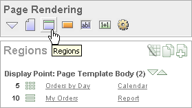
You can temporarily hide other subsections by clicking the Regions icon. To restore the view, click Show All. The Show All icon resembles an inverted triangle.
The following icons display adjacent to the section title:
Edit All. The Edit All icon resembles a small grid with a pencil on top of it. Use this icon to edit all regions at once.
Copy. The Copy icon resembles two small overlapping pages. Use this icon to make a copy of an existing region.
Create. The Create icon resembles a plus (+) sign overlapping a small page. Click this icon to create a region.
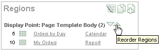
Regions are organized by position (or Display Point). The links available for a given region depend upon the type of region.
You can quickly change the order that regions display, edit a region title, or change a region template by clicking the Reorder Regions icon on the Page Definition. The Reorder Regions icon displays as light green down and up arrows and displays to the right of Display Point.
To edit regions using the Reorder Regions icon:
Navigate to the appropriate Page Definition. See "Accessing a Page Definition".
Under Regions, click the Reorder Regions icon.
The Reorder Regions page appears. Use this page to edit the region title or select a template.
In Region, enter a title.
From Template, select a template.
To change the order in which regions display, click the up and down arrows in the far right column.
Click Apply Changes.
You can alter the appearance of a page by editing attributes on the Region Definition.
Topics in this section include:
To edit region attributes:
Navigate to the appropriate Page Definition. See "Accessing a Page Definition".
Under Regions, select the region name.
The Region Definition appears.
Edit the appropriate attributes.
To learn more about a specific item on a page, click the item label.
When Help is available, the item label changes to red when you pass your cursor over it and the cursor changes to an arrow and question mark. See "About Field-Level Help".
Click Apply Changes.
See Also:
"How Region Attributes Affect Page Layout", "Controlling Region Positioning", "Using the Reorder Regions Icon", and "Specifying a Region Header and Footer"The Region Definition page is divided into the following sections: Identification, User Interface, Source, Conditions, Cache, Header and Footer, Authorization, Customization, Configuration, and Comments.
You can access these sections by scrolling down the page, or by clicking a navigation button at the top of the page. When you select a button at the top of the page, the selected section appears and all other sections are temporarily hidden. To view all sections of the page, click Show All.
Table 9-1 describes region attributes that affect the layout of a page.
Table 9-1 Region Attributes Affecting Page Layout
| Attribute | Description |
|---|---|
|
Determines the look of the region. Select from the region templates defined in the application. To view template attributes, click the template name on the Page Definition. See Also: "Customizing Templates" and "Region Templates" |
|
|
Specifies the display order of the regions within the page. |
|
|
Identifies where the region displays within the page. Regions are rendered in order of sequence number within a Display Point. Click the View icon to see the page layout and select a position. The possible display points for a region are determined by the page-level template (which is a page attribute). If no page-level template is selected, the default page-level template, defined in the Application Definition, is used. |
|
|
Defines additional attributes to be used in the HTML table cells when regions display in multiple columns. The attributes control the cells in the table used to lay out a region in multiple columns. |
|
|
Determines the column where the region displays. If two regions are in the same display point, you can place them next to one another by setting the second region to display in column 2. Many regions can display in each column and the display order of the regions within the region display point and column is controlled by the region display sequence number. |
|
|
Specifies HTML text to be displayed at the top of the region (just before the |
|
|
Defines conditions and appropriate expressions that determine if the region displays. Conditions can reference session state, the currently logged in user, or environment preferences (such as whether a page is in Print View mode). See Also: "Understanding Conditional Rendering and Processing" and "Optimizing a Page for Printing" |
|
|
Enables end-user customization. To utilize this feature, you must include the See Also: "Enabling Users to Customize a Page" |
When you create a region, you must specify its position (or Display Point) on the page. You can choose either a default position (such as Page Template Body) or a user-defined position in the template (such as Page Template Region Position 1.)
In addition to Display Point, you can specify the column in which the region will be placed. When you place regions in multiple columns, Oracle Application Express automatically renders the necessary HTML to produce a multiple column layout.
In addition to the body content of a region (which can be a report, a chart, or HTML with form elements), you can specify additional HTML to be placed above and below a region or in its header and footer.
The region footer supports the following substitution strings:
#TIMING# shows the elapsed time in seconds used when rendering a region. You can use this substitution string for debugging purposes.
#ROWS_FETCHED# shows the number of rows fetched by the Oracle Application Express reporting engine (the page size). You can use these substitution strings to display customized messages to the user. For example:
Fetched #ROWS_FETCHED# rows in #TIMING# seconds.
#TOTAL_ROWS# displays the total number of rows that satisfy a SQL query used for a report.
#FIRST_ROW_FETCHED# and #LAST_ROW_FETCHED# display the range of rows displayed. For example:
Row(s) #FIRST_ROW_FETCHED# through #LAST_ROW_FETCHED# of #ROWS_FETCHED# displayed
You can use the Customization attribute to enable users to turn regions on and off in a running application.
To enable end-user customization:
Navigate to the appropriate Page Definition. See "Accessing a Page Definition".
Under Regions, click the region name.
The Region Definition appears.
Scroll down to Customization and select one of the following:
Customizable and Not Shown By Default
Customizable and Shown By Default
In Customized Option Name, enter the label that represents this region on the page to the user.
Include the #CUSTOMIZE# substitution string in the Header, Body, or Footer section of the page template.
To use this feature, you must include the #CUSTOMIZE# substitution string in the Header, Body, or Footer section of the page template.
If at least one region supports end-user customization, a link called Customize appears wherever you include the #CUSTOMIZE# substitution string in the page template. When users click this link, a window appears, enabling them to turn on and off regions on the page.
See Also:
"Customizing Templates"Enabling region caching is an effective way improve the performance of static regions such as regions containing lists that do not use conditions or regions containing static HTML.
Tip:
Region caching is not available for interactive report regions. See "Editing Interactive Reports".When you enable region caching, the Application Express engine renders a region from a cached (or stored) respository instead of rendering it dynamically. Keep in mind that the actual session identifiers are not cached. Instead, the Application Express engine caches a &SESSION. substitution string and the current session rendering the cached region is substituted on display. For example, if a region contains a link and the link includes a session, the exact session is not cached to ensure that the links works for all sessions.
The Application Express engine only renders a region from cache if it meets the defined condition. Additionally, regions can be cached specific to a user or cached independent of a user.
See Also:
"Cache"To enable region caching:
Navigate to the appropriate Page Definition. See "Accessing a Page Definition".
Under Regions, click the region name.
The Region Definition appears.
Scroll down to Cache and specify the following:
Caching - Select Cached to cache the region independent of the user. Select Cached by User to cache the region specific to a given user.
Timeout Cache After - Identify how long the cached region remains valid.
Cache Condition Type - Select a condition type from the list. If the condition returns false, the region is rendered dynamically and is not be cached. If the condition returns true, the region is cached.
Expression 1 and Expression 2 - Enter values based on the specific condition type selected.
Click Apply Changes.
Specifying a static region ID is useful when creating custom JavaScript or cascading stylesheets. You can use the Static ID attribute on the Edit Region page to uniquely identify a region. You can then reference the region using the #REGION_STATIC_ID# substitution string in a region templates, the header, the footer, or the body.
To specify a static region ID:
Navigate to the appropriate Page Definition. See "Accessing a Page Definition".
The Region Definition appears.
Under Identification, enter a value in Static ID.
Click Apply Changes.
You create regions by running the Create Region Wizard.
To create a region:
Navigate to the appropriate Page Definition. See "Accessing a Page Definition".
Under Regions, click the Create icon.
Select a region type. See "About Region Types".
Follow the on-screen instructions.
When you create a region, you select a region type. The Application Express engine interprets a region differently based on the type you select. Table 9-2 describes the available region types.
| Region Type | Description |
|---|---|
|
When you select HTML, the wizard prompts you to select one of the following:
See Also: "Using Shortcuts" |
|
|
Use this option to create multiple HTML regions at once. In the fields provided, specify the Sequence, Title, Display Point, Report Template, and Column for each region. |
|
|
Report regions can be defined by a SQL query you write, or by using a wizard to guide you through the steps needed to write a query. See Also: "Creating Reports" |
|
|
Form regions are used to contain a form. See Also: "Creating Forms" |
|
|
Chart regions contain line, bar, or pie charts based on SQL queries. See Also: |
|
|
List regions contain a shared collection of links called list. See Also: "Creating Lists" |
|
|
Breadcrumb regions contain a hierarchical list of links called a breadcrumb. See Also: "Creating Breadcrumbs" |
|
|
Regions based on PL/SQL enable you to render any HTML or text using the PL/SQL Web Toolkit. |
|
|
Trees are a hierarchical navigational control based on a SQL query executed at run time. It enables the user to expand and collapse nodes. See Also: "Creating Trees" |
|
|
URL based regions obtain their content by calling a Web server using a predefined URL. |
|
|
Calendar regions are used to contain a calendar. See Also: "Creating Calendars" |
|
|
Help Text regions enable you to provide page-level help. See Also: "Creating a Help Page" |
See Also:
Oracle Database Advanced Application Developer's Guide for information about developing Web applications with PL/SQL
Oracle Database PL/SQL Packages and Types Reference for information about htp packages
You can quickly copy a region by clicking the Copy icon on the Page Definition. The Copy icon resembles two small overlapping pages.

When you copy a region, you also have the option to copy the button and items within the region.
Note:
You cannot copy a Tree region since this type of region encompasses more than one region.To copy a region:
Navigate to the Page Definition. See "Accessing a Page Definition".
Under Regions, click the Copy icon.
The Copy Region Wizard appears.
For Region to Copy, select the region you want to copy.
For To Page:
To Page - Select the page to which you want to copy the region.
Copy Region Items - Select Yes or No to determine whether to copy items within this region.
Copy Buttons - Select Yes or No to determine whether to copy buttons within this region.
Click Next.
Click Copy Region.
A region is an area on a page that uses a specific template to format HTML content. You use regions to group page controls. To create a multiple column layout, you create two regions that display in adjacent cells of the same table.
You can create a multiple column layout by either:
Manually creating the two adjacent regions
Defining a page template that contains a multiple column table
Topics in this section include:
You create regions using the Create Region Wizard. To create a two-column page, you create two regions. Oracle Application Express replaces the #BOX_BODY# substitution string within a two-column table and displays the regions in two separate cells.
To create a two-column page by creating regions:
Navigate to the Page Definition. See "Accessing a Page Definition".
Create the first region:
Under Regions, click Create.
The Create Region Wizard appears.
Select a region type.
From the Column field, select 1.
Follow the on-screen instructions.
Create the second region:
Under Regions, click Create.
The Create Region Wizard appears.
Select a region type.
From the Column field, select 2.
Follow the on-screen instructions.
Page templates define the appearance of individual pages, including the placement of page controls and components. Each page template is divided into three sections: Header, Body, and Footer. The most basic template must include the substitution string #BOX_BODY# in the Body attribute. When the page is rendered, the Application Express engine replaces #BOX_BODY# with HTML to display the regions on that page.
You can create a multiple column page by defining a page template that contains a multiple column table. You then explicitly place regions within specific table cells.
The following example demonstrates how to create a two-column page and specify a region position using the #REGION_POSITION_XX# substitution string in each column. You would enter the code in the Body section of the page-level template.
<body #ONLOAD#>
  #FORM_OPEN#
  <table style="width:100%">
    <tr>
      <td style="width:50%;padding:5px;">#REGION_POSITION_01#</td>
      <td style="width:50%; border-left:2px #bbbbbb dashed; padding:5px;">#REGION_POSITION_02#</td>
    </tr>
  <br />
  #BOX_BODY#
  #FORM_CLOSE#
</body>
Once you create this page-level template, the newly defined positions would be available as Display Point options when you run the Create Region Wizard.
An item is part of an HTML form and can be a text field, text area, password, select list, check box, and so on. You can alter the appearance of a page by changing the item attributes. For example, these attributes can effect where a label displays, how large an item will be, if the item will display next to or below the previous item.
To edit item attributes:
Navigate to the Page Definition. See "Accessing a Page Definition".
Under Items, click the item name.
The Edit Page Item page appears.
Table 9-3 describes how item attributes affect the layout of a page.
Table 9-3 Item Attributes Effecting Page Layout
| Heading | Attribute | Description |
|---|---|---|
|
Displayed |
Determines the order that items are rendered within a region. |
|
|
Displayed |
Defines the region where the item displays. All items must be in a region. |
|
|
Displayed |
Determines if this item displays on the same line or on the next line as the previous item. |
|
|
Displayed |
Determines if this item displays in the next column or in the same column as the previous item. |
|
|
Displayed |
Items are laid out in HTML tables. Defines the value to be used for the COLSPAN attribute of the table cell containing an item. |
|
|
Displayed |
Items are laid out in HTML tables. Defines the value to be used for the ROWSPAN attribute in the table cell where the item displays. |
|
|
Label |
Defines the label for this item. You can include HTML, JavaScript, and shortcuts. You can also use the substitution string |
|
|
Label |
Controls the placement and the horizontal and vertical alignment of the label. Labels can be displayed above, below, or to the left of the item. |
|
|
Label |
Specifies the label template. Use label templates to apply a consistent appearance to labels in your application. |
|
|
Label |
Defines additional attributes for the cell containing this item's label (for example, |
|
|
Element |
Specifies additional attributes for the HTML table cell used to display each individual option in a radio group or set of check boxes. Can include HTML, JavaScript, and shortcuts. You can reference the following substitution strings:
|
|
|
Element |
Specifies additional attributes for the HTML table cell used to display each individual option in a radio group or set of check boxes. Can include HTML, JavaScript, and shortcuts. You can reference the following substitution strings:
|
|
|
List of Values |
Applies to radio groups and check boxes. Defines the number of columns to use to display the values defined in the List of Values. By default, all values display in one column. |
|
|
Conditions |
Defines conditions and appropriate expressions that determine if an item displays. See Also: "Understanding Conditional Rendering and Processing" |
|
|
Read Only Display Settings |
Defines conditions and expressions that determine if the item displays as read-only. Use this attribute to display certain items to a set of users as updatable, while displaying that same set of items to others users as nonupdatable. Reduces the need to code duplicate interfaces for different users. |
Typically, pages in an application are based on data stored in an Oracle database. To incorporate content from other servers, you can create a region based on a URL to display content. For example, suppose you wanted to reference the current Oracle stock price. You could create a region of type URL based on a URL such as the following:
http://quote.yahoo.com/q?d=b&s=ORCL
You could then create an item called STOCK_SYMBOL and base your region on a stock price entered by the user. For example:
http://quote.yahoo.com/q?d=b&s=&STOCK_SYMBOL.
Sometimes (as is the case with the previous example) the HTML returned to the region is more than is needed. To restrict the HTML displayed, you can use the following region attributes:
URL (discard until but not including this text)
URL (discard after and including this text)
Note that the previous example may require that you set the Proxy Server application attribute. If you do not set the Proxy Server application attribute, you get an error message. Oracle Application Express uses the Oracle utl_http.request_pieces function to obtain the HTML generated from the given URL. See "Configuring the Application Definition".
If you call a SSL-enabled URL (for example, by invoking a Web service), or create a region of type URL that is SSL-enabled, you must create a wallet. A wallet is a password-protected container that stores authentication and signing credentials (including private keys, certificates, and trusted certificates) needed by SSL.
Tip:
See "Configuring Wallet Information" in Oracle Application Express Administration GuideYou can reference images within your application by uploading them to the Images Repository. When you upload an image, you can specify whether it is available to all applications or a specific application.
Topics in this section include:
Tip:
You can use the Images Finder to identify images available to the current application. See "Using the Images Finder".You upload images to your workspace using the Image Repository.
To upload images to your workspace:
On the Workspace home page, click the Application Builder icon.
Select an application.
Click Shared Components.
The Shared Components page appears.
Under Files, select Images.
The Images page appears.
To upload an image, click Create.
On the Create Image page, specify the following:
Application - Select No Application Associated to make the image available to all applications within the workspace, or select a specific application ID.
Upload New Image - Click Browse to identify a file to upload.
Note - Enter details that describe the image.
Click Upload.
You can reference images in your application by referencing the substitution string #IMAGE_PREFIX# or including a fully qualified URL to the image.
Topics in this section include:
When you install Application Builder, the installer creates a virtual directory for images. This virtual directory points to the actual path on the file system that contains uploaded images. By default, you reference this virtual directory using the prefix:
/i/
When you first create an application, you must verify this prefix on the Edit Definition page.
To verify the Image Prefix for an application:
On the Workspace home page, click the Application Builder icon.
Select an application.
On the Application home page, click Shared Components.
Under Application, select Definition.
When the Edit Application Definition page appears, locate the Image Prefix field.
By default, this attribute is defined as /i/. Contact your administrator for information about the name of this virtual directory for your installation.
When you embed an image in static text (for example, in page headers, region headers, or footers), you can reference the image using the substitution string #IMAGE_PREFIX#. For example, to reference the image go.gif, you would use the following syntax:
<img src="#IMAGE_PREFIX#go.gif">
When you edit image attributes, you can add notes that describe an image or change the associated application. However, you cannot change the actual image. To change an image, delete it and then upload it again.
To edit images attributes:
On the Workspace home page, click the Application Builder icon.
Select an application.
Click Shared Components.
The Shared Components page appears.
Under Files, select Images.
The Images page appears.
Use the following controls to filter the view:
Image - Enter text to search for an image name or notes describing the image. Select whether to search for All Images, Workspace Images, or Application Images.
View - Select one of the following:
Icons (the default) displays each image as a large icon.
Details displays each image as a line in a report.
Display - Determines the number of images that display.
Click Go.
Select an image.
The Edit Image Attributes page appears.
From Application, specify the image availability.
Select No Application Associated to make the image available to all applications within the workspace, or select a specific application ID.
In Notes, enter details that describe the image.
Click Apply Changes.
To delete an image:
On the Workspace home page, click the Application Builder icon.
Select an application.
Click Shared Components.
The Shared Components page appears.
Under Files, select Images.
The Images page appears.
Use the following to filter the view:
Image - Enter text to search for an image name or notes describing the image. Select whether to search for All Images, Workspace Images, or Application Images.
View - Select one of the following:
Icons (the default) displays each image as a large icon.
Details displays each image as a line in a report.
Click Go.
Select an image.
Click Delete.
You can upload static files to your workspace using the Static File Repository.
Topics in this section include:
To upload static files:
On the Workspace home page, click the Application Builder icon.
Select an application.
Click Shared Components.
The Shared Components page appears.
Under Files, select Static Files.
The Static Files page appears.
To upload a file, click Create.
Follow the on-screen instructions.
You can edit static files smaller than 30,000 bytes by selecting the file name. Otherwise, you must edit the file offline and upload it again.
To edit a static file smaller than 30,000 bytes:
On the Workspace home page, click the Application Builder icon.
Select an application.
Click Shared Components.
The Shared Components page appears.
Under Files, select Static Files.
The Static Files page appears.
Use the following controls to filter the view:
Static File - Enter text to search for a file name or notes describing the file.
Application - Narrow or broaden the view by selecting one of the following:
All Static Files
No Associated Application
A specific application
View - Select one of the following:
Icons (the default) displays each file as a large icon.
Details displays each file as a line in a report.
Display - Determines the number of files to display.
Click Go.
Select a file.
If the file is smaller than 30,000 bytes, edit the file.
In Notes, edit or enter notes describing the file.
Click Apply Changes.
To download an uploaded file:
On the Workspace home page, click the Application Builder icon.
Select an application.
Click Shared Components.
The Shared Components page appears.
Under Files, select Static Files.
The Static Files Repository appears.
From View, select Details and click Go.
Details displays each file as a line in a report.
Select the Download icon next to the appropriate file.
To delete an uploaded static file:
On the Workspace home page, click the Application Builder icon.
Select an application.
Click Shared Components.
The Shared Components page appears.
Under Files, select Static Files.
The Static Files Repository appears.
Use the following controls to filter the view:
Static File - Enter text to search for a file name or notes describing the file.
Application - Narrow or broaden the view by selecting one of the following:
All Static Files
No Associated Application
A specific application
View - Select one of the following:
Icons (the default) displays each file as a large icon.
Details displays each file as a line in a report.
Display - Determines the number of files to display.
Click Go.
Select a file.
Click Delete.
If you need to generate specific HTML content not handled by Oracle Application Express forms, reports, and charts, you can use the PL/SQL region type. To generate HTML in this type of region, you need to use the PL/SQL Web Toolkit. You can reference session state using bind variable syntax. Keep in mind that when you generate HTML in this way, you do not get the same consistency and control provided with templates.
See Also:
Oracle Database Advanced Application Developer's Guide for information about developing Web applications with PL/SQL
Oracle Database PL/SQL Packages and Types Reference for information about htp packages
To give you more control over HTML dynamically generated within a region, you can use PL/SQL. For example, to print the current date, you could create a region with the following source:
htp.p(TO_CHAR(SYSDATE,'Day Month DD, YYYY'));
This next example accesses tables:
DECLARE
   l_max_sal NUMBER;
BEGIN
   SELECT max(sal) INTO l_max_sal FROM emp;
   htp.p('The maximum salary is: '||TO_CHAR(l_max_sal,'999,999.00'));
END;
|
 Copyright © 2003, 2012, Oracle and/or its affiliates. All rights reserved. Legal Notices |
|