| Oracle® Application Express Application Builder User's Guide Release 3.2 Part Number E11947-02 |
|
|
PDF · Mobi · ePub |
| Oracle® Application Express Application Builder User's Guide Release 3.2 Part Number E11947-02 |
|
|
PDF · Mobi · ePub |
When you build an application, you can include different types of navigation controls, such as navigation bar entries, tabs, breadcrumbs, lists, and trees. This section describes how to implement navigation in your application.
Navigation controls are shared components, so you create the specific type of navigation control at the application level on the Shared Components page. After that, you can add them to any page within your application.
This section contains the following topics:
See Also:
"Working with Shared Components"Tabs are an effective way to navigate users between pages of an application. You can create a tabbed application look by using parent tabs, standard tabs, and lists.
Application Builder includes two different types of tabs:
Standard tabs
An application having only one level of tabs uses a standard tab set. A standard tab set is associated with a specific page and page number. You can use standard tabs to link users to a specific page.
Parent tabs
A parent tab set functions as a container to hold a group of standard tabs. Parent tabs give users another level of navigation and a context (or sense of place) within the application. You can use parent tabs to link users to a specific URL associated with a specific page.
Topics in this section include:
Note:
When running the Create Application Wizard, you have the option of creating an application with tabs. The following procedures assume you have created an application that does not have any tabs.See Also:
"Creating an Application"Before you can create parent and standard tabs, you must check that your default template has positions defined for both standard and parent tabs using the appropriate substitution strings. You also must make sure you do not override this template at the page-level.
See Also:
"Template Defaults" for information about setting a default page template at the application level
You can create and edit tabs on the Page Definition. Tabs display under the Shared Components section.
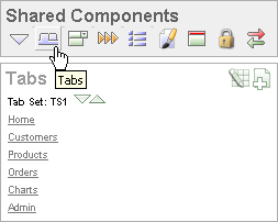
You can temporarily hide all other Shared Components subsections by clicking the Tabs icon under the Shared Components title. To restore the view, click Show All. The Show All icon resembles an inverted triangle.
The following icons appear in the Tabs section:
Edit All. The Edit All icon resembles a small grid with a pencil on top of it. Use this icon to edit all tabs at once.
Create. The Create icon resembles a plus (+) sign overlapping a small page. Click this icon to create a new tab.
Reorder. The Reorder icon resembles light green down and up arrows. Click this icon to edit the label and location of tabs.
To edit a tab, click the tab name.
You can quickly edit the label and location of tabs by clicking the Reorder Tabs icon. It appears in the Tabs section of the Page Definition. This icon resembles light green down and up arrows.
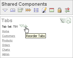
To edit tabs using the Reorder Tabs icon:
Navigate to the appropriate Page Definition. See "Accessing a Page Definition".
Under Tabs, click the Reorder Tabs icon.
The Reorder Tabs page appears.
Edit the appropriate information:
Label - Enter a label for the tab.
Page - Enter the page number that corresponds to the tab.
Tab Also Current For - List other pages that also correspond to this tab. To enter multiple pages, enter a list of pages delimited by a comma. For example:
11,12,13,14,29,14
To change the order in which tabs display, click the up and down arrows in the far right column.
Click Apply Changes.
The Tabs page displays a graphical representation of the tabs defined in your application. You access the Tabs page from the Shared Components page, or by clicking the heading Tabs on the Page Definition.
You create a parent tab or standard tab from the Tabs page.
To create a tab:
Access the Tabs page:
To access the Tabs page from the Shared Components page:
On the Workspace home page, click the Application Builder icon.
Select an application.
On the Application Builder home page, click Shared Components.
Under Navigation, click Tabs.
To access the Tabs page from a Page Definition:
Navigate to the appropriate Page Definition. See "Accessing a Page Definition".
Under Shared Components, click the Create icon in the Tabs section.
To create a tab:
Click Add in the appropriate row:
Use the Add button in the upper row to add Parent tabs.
Think of parent tabs as a container to hold standard tabs. For example, to add two levels of tabs, you first create a parent tab and then add standard tabs to it.
Use the Add button in the lower row to add Standard tabs.
The Create Parent Tab or Create Standard Tab Wizard appears.
Follow the on-screen instructions.
You can edit multiple tabs simultaneously. Also, for standard tabs, you can update tab properties, such as their labels and order sequence, by using the Standard Tab Tasks list.
You can edit multiple tabs simultaneously.
To edit multiple tabs simultaneously:
Navigate to the Tabs page:
On the Workspace home page, click the Application Builder icon.
Select an application.
Click Shared Components.
Under Navigation, click Tabs.
Click one of the following buttons:
Edit Standard Tabs
Edit Parent Tabs
The Standard Tab Task list displays on the right side of the Tabs page. You can access the links on this list to rename a standard tab set, resequence the display order, associate pages with a tab set, create a new standard tab, or create a new standard tab set.
To access the Standard Tab Task list:
Navigate to the Tabs page:
On the Workspace home page, click the Application Builder icon.
Select an application.
Click Shared Components.
Under Navigation, click Tabs.
Make a selection from the Standard Tab Task list:
Rename Standard Tab Set
Resequence Display Order
Associate Page(s) with Selected Standard Tab
Create New Standard Tab
Create New Standard Tab Set
You can view the Tab Utilization and Tab History reports by clicking the appropriate tab at the top of the Tab Manager page.
Click Utilization to access the Standard Tab Utilization report. This report lists the standard tabs used in the current application.
A list is a shared collection of links. You add a list to a page by creating a region and specifying the region type as List. You control the appearance of a list through list templates.
Each list element has a display condition, which enables you to control when it displays. You can define a list element to be either current or non-current for a specific page. You further specify what current looks like using template attributes.
Topics in this section include:
See Also:
"Creating a New Template" and "List Templates" for information about altering list displayTo add a list to a page in your application, you must:
Create the list using one of these methods:
Add entries to the list:
Create list entries from scratch.
Copy a single list entry from the current list. This copies the list entry attributes.
Copy list entries from another list into the current one. This merges the two sets of list entries without changing the list whose entries are copied into the current one.
Add the list to a page by creating a List region.
Topics in this section include:
To create a list:
Access the Create/Edit Lists Wizard:
To access the wizard from the Shared Components page:
On the Workspace home page, click the Application Builder icon.
Select an application.
On the Application Builder home page, click Shared Components.
Under Navigation, click Lists.
Click Create.
To access the wizard from a Page Definition:
Navigate to the appropriate Page Definition. See "Accessing a Page Definition".
Under Shared Components, click the Create icon in the Lists section.
In the Create/Edit Wizard:
Name - Enter a name for the list.
List Template - Select a list template.
Build Option - If applicable, select a build option for this component. Build options are predefined settings that determine whether components within an application are enabled.
Click Create.
To copy a list:
Access the Copy List Wizard:
To access the wizard from the Shared Components page:
On the Workspace home page, click the Application Builder icon.
Select an application.
On the Application Builder home page, click Shared Components.
Under Navigation, click Lists.
Click Copy.
To access the wizard from a Page Definition:
Navigate to the appropriate Page Definition. See "Accessing a Page Definition".
Under Shared Components, click the Copy icon in the Lists section.
The Copy icon appears only if a list exists for this page.
In the Copy Wizard, select the location of the list to copy and click Next.
If you selected List in another application, select the application and click Next.
For Identify List, enter a name for the new list and click Copy.
For the list to appear on a page, you must add it to the page.
Once your list is created, you must add entries to it. You can add list entries from scratch, copy one list entry within a list, or copy existing entries from one list to another.
You can also create hierarchical lists that contain sublists. To create a hierarchical list, you must:
Select a list template that supports hierarchical lists. To determine which list templates support hierarchical lists, look for templates having the naming convention "with Sublist."
Select a Parent List Item when you create each list entry.
To add an entry or sublist from scratch:
Navigate to the Lists page:
On the Workspace home page, click the Application Builder icon.
Select an application.
On the Application home page, click Shared Components.
Under Navigation, select Lists.
The Lists page appears.
Select a list.
Click Create List Entry.
The Create/Edit List Entry page appears.
Under Entry:
Parent List Item - Identify the parent for this list entry. Use this attribute if you are creating a hierarchical list that will contain a sublist.
Sequence - Indicate the order in which list entries appear.
Image - Identify the file name for the image used to display this list entry. List templates control this attribute.
Attributes - Identify the image attributes (such as width="12" height="12") for the list element image.
Use the #LIST_LABEL# substitution string to reference the list label text. This substitution string allows for the title image attribute to be automatically set based on the value of the list label text. For example:
title="#LIST_LABEL#"
List Entry Label - Enter the label text for this link.
Specify a target location.
If the target location is a URL, specify the following:
Target is a - Select URL.
URL Target - Enter a URL. For example:
http://www.yahoo.com
If the target location is a page:
Target Type - Select Page in this Application.
Page - Specify the target page number.
You can also select reset pagination for this page. Selecting this option causes the page to return to the first set of data meeting a user's new query.
You can also select Printer Friendly. Selecting this option displays the target page using the application's Printer Friendly template. Printer friendly templates optimize a page for printing. "Changing the Default Templates in a Theme" and "Optimizing a Page for Printing".
Request - Specify the request to be used.
Clear Cache - Specify the page numbers on which to clear cache.
To set session state (that is, give a listed item a value):
Set these items - Enter a comma-delimited list of item names for which you would like to set session state.
With these values - Enter a comma-delimited list of values for the items specified in the previous step.
You can specify static values or substitution syntax (for example, &APP_ITEM_NAME.). Note that item values passed to f?p= in the URL cannot contain a colon. Additionally, item values cannot contain commas unless you enclose the entire value in backslashes (for example, \1234,56\).
Under Current List Entry:
List Entry Current for Pages Type - Specify when this list entry should be current based on the page type.
List items can be current or non-current. Current list items use the current template; non-current list items use the non-current list item template. The actual condition and templates are defined in subsequent attributes.
List Entry Current for Condition - Based on the selection above, define a condition to evaluate. When this condition is true, then the list item becomes current.
To make the list entry conditional, specify the appropriate information under Conditions.
Under Authorization, you can specify an authorization scheme.
This authorization scheme must evaluate to TRUE in order for this component to be rendered or otherwise processed.
Under Configuration, you can select a build option for this component.
Build options are predefined settings that determine whether components within an application are enabled.
Under Click Counting, you can specify if you want the list entries to be included in the click count.
If this is a link to an external page, such as www.google.com, you can count clicks. For more information, see "COUNT_CLICK Procedure" in Oracle Application Express API Reference.
To specify additional attributes, use the User Defined Attributes section. For example, the following adds a tabindex and accesskey.
tabindex="15" accesskey="D"
When you are finished defining list attributes, click Create or Create and Create Another.
To copy list entries:
Navigate to the List Entries page:
On the Workspace home page, click the Application Builder icon.
Select an application.
On the Application home page, click Shared Components.
Under Navigation, select Lists.
The Lists page appears.
On the Lists page, click the name of the list whose entries you want to copy.
The List Entries page appears.
To copy a single list entry that appears in the current list:
Click the Copy icon in the in the row you want to copy. The Copy icon appears under the Copy column in the list.
All the attributes of the selected list entry, such as image and parent, will be copied to the new entry.
For Copy List Entry, enter the appropriate information and click Copy List Entry.
To copy list entries from one list to another:
Click Copy List Entries from one List to Another under the Tasks list on the right side of the page.
For Identify Copy Target, select the target list where you want to add the entries and click Next.
For Confirm List Entry Copy, click the Report of New Combined List to review the composite list.
Click Copy List Entries.
To change the parent of list entries:
Navigate to the List Entries page:
On the Workspace home page, click the Application Builder icon.
Select an application.
On the Application home page, click Shared Components.
Under Navigation, select Lists.
The Lists page appears.
On the Lists page, click the name of the list whose entries you want to update.
The List Entries page appears.
From the Tasks list on the right, click Reparent List Entries within this List.
On the Reparent List Entries page:
Enter the appropriate information for List and Start With and click Go.
You can use the Start With field to filter down a large, hierarchical list to pinpoint the entries you need to reparent. You can also use these fields to focus on a subset of a list you want to edit.
For Reparent To, select the new parent for the list entries.
Select the check boxes for the list entries you want to include.
Click Reparent Checked Entries.
An orphaned list entry is a list entry whose parent is no longer a member of the current list. When a list entry becomes orphaned, remove the parent entry.
To remove the parent of an orphaned list entry:
Navigate to the List Entries page:
On the Workspace home page, click the Application Builder icon.
Select an application.
On the Application home page, click Shared Components.
Under Navigation, select Lists.
The Lists page appears.
On the Lists page, click the name of the list whose entries you want to update.
The List Entries page appears.
From the Tasks list on the right, click Manage Oprhaned List Entries.
On the Manage Orphaned List Entries page:
From the Show list, select Orphaned and click Go.
Select the check boxes for the orphaned list entries.
Click Remove Parent Entry.
Once you create a list and list entries, the next step is to add it to a page by creating a region and specifying the region type as List.
See Also:
"Creating a New Template" and "List Templates" for information about altering list displayTo add a list to a page:
Navigate to the appropriate Page Definition. See "Accessing a Page Definition".
Under Regions, click the Create icon.
For Region, select List as the region type and click Next.
For Display Attributes, specify the appropriate information and click Next:
Title - Enter a title for the region. This title will display if the region template you choose displays the region title.
Region Template - Choose a template to control the look of the region.
Display Point - Identify a display point for this region.
Page Template Body - These positions are displayed where indicated by the #BODY# substitution string in the page template.
Page Template Region - These positions are controlled by page template substitution strings (#REGION_POSITION_01#..#REGION_POSITION_08#). Page template region positions enable exact placement of a region within a template.
Sequence - Specify the sequence for this component. The sequence determines the order of evaluation.
Column - Indicate the column where this region is to be displayed. A page can have multiple regions, which can be displayed in different columns. Note that this attribute only applies to regions that are displayed in a Page Template Body position.
For Source, select the list you want to add.
Click Create List Region.
Repeat these procedures for each page where you would like to add a list.
Once you create a list, you can edit it on the Lists page.
To edit a list:
Navigate to the Lists page.
From the Page Definition:
Navigate to the Workspace home page.
Click the Application Builder icon.
Select an application.
Select a page.
Under Shared Components, click Edit All.
From the Shared Components page:
Navigate to the Workspace home page.
Click the Application Builder icon.
Select an application.
On the Application home page, click Shared Components.
Under Navigation, click Lists.
On the Lists page, you can change the appearance of the page by making a selection from the View list:
Icons (the default) displays each list as a large icon. To edit a list, click the appropriate icon.
Details displays each list as a line in a report. To edit a list, click the list name.
Select a list.
The List Entries page appears.
Select the appropriate list name.
The Create/Edit List Entry page that appears is divided into sections. You can access these sections by scrolling down the page, or by clicking a navigation button at the top of the page. When you select a button at the top of the page, the selected section appears and all other sections are temporarily hidden. To view all sections of the page, click Show All.
Edit the appropriate attributes.
To learn more about a specific item on a page, click the item label.
When Help is available, the item label changes to red when you pass your cursor over it and the cursor changes to an arrow and question mark. See "About Field-Level Help".
Click Apply Changes.
You can edit multiple list entries simultaneously by clicking Grid Edit on the List Entries page.
To edit multiple list entries at once:
On the Workspace home page, click the Application Builder icon.
Select an application.
On the Application Builder home page, click Shared Components.
Under Navigation, click Lists.
The Lists page appears.
Select a list name.
The List Entries page appears.
Click Grid Edit.
Edit the appropriate items and click Apply Changes.
You can view the List Utilization by Page, Unused Lists, and List History reports by clicking the appropriate tab at the top of the Lists page.
Note:
The List Utilization, Unused Lists, and History buttons only appear after you create a list.Click List Utilization on the Lists page to access the Lists Utilization report. This report displays all lists included in the current application. From the report:
To edit list entries, select the list name.
To view the pages on which the list appears, click the number in the Pages column.
To view the template used with the list, click List Template Utilization. Then click the name to view or edit the list template.
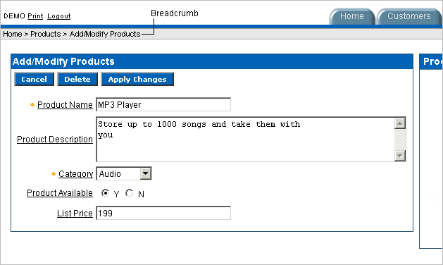
Breadcrumbs provide users with hierarchical navigation. A breadcrumb is a hierarchical list of links that display using templates. You can display a breadcrumb as a list of links or as a breadcrumb path.
Topics in this section include:
A breadcrumb trail indicates where the user is within the application from a hierarchical perspective. In addition, users can click a specific breadcrumb link to instantly view the page. You use breadcrumbs as a second level of navigation at the top of each page, complementing other user interface elements such as tabs and lists.
You can create breadcrumbs while creating a page, or manually by running the Create Breadcrumb Wizard.
Topics in this section include:
To create a breadcrumb while creating a page:
Run the Create Page Wizard to add a new page. See "Managing Pages in an Application". You can access this wizard by:
Clicking Create Page on the Application home page
Clicking Create on the Page Definition
Clicking the Create link on the Developer toolbar
During the wizard, a Breadcrumb list appears. The actual page on which this list displays depends upon the type of page you are creating.
From the Breadcrumb list, select Breadcrumb.
The Create Breadcrumb Entry form appears.
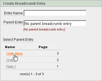
In Entry Name, enter a name for the breadcrumb.
For Parent Entry:
To specify a parent, select a parent page from the Select Parent Entry list.
If this breadcrumb does not have a parent, select No parent breadcrumb entry.
Follow the on-screen instructions.
To create breadcrumbs manually, you need to add a breadcrumb to each page in your application as follows:
Create the breadcrumb by running the Create/Edit Breadcrumb Wizard from either the Shared Components page or the Page Definition.
Add entries to it.
Add the breadcrumb to a page by creating a region.
To create breadcrumbs from the Shared Components page:
On the Workspace home page, click the Application Builder icon.
Select an application.
On the Application Builder home page, click Shared Components.
Under Navigation, click Breadcrumbs.
The Breadcrumbs page appears.
Click Create.
Enter a name and click Create.
To create breadcrumbs from a Page Definition:
Navigate to the appropriate Page Definition. See "Accessing a Page Definition".
Under Shared Components, scroll down to Breadcrumbs and click the Create icon.
For Create, select Breadcrumb and click Next.
Enter a name and click Create.
After you create a breadcrumb, you add entries to it.
To add a breadcrumb entry:
Navigate to the Breadcrumbs page:
Navigate to the Workspace home page.
Click the Application Builder icon.
Select an application.
On the Application Builder home page, click Shared Components.
Under Navigation, click Breadcrumbs.
The Breadcrumbs page appears.
Select a breadcrumb to add entries to.
Click Create Breadcrumb Entry.
Under Breadcrumb, specify the page where this breadcrumb entry will display.
Under Entry:
Sequence - Indicate the order in which breadcrumb entries appear.
Parent Entry - Identify the parent of this entry.
Short Name - Specify the short name of this entry (referenced in the breadcrumb template).
Long Name - Specify the long name of this entry (referenced in the breadcrumb template).
Under Target, specify the target location. The information that appears on the page depends on the branch type you selected:
If the target location is a URL, specify the following:
Target is a - Select URL.
URL Target - Enter a URL. For example:
http://www.yahoo.com
If the target location is a page, specify the following:
Target is a - Select Page in this Application.
Page - Specify the target page number.
You can also select reset pagination for this page. Selecting this option causes the page to return to the first set of data meeting a user's new query.
Request - Specify the request to be used.
Clear Cache - Specify the page numbers on which to clear cache.
To set session state (that is, give a listed item a value):
Set these items - Enter a comma-delimited list of item names for which you would like to set session state.
With these values - Enter a comma-delimited list of values for the items your specified.
You can specify static values or substitution syntax (for example, &APP_ITEM_NAME.). Note that item values passed to f?p= in the URL cannot contain a colon. Additionally, item values cannot contain commas unless you enclose the entire value in backslashes (for example, \1234,56\).
Click Next.
To make the breadcrumb conditional:
Make a selection from the Condition Type list.
Enter an expression in the fields provided.
Under Authorization, you can specify an authorization scheme.
This authorization scheme must evaluate to TRUE in order for this component to be rendered or otherwise processed.
Under Configuration, you can select a build option for this component.
Build options are predefined settings that determine whether components within an application are enabled.
When you are finished defining menu attributes, click Create at the top of the page.
Repeat these procedures for each breadcrumb entry you need to create.
A region is an area on a page that serves as a container for content. Once you create a breadcrumb and a breadcrumb template, the next step is to create a region. Once you create a region, you can add a breadcrumb to a page.
See Also:
"Creating a New Template" and "Breadcrumb Templates" for information about changing menu displayTo create a breadcrumb region:
Navigate to the appropriate Page Definition. See "Accessing a Page Definition".
Under Regions, click the Create icon.
The Create Region Wizard appears. Note that each wizard page displays a series of blocks on the left, representing the sequence of steps. The highlighted block indicates the step you are performing.
For the region type, select Breadcrumb and click Next.
For Breadcrumb Container Region:
Region Title - Enter a title for this region.
Region Template - Select a region template.
Display Point - Select a Display Point.
Regions are organized by position (or Display Point). To determine the appropriate region position, click the flashlight icon. A graphical representation appears.
Sequence - Enter a number for the sequence.
Click Next.
For Breadcrumb:
Breadcrumb - Select the breadcrumb to be associated with this region.
Breadcrumb Template - Select a template.
Click Next.
For Breadcrumb Entry, identify the breadcrumb entry used to identify this page:
Breadcrumb Entry Label - Enter a label for the breadcrumb entry.
Parent Entry - Select the appropriate hierarchical parent.
Click Next.
Click Finish.
Repeat these procedures for each page where you would like to add breadcrumb navigation.
To give users more exact context, you can include session state in breadcrumbs, making your breadcrumbs dynamic. For example, suppose a page in your application displays a list of orders for a particular company and you want to include the following breadcrumb:
Home > Orders > Orders for ACME Inc
In this example, ACME Inc not only indicates the page a user is on but also the navigation path. The Application Express engine stores the value of ACME Inc. in session state.
To create this type of dynamic menu, you must include a reference to a session state item in the breadcrumb's short name or long name. For example:
&COMPANY_NAME.
Once you create a breadcrumb, you can edit it on the Breadcrumbs page.
To edit a breadcrumb:
Navigate to the Workspace home page.
Click the Application Builder icon.
Select an application.
On the Application Builder home page, click Shared Components.
Under Navigation, select Breadcrumbs.
The Breadcrumbs page appears.
You can change the appearance of the page by making a selection from the View list and clicking Go:
Icons (the default) displays each breadcrumb as a large icon. To edit a breadcrumb, click the icon.
Details displays each breadcrumb as a line in a report. To edit a breadcrumb, click the appropriate name.
Select a breadcrumb.
Select the appropriate breadcrumb entry name.
The Create/Edit Breadcrumb Entry page appears.
Edit the appropriate attributes.
Tip:
To learn more about a specific item on a page, click the item label. When Help is available, the item label changes to red when you pass your cursor over it and the cursor changes to an arrow and question mark. See "About Field-Level Help".(Optional) In the Breadcrumb Entry list on the right side of the page, you can select the Synchronize Breadcrumb With Page Name and Title option.
Selecting this option makes changing the name of a page and breadcrumb a one-step process. The information you provide for breadcrumb names is used to update the referenced page name and title.
Click Apply Changes.
The Create/Edit Breadcrumb Entry page is divided into the following sections: Breadcrumb, Entry, Target, Conditions, Authorization and Configuration.
You can access these sections by scrolling down the page, or by clicking a navigation button at the top of the page. When you select a button at the top of the page, the selected section appears and all other sections are temporarily hidden. To view all sections of the page, click Show All.
You can select a new parent for selected breadcrumb entries on the Reparent Entries page.
To reparent breadcrumb entries:
Navigate to the Breadcrumbs page:
Navigate to the Workspace home page.
Click the Application Builder icon.
Select an application.
On the Application Builder home page, click Shared Components.
Under Navigation, select Breadcrumbs.
The Breadcrumbs page appears.
Select a breadcrumb.
The Breadcrumb Entries page appears.
From the Tasks list, click Reparent Entries within this Breadcrumb.
The Reparent Entries page appears.
Use the navigation bar to edit or filter the view:
Breadcrumb - Identify the breadcrumb you want to edit and click Go.
Start With - Make a selection to restrict your view to a subset of the breadcrumb hierarchy and click Go.
From Reparent to, select the new parent.
Select the breadcrumbs entries you want to move and click Reparent Checked Entries.
You can view the Breadcrumb Utilization and Breadcrumb History reports by clicking the appropriate tab at the top of the Breadcrumbs page.
Note:
The Utilization and History buttons only appear after you create a breadcrumb.To access the Breadcrumbs page:
Navigate to the Workspace home page.
Click the Application Builder icon.
Select an application.
On the Application Builder home page, click Shared Components.
Under Navigation, select Breadcrumbs.
Click Utilization to access the Breadcrumb Utilization report. This report lists breadcrumbs by page. Click the page number to go to a specific page.
You can use a tree in your application to effectively communicate hierarchical or multiple level data.
Topics in this section include:
To create a tree:
Navigate to the Shared Components page:
Navigate to the Workspace home page.
Click the Application Builder icon.
Select an application.
On the Application Builder home page, click Shared Components.
Under Navigation, click Trees.
The Trees page appears.
Click Create.
The Create Tree Wizard appears. Note that each wizard page displays a series of blocks on the left, representing the sequence of steps. The highlighted block indicates the step you are performing.
For Page Attributes, enter basic page information and click Next.
To learn more about a specific item on a page, click the item label. A Help window appears with a description of the item or field.
For Tab, specify how tabs should be implemented and click Next.
For Tree Attributes:
Tree Name - Enter a name.
Default Expanded Levels - Specify the number of default expanded levels.
Start Tree - Specify how you want to determine the starting point. This determines what point in the hierarchy you want to display.
- Based on New Item with Popup List of Values - Select this option to set up an item containing a list of values. This option enables the user to determine the starting point to display by selecting an option for the list of values.
- Based on a SQL Query - Select this option to write a query that dynamically finds the starting point of a hierarchy (the entry with no parent).
- Static Value - Select this option to hard code the starting point.
Click Next.
For Tree Template, select a template and click Next.
For Tree Start, specify a starting point and click Next. Depending on your Start Tree selection, enter either a query or a single value.
For Expand/Collapse, select the buttons to include and click Next.
For Table/View Owner, specify the owner of the table on which the tree will be based and click Next.
For Table/View Name, specify the name of the table on which the tree will be based and click Next.
A tree is based on a query and returns data that can be represented in a hierarchy. This hierarchy is determined by the relationship between ID and Parent ID values. Identify the column you want to use as the ID, the Parent ID, and specify the text that should appear on the leaf nodes.
ID - Enter the column you want to use as the ID.
Parent ID - Enter the Parent ID.
Leaf Node Text - Specify the text that should appear on the leaf nodes.
Link Option - Select Existing Application Item to make the leaf node text a link. If you select this option, specify a page to link to.
Identify an optional where and order by clause to add to your query.
Specify the display text for the Go button.
Identify the page you want to branch to when the user clicks a button.
Click Finish.
Once you create a tree, you can edit it on the Trees page.
To edit a tree:
On the Workspace home page, click the Application Builder icon.
Select an application.
On the Application home page, click Shared Components.
Under Navigation, select Trees.
The Trees page appears.
You can change the appearance of the page by making a selection from the View list:
Icons (the default) displays each tree as a large icon.
Details displays each tree as a line in a report.
Select a tree.
The Edit Tree page appears.
Edit the appropriate attributes.
To learn more about a specific item on a page, click the item label.
When Help is available, the item label changes to red when you pass your cursor over it and the cursor changes to an arrow and question mark. See "About Field-Level Help".
Click Apply Changes.
The Edit Tree page is divided into the following sections: Name, Query, Before and After, Static Node Templates, Dynamic Templates, Node Text Templates, and Link Templates.
You can access these sections by scrolling down the page, or by clicking a navigation button at the top of the page. When you select a button at the top of the page, the selected section appears and all other sections are temporarily hidden. To view all sections of the page, click Show All.
You can view the Trees Utilization and Tree History reports by clicking the appropriate tab at the top of the Trees page.
Note:
The Utilization and History buttons only appear after you have created a tree.Click Utilization on the Trees page to access the Tree Utilization report. This report displays all trees included in the current application. To edit a tree, select the tree name.
Navigation bar entries offer an easy way to move users between pages in an application. For example, a navigation entry enables you to display a link from an image or text. The associated page template determines the location of a navigation bar.
Topics in this section include:
See Also:
"Customizing Templates"A navigation bar entry can be an image, text, or an image with text beneath it. You must supply the images and text to use in the navigation bar entries.
Navigation bars are different from other shared components in that you do not need to reference them on a page-by-page basis. If your page template includes the #NAVIGATION_BAR# substitution string, the Application Express engine automatically includes any defined navigation bars when it renders the page.
Before adding a navigation bar, you must create entries for the navigation bar. To do so, access the Navigation Bar page from either the Page Definition or from the Shared Components page.
See Also:
"Working with Shared Components",To create a navigation bar entry:
Navigate to the appropriate Page Definition. See "Accessing a Page Definition".
Under Shared Components, scroll down to Navigation Bar.
Under Navigation Bar, click the Create icon.
The Create Navigation Bar Entry Wizard appears. Note that each wizard page displays a series of blocks on the left, representing the sequence of steps. The highlighted block indicates the step you are performing.
For Attributes, specify the appropriate information:
Sequence - Specify the order of evaluation for this component.
Tip:
To review the existing entries, click the Existing Navigation Bar Entries link at the bottom of the page.Alt Tag Text - Enter ALT text for navigation icons that are images. If you do not specify an image name, then this text displays.
Icon Image Name - Enter an image name. For naming conventions, click the item label (Icon Image Name). This opens item-level help with a list of supported prefixes and examples of image names.
Image Height - Define the height of the image in pixels.
Width - Define the width of the image in pixels.
Text - For text-only entries, enter the entry text. For images, you can also enter additional text to display with the image. This attribute can be translated.
Click Next.
For Target, specify the target location.
If the target location is a URL, specify the following:
Target is a - Select URL.
URL Target - Enter a URL. For example:
http://www.yahoo.com
If the target location is a page, specify the following:
Target is a - Select Page in this Application.
Page - Specify the target page number.
You can also select reset pagination for this page. Selecting this option causes the page to return to the first set of data meeting a user's new query.
You can also select Printer Friendly. Selecting this option displays the target page using the application's Printer Friendly template. Printer friendly templates optimize a page for printing. "Changing the Default Templates in a Theme" and "Optimizing a Page for Printing".
Request - Specify the request to be used.
Clear Cache - Specify the page numbers on which to clear cache.
To set session state (that is, give a listed item a value):
Set these items - Enter a comma-delimited list of item names for which you would like to set session state.
With these values - Enter a comma-delimited list of values for the items your specified.
You can specify static values or substitution syntax (for example, &APP_ITEM_NAME.). Note that item values passed to f?p= in the URL cannot contain a colon. Additionally, item values cannot contain commas unless you enclose the entire value in backslashes (for example, \1234,56\).
Click Next.
To set a condition for displaying the navigation bar entry, specify the appropriate conditional information and click Create.
Tip:
In order for a navigation bar to appear, your page template must include the#NAVIGATION_BAR# substitution string. See"Supported Page Template Substitution Strings".Once you create a navigation bar entry, you can edit it on the Navigation Bar Entries page.
To edit a navigation bar entry:
On the Workspace home page, click the Application Builder icon.
Select an application.
On the Application home page, click Shared Components.
Under Navigation, click Navigation Bar Entries.
The Navigation Bar Entries page appears. You can change the appearance of the page by making a selection from the View list and clicking Go. Available options include:
Icons (the default) displays each navigation bar entry as a large icon. To edit a navigation bar entry, click the icon.
Details displays each navigation bar as a line in a report. To edit a navigation bar, click the appropriate sequence number.
Select a navigation bar entry.
The Edit Navigation Bar Entry page appears.
The Edit Navigation Bar Entry is divided into the following sections: Sequence, Subscription, Image Attributes, Target, Conditions, Authorization, Configuration, and Comments.
You can access these sections by scrolling down the page, or by clicking a navigation button at the top of the page. When you select a button at the top of the page, the selected section appears and all other sections are temporarily hidden. To view all sections of the page, click Show All.
Edit the appropriate attributes.
To learn more about a specific item on a page, click the item label.
When Help is available, the item label changes to red when you pass your cursor over it and the cursor changes to an arrow and question mark. See "About Field-Level Help".
Click Apply Changes.
To edit multiple navigation bar entries simultaneously:
On the Workspace home page, click the Application Builder icon.
Select an application.
On the Application home page, click Shared Components.
Under Navigation, click Navigation Bar Entries.
The Navigation Bar Entries page appears.
Click Grid Edit at the top of the page.
Edit the appropriate attributes and click Apply Changes.
You can quickly change the order of navigation bar entries by clicking the Reorder Navigation Bar Entries icon on the Page Definition. This icon resembles light green down and up arrows.
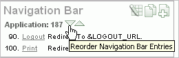
To change the order of the navigation bar entries using the Reorder Tabs icon:
Navigate to the appropriate Page Definition. See "Accessing a Page Definition".
Under Navigation Bar, click the Reorder Navigation Bar Entries icon.
The Reorder Navigation Bar Entries page appears.
To change the order in which the entries display on this page, click the up and down arrows in the far right column or edit the numbers.
Click Apply Changes.
You can view the Navigation Bar Entry Subscription and Navigation Bar Entry History reports by clicking the appropriate tab at the top of the Navigation Bar Entries page.
Note:
The Subscription and History buttons only appear after you create a navigation bar.A branch is an instruction to link to a specific page, procedure, or URL after a given page is submitted. For example, you can branch from page 1 to page 2 after page 1 is submitted.
You create a branch by running the Create Branch Wizard and specifying the branch point and branch type.
To create a branch:
Navigate to the appropriate Page Definition. See "Accessing a Page Definition".
Under Branches in the Page Processing column, click the Create icon.
For Point and Type, select a branch point:
On Submit: Before Computation - Occurs before computations, validations, or processing. Use this option for a Cancel button.
On Submit: Before Validation - Occurs after computations, but before validations or processing. Typically not used. If a validation fails, page processing stops, a rollback is issued, and the page displays the error. Because of this default behavior, you do not need to create branches to accommodate validations. However, you might want to branch based on the result of a computation (for example, to the previous branch point).
On Submit: Before Processing - Occurs after computations and validations, but before processing. Use this option to branch based on a validated session state, but before performing any page processing.
On Submit: After Processing - Occurs after computations, validations, and processing. This option branches to a URL or page after performing computations, validations, and processing. When using this option, remember to sequence your branches if you have multiple branches for a given branch point.
On Load: Before Header - Occurs before a page is rendered. This option displays another page, instead of the current page, or redirects the user to another URL or procedure.
Select a branch type and click Next.
For Target, specify the target location. The information that appears on the page depends on the branch type you selected:
If the target location is a URL, specify the following:
Target is a - Select URL.
URL Target - Enter a URL. For example:
http://www.yahoo.com
If the target location is a page, specify the following:
Target is a - Select Page in this Application.
Page - Specify the target page number.
You can also select reset pagination for this page. Selecting this option causes the page to return to the first set of data meeting a user's query.
You can also select include process success message. Selecting this option displays a message when a user submits a page and a branch is taken to another page. If you do not select this option, the message does not display because it is part of submitting the page, not displaying the next one.
Request - Specify the request to be used.
Clear Cache - Specify the page numbers on which to clear cache. Separate multiple entries with a comma.
To set session state (that is, give a listed item a value):
Set these items - Enter a comma-delimited list of item names for which you would like to set session state.
With these values - Enter a comma-delimited list of values for the items your specified.
You can specify static values or substitution syntax (for example, &APP_ITEM_NAME.). Note that item values passed to f?p= in the URL cannot contain a colon. Additionally, item values cannot contain commas unless you enclose the entire value in backslashes (for example, \1234,56\).
Select save state before branching to clear cache and save session state before performing the redirect. See "About Saving State Before Branching".
Click Next.
Follow the on-screen instructions.
Creating a Branch on a Page with a Component that Submits
If you have a page with a component that submits, such as a Go button or select list with submit, note that you must create a branch that links back to that page. For example, suppose you have a page with a select list and a submit button. For processing to occur properly, you need to create a branch on the page that links back to the page.
About Saving State Before Branching
Consider selecting save state before branching if your branch is redirecting to a URL or returning a URL and passes clear cache directives or item names and item values in the resulting f?p URL. By default, this information is passed after the branch is taken, displaying any passed information in the URL.
Selecting save state before branching sets potentially sensitive information in session state before the branch redirect. This option improves application security by making URLs less susceptible to tampering and by exposing fewer item names, values, and indications of program logic.
Note that when you select save state before branching, the redirected URL no longer include clear cache or item name and item values. You can still view this information, by running your application in Debug mode. See "Accessing Debug Mode".
|
 Copyright © 2003, 2012, Oracle and/or its affiliates. All rights reserved. Legal Notices |
|