The Android UI toolkit offers several layout managers that are rather easy to use and, most of the time, you only need the basic features of these layout managers to implement a user interface.
Sticking to the basic features is unfortunately not the most efficient
way to create user interfaces. A common example is the abuse of
LinearLayout, which leads to a proliferation of
views in the view hierarchy. Every view — or worse, every layout
manager — that you add to your application comes at a cost:
initialization, layout and drawing become slower. The layout pass can be
especially expensive when you nest several LinearLayout
that use the weight
parameter, which requires the child to be measured twice.
Let's consider a very simple and common example of a layout: a list item with an icon on the left, a title at the top and an optional description underneath the title. Here is what such an item looks like:

To clearly understand how the views, one ImageView and
two TextView, are positioned with respect to each other,
here is the wireframe of the layout as captured by HierarchyViewer:

Implementing this layout is straightforward with LinearLayout.
The item itself is a horizontal LinearLayout with an
ImageView and a vertical LinearLayout, which contains
the two TextView. Here's the source code of this layout:
<LinearLayout xmlns:android="http://schemas.android.com/apk/res/android"
    android:layout_width="fill_parent"
    android:layout_height="?android:attr/listPreferredItemHeight"
    android:padding="6dip">
    <ImageView
        android:id="@+id/icon"
        android:layout_width="wrap_content"
        android:layout_height="fill_parent"
        android:layout_marginRight="6dip"
        android:src="@drawable/icon" />
    <LinearLayout
        android:orientation="vertical"
        android:layout_width="0dip"
        android:layout_weight="1"
        android:layout_height="fill_parent">
        <TextView
            android:layout_width="fill_parent"
            android:layout_height="0dip"
            android:layout_weight="1"
            android:gravity="center_vertical"
            android:text="My Application" />
        <TextView
            android:layout_width="fill_parent"
            android:layout_height="0dip"
            android:layout_weight="1"
            android:singleLine="true"
            android:ellipsize="marquee"
            android:text="Simple application that shows how to use RelativeLayout" />
    </LinearLayout>
</LinearLayout>
This layout works but can be wasteful if you instantiate it for every list
item of a ListView. The same layout can be rewritten
using a single RelativeLayout, thus saving one view, and
even better one level in view hierarchy, per list item. The implementation of
the layout with a RelativeLayout remains simple:
<RelativeLayout xmlns:android="http://schemas.android.com/apk/res/android"
    android:layout_width="fill_parent"
    android:layout_height="?android:attr/listPreferredItemHeight"
    android:padding="6dip">
    <ImageView
        android:id="@+id/icon"
        android:layout_width="wrap_content"
        android:layout_height="fill_parent"
        android:layout_alignParentTop="true"
        android:layout_alignParentBottom="true"
        android:layout_marginRight="6dip"
        android:src="@drawable/icon" />
    <TextView
        android:id="@+id/secondLine"
        android:layout_width="fill_parent"
        android:layout_height="26dip"
        android:layout_toRightOf="@id/icon"
        android:layout_alignParentBottom="true"
        android:layout_alignParentRight="true"
        android:singleLine="true"
        android:ellipsize="marquee"
        android:text="Simple application that shows how to use RelativeLayout" />
    <TextView
        android:layout_width="fill_parent"
        android:layout_height="wrap_content"
        android:layout_toRightOf="@id/icon"
        android:layout_alignParentRight="true"
        android:layout_alignParentTop="true"
        android:layout_above="@id/secondLine"
        android:layout_alignWithParentIfMissing="true"
        android:gravity="center_vertical"
        android:text="My Application" />
</RelativeLayout>
This new implementation behaves exactly the same way as the previous
implementation, except in one case. The list item we want to display has two
lines of text: the title and an optional description. When a
description is not available for a given list item, the application would simply
set the visibility of the second TextView to
GONE. This works perfectly with the LinearLayout
implementation but not with the RelativeLayout version:


In a RelativeLayout, views are aligned with their parent, with the
RelativeLayout itself, or with other views. For instance, we declared that
the description is aligned with the bottom of the RelativeLayout and
that the title is positioned above the description and anchored to the
parent's top. With the description GONE, RelativeLayout doesn't know
where to position the title's bottom edge. To solve this problem, you
can use a very special layout parameter called
layout_alignWithParentIfMissing.
This boolean parameter simply tells RelativeLayout to use its own edges as
anchors when a constraint target is missing. For instance, if you position a
view to the right of a GONE view and set alignWithParentIfMissing
to true, RelativeLayout will instead anchor the view
to its left edge. In our case, using alignWithParentIfMissing will
cause RelativeLayout to align the title's bottom with its own
bottom. The result is the following:


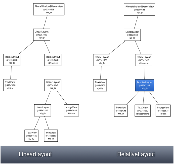
The behavior of our layout is now perfect, even when the description is GONE. Even better, the hierarchy is simpler and because we are not using LinearLayout's weights it's also more efficient. The difference between the two implementations becomes obvious when comparing the view hierarchies in HierarchyViewer:

Again, the difference will be much more important when you use such a layout for every item in a ListView for instance. Hopefully this simple example showed you that getting to know your layouts is the best way to learn how to optimize your UI.
