The border-bottom-left-radius CSS property sets the rounding of the bottom-left corner of the element.
/* the corner is a circle */
/* border-bottom-left-radius: radius */
border-bottom-left-radius: 3px;
/* Percentage values */
border-bottom-left-radius: 20%; /* corner of a circle if box is a square or else corner of a rectangle */
border-bottom-left-radius: 20% 20%; /* same as above */ /* 20% of horizontal(width) and vertical(height) */
border-bottom-left-radius: 20% 10%; /* 20% of horizontal(width) and 10% of vertical(height) */
/* the corner is an ellipsis */
/* border-bottom-left-radius: horizontal vertical */
border-bottom-left-radius: 0.5em 1em;
border-bottom-left-radius: inherit;
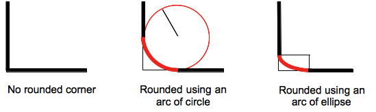
The rounding can be a circle or an ellipse, or if one of the value is 0 no rounding is done and the corner is square.
A background, being an image or a color, is clipped at the border, even a rounded one; the exact location of the clipping is defined by the value of the background-clip property.
border-radius shorthand property that is applied to the element after the border-bottom-left-radius CSS property, the value of this property is then reset to its initial value by the shorthand property.| Initial value | 0 |
|---|---|
| Applies to | all elements; but User Agents are not required to apply to table and inline-table elements when border-collapse is collapse. The behavior on internal table elements is undefined for the moment.. It also applies to ::first-letter. |
| Inherited | no |
| Percentages | refer to the corresponding dimension of the border box |
| Media | visual |
| Computed value | two absolute <length>s or <percentage>s |
| Animation type | a length, percentage or calc(); |
| Canonical order | the unique non-ambiguous order defined by the formal grammar |
Syntax
With one value:
- the value is a
<length>or a<percentage>denoting the radius of the circle to use for the border in that corner.
With two values:
- the first value is a
<length>or a<percentage>denoting the horizontal semi-major axis of the ellipsis to use for the border in that corner. - the second value is a
<percentage>denoting the vertical semi-major axis of the ellipsis to use for the border in that corner.
Values
<length-percentage>- Denotes the size of the circle radius or the semi-major and semi-minor axes of the ellipsis. As absolute length it can be expressed in any unit allowed by the CSS
<length>data type. Percentages for the horizontal axis refer to the width of the box, percentages for the vertical axis refer to the height of the box. Negative values are invalid.
Formal syntax
<length-percentage>{1,2}where
<length-percentage> = <length> | <percentage>
Examples
| Live example | Code |
|---|---|
|
|
An arc of circle is used as the border
div {
  border-bottom-left-radius: 40px 40px;
}
|
|
|
An arc of ellipse is used as the border
div {
  border-bottom-left-radius: 40px 20px;
}
|
|
|
The box is a square: an arc of circle is used as the border
div {
  border-bottom-left-radius: 40%;
}
|
|
|
The box is not a square: an arc of ellipse is used as the border
div {
  border-bottom-left-radius: 40%;
}
|
|
|
The background color is clipped at the border
div {
  border-bottom-left-radius:40%;
  border-style: black 3px double;
  background-color: rgb(250,20,70);
  background-clip: content-box;
}
|
Specifications
| Specification | Status | Comment |
|---|---|---|
| CSS Backgrounds and Borders Module Level 3 The definition of 'border-bottom-left-radius' in that specification. |
Candidate Recommendation | Initial definition |
Browser compatibility
| Feature | Chrome | Edge | Firefox (Gecko) | Internet Explorer | Opera | Safari (WebKit) |
|---|---|---|---|---|---|---|
| Basic support | 1.0 -webkit 4.0 |
(Yes)-webkit (Yes) |
1.0 (1.0)-moz[1] 4.0 (2.0)[3] |
9.0 | 10.5 | 3.0 (522)-webkit 5.0 (532.5) |
| Percentages | 4.0 | ? | 1.0 (1.0)[2] 4.0 (2.0) |
9.0 | 10.5 | 5.0 (532.5) |
| Elliptical corners | 1.0 | ? | 3.5 (1.9.1) | 9.0 | 10.5 | 3.0 (522) |
| Feature | Android | Edge | Firefox Mobile (Gecko) | IE Phone | Opera Mobile | Safari Mobile |
|---|---|---|---|---|---|---|
| Basic support | ? | (Yes)-webkit (Yes) |
(Yes)[3] | ? | ? | ? |
| Percentages | ? | ? | (Yes) | ? | ? | ? |
| Elliptical corners | ? | ? | (Yes) | ? | ? | ? |
[1] The prefixed version (allowed from Firefox 1 to Firefox 12) of this property uses a different name, -moz-border-radius-bottomleft, than the final property as Mozilla implemented it before the final name was coined.
[2] Before Firefox 4, the <percentage> was relative to the width of the box even when specifying the radius for a height). This implied that -moz-border-radius-bottomleft was always drawing an arc of circle, and never an ellipse, when followed by a single value.
[3] Prior to Gecko 50.0 (Firefox 50.0 / Thunderbird 50.0 / SeaMonkey 2.47), border styles of rounded corners were always rendered as if border-style was solid. This has been fixed in Gecko 50.0.
In addition to the unprefixed support, Gecko 44.0 (Firefox 44.0 / Thunderbird 44.0 / SeaMonkey 2.41) added support for a -webkit prefixed version of the property for web compatibility reasons behind the preference layout.css.prefixes.webkit, defaulting to false. Since Gecko 49.0 (Firefox 49.0 / Thunderbird 49.0 / SeaMonkey 2.46) the preference defaults to true.
See also
The border-radius-related CSS properties: the CSS shorthand border-radius, the properties for the other corners: border-top-right-radius, border-bottom-right-radius, and border-top-left-radius.