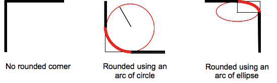
The border-radius CSS property allows Web authors to define how rounded border corners are. The curve of each corner is defined using one or two radii, defining its shape: circle or ellipse.
/* The syntax of the first radius allows one to four values */
/* Radius is set for all 4 sides */
border-radius: 10px;
/* top-left-and-bottom-right | top-right-and-bottom-left */
border-radius: 10px 5%;
/* top-left | top-right-and-bottom-left | bottom-right */
border-radius: 2px 4px 2px;
/* top-left | top-right | bottom-right | bottom-left */
border-radius: 1px 0 3px 4px;
/* The syntax of the second radius allows one to four values */
/* (first radius values) / radius */
border-radius: 10px 5% / 20px;
/* (first radius values) / top-left-and-bottom-right | top-right-and-bottom-left */
border-radius: 10px 5% / 20px 30px;
/* (first radius values) / top-left | top-right-and-bottom-left | bottom-right */
border-radius: 10px 5px 2em / 20px 25px 30%;
/* (first radius values) / top-left | top-right | bottom-right | bottom-left */
border-radius: 10px 5% / 20px 25em 30px 35em;
border-radius: inherit;
The radius applies to the whole background, even if the element has no border; the exact position of the clipping is defined by the background-clip property.
This property is a shorthand to set the four properties border-top-left-radius, border-top-right-radius, border-bottom-right-radius and border-bottom-left-radius.
The border-radius property does not apply to table elements when border-collapse is collapse.
border-radius:0 0 inherit inherit, which would override existing definitions partially. In that case, the individual longhand properties have to be used.| Initial value | as each of the properties of the shorthand: |
|---|---|
| Applies to | all elements; but User Agents are not required to apply to table and inline-table elements when border-collapse is collapse. The behavior on internal table elements is undefined for the moment.. It also applies to ::first-letter. |
| Inherited | no |
| Percentages | refer to the corresponding dimension of the border box |
| Media | visual |
| Computed value | as each of the properties of the shorthand:
|
| Animation type | as each of the properties of the shorthand:
|
| Canonical order | the unique non-ambiguous order defined by the formal grammar |
Syntax
The border-radius property is specified as:
- one, two, three, or four
<length>or<percentage>values. This is used to set a single radius for the corners. - followed optionally by "/" followed by one, two, three, or four
<length>or<percentage>values. This is used to set an additional radius, so you can have elliptical corners.
Values
| radius |  |
Is a <length> or a <percentage> denoting a radius to use for the border in each corner of the border. It is used only in the one-value syntax. |
| top-left-and-bottom-right |  |
Is a <length> or a <percentage> denoting a radius to use for the border in the top-left and bottom-right corners of the element's box. It is used only in the two-value syntax. |
| top-right-and-bottom-left |  |
Is a <length> or a <percentage> denoting a radius to use for the border in the top-right and bottom-left corners of the element's box. It is used only in the two- and three-value syntaxes. |
| top-left |  |
Is a <length> or a <percentage> denoting a radius to use for the border in the top-left corner of the element's box. It is used only in the three- and four-value syntaxes. |
| top-right |  |
Is a <length> or a <percentage> denoting a radius to use for the border in the top-right corner of the element's box. It is used only in the four-value syntax. |
| bottom-right |  |
Is a <length> or a <percentage> denoting a radius to use for the border in the bottom-right corner of the element's box. It is used only in the three- and four-value syntaxes. |
| bottom-left |  |
Is a <length> or a <percentage> denoting a radius to use for the border in the bottom-left corner of the element's box. It is used only in the four-value syntax. |
inherit |
Is a keyword indicating that all four values are inherited from their parent's element calculated value. |
<length>- Denotes the size of the circle radius or the semi-major and semi-minor axes of the ellipsis. It can be expressed in any unit allowed by the CSS
<length>data types. Negative values are invalid. <percentage>- Denotes the size of the circle radius, or the semi-major and semi-minor axes of the ellipsis, using percentage values. Percentages for the horizontal axis refer to the width of the box, percentages for the vertical axis refer to the height of the box. Negative values are invalid.
For example:
border-radius: 1em/5em;
/* is equivalent to */
border-top-left-radius:     1em 5em;
border-top-right-radius:    1em 5em;
border-bottom-right-radius: 1em 5em;
border-bottom-left-radius:  1em 5em;
border-radius: 4px 3px 6px / 2px 4px;
/* is equivalent to: */
border-top-left-radius:     4px 2px;
border-top-right-radius:    3px 4px;
border-bottom-right-radius: 6px 2px;
border-bottom-left-radius:  3px 4px;
Formal syntax
<length-percentage>{1,4} [ / <length-percentage>{1,4} ]?where
<length-percentage> = <length> | <percentage>
Examples
  border: solid 10px;
  /* the border will curve into a 'D' */
  border-radius: 10px 40px 40px 10px;
  border: groove 1em red;
  border-radius: 2em;
  background: gold;
  border: ridge gold;
  border-radius: 13em/3em;
  border: none;
  border-radius: 40px 10px;
  border: none;
  border-radius: 50%;
  border: dotted;
  border-width: 10px 4px;
  border-radius: 10px 40px;
  border: dashed;
  border-width: 2px 4px;
  border-radius: 40px;
Live Samples
Sample 1 : http://jsfiddle.net/Tripad/qnGKj/2/
Sample 2 : http://jsfiddle.net/Tripad/qnGKj/3/
Sample 3 : http://jsfiddle.net/Tripad/qnGKj/4/
Sample 4 : http://jsfiddle.net/Tripad/qnGKj/5/
Sample 5 : http://jsfiddle.net/Tripad/qnGKj/6/
Specifications
| Specification | Status | Comment |
|---|---|---|
| CSS Backgrounds and Borders Module Level 3 The definition of 'border-radius' in that specification. |
Candidate Recommendation | Initial definition |
Browser compatibility
| Feature | Firefox (Gecko) | Chrome | Edge | Internet Explorer | Opera | Safari |
|---|---|---|---|---|---|---|
| Basic support | 1.0-webkit 4.0[9] |
(Yes)-webkit (Yes) |
9.0 | 10.5[8] | 3.0-webkit 5.0[9] |
|
| Elliptical borders | 3.5 (1.9.1) | (Yes)[7] | (Yes) | (Yes) | (Yes) | (Yes)[7] |
| 4 values for 4 corners | (Yes) | 4.0[6] | (Yes) | (Yes) | (Yes) | 5.0[6] |
| Percentages | (Yes)[5] 4.0 (2.0) |
(Yes)[2] | (Yes) | (Yes) | 11.5[3] | 5.1[2] |
| Feature | Edge | Firefox Mobile (Gecko) | iOS Safari | Opera Mini | Opera Mobile | Android Browser |
|---|---|---|---|---|---|---|
| Basic support | (Yes)-webkit (Yes) |
(Yes)[10] | 3.2-webkit | No support | No support | 2.1-webkit |
| Elliptical borders | (Yes) | (Yes)[10] | ? | No support | No support | ? |
| 4 values for 4 corners | (Yes) | (Yes)[10] | ? | No support | No support | ? |
| Percentages | (Yes) | (Yes)[10] | (Yes)[4] | No support | No support | (Yes)[4] |
[1] In Gecko 2.0 (Firefox 4 / Thunderbird 3.3 / SeaMonkey 2.1) -moz-border-radius was renamed to border-radius; -moz-border-radius was supported as an alias until Gecko 12.0 (Firefox 12.0 / Thunderbird 12.0 / SeaMonkey 2.9). In order to conform to the CSS3 standard, Gecko 2.0 changes the handling of <percentage> values to match the specification. You can specify an ellipse as border on an arbitrary sized element just with border-radius: 50%;. Gecko 2.0 also makes rounded corners clip content and images (if overflow: visible is not set)
Support for the prefixed version (-moz-border-radius) was removed in Gecko 13.0 (Firefox 13.0 / Thunderbird 13.0 / SeaMonkey 2.10).
[2] <percentage> values are not supported in older Chrome and Safari versions (it was fixed in Sepember 2010).
[3] The implementation of <percentage> values was buggy in Opera prior to 11.50.
[4] <percentage> values are not supported in iOS versions prior to 5 and Android versions prior to WebKit 532.
[5] <percentage> values are implemented in a non-standard way prior to Gecko 2.0. Both horizontal and vertical radii were relative to the width of the border box.
[6] Safari and Chrome versions prior to WebKit 532.5 support only one value for all four corners. For different radii the border-top-left-radius long form properties must be used.
[7] Safari and Chrome versions prior to WebKit 532.5 don't support the slash / notation. If two values are specified, an elliptical border is drawn on all four corners. -webkit-border-radius: 40px 10px; is equivalent to border-radius: 40px/10px;.
[8] In Opera prior to version 11.60, applying border-radius to replaced elements will not have rounded corners.
[9] Current Chrome and Safari versions ignore border-radius on <select> elements unless -webkit-appearance is overridden to an appropriate value.
[10] Prior to Gecko 50.0 (Firefox 50.0 / Thunderbird 50.0 / SeaMonkey 2.47), border styles of rounded corners (with border-radius) were always rendered as if border-style was solid. This has been fixed in Gecko 50.0.
In addition to the unprefixed support, Gecko 44.0 (Firefox 44.0 / Thunderbird 44.0 / SeaMonkey 2.41) added support for a -webkit prefixed version of the property for web compatibility reasons behind the preference layout.css.prefixes.webkit, defaulting to false. Since Gecko 49.0 (Firefox 49.0 / Thunderbird 49.0 / SeaMonkey 2.46) the preference defaults to true.
See also
- Border-radius-related CSS properties:
border-top-left-radius,border-top-right-radius,border-bottom-right-radius,border-bottom-left-radius