Lesson: Using Swing Components
Section: How to Use Various Components
How to Use Panels
The
JPanel class provides general-purpose containers for lightweight components. By default, panels do not add colors to anything except their own background; however, you can easily add borders to them and otherwise customize their painting. Details can be found in
Performing Custom Painting.
In many types of look and feel, panels are opaque by default. Opaque panels work well as content panes and can help with painting efficiently, as described in
Using Top-Level Containers. You can change a panel's transparency by invoking the setOpaque method. A transparent panel draws no background, so that any components underneath show through.
An Example
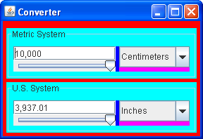
The following picture shows a colored version of the Converter application, which is discussed in more detail in Using Models.

The Converter example uses panels in several ways:
- One
JPanelinstance — colored red in the preceding snapshot — serves as a content pane for the application's frame. This content pane uses a top-to-bottomBoxLayoutto lay out its contents, and an empty border to put 5 pixels of space around them. See Using Top-Level Containers for information about content panes. - Two instances of a custom
JPanelsubclass namedConversionPanel— colored cyan — are used to contain components and coordinate communication between components. TheseConversionPanelpanels also have titled borders, which describe their contents and enclose the contents with a line. EachConversionPanelpanel uses a left-to-rightBoxLayoutobject to lay out its contents. - In each
ConversionPanel, aJPanelinstance — colored magenta — is used to ensure the proper size and position of the combo box. Each of theseJPanelinstances uses a top-to-bottomBoxLayoutobject (helped by an invisible space-filling component) to lay out the combo box. - In each
ConversionPanel, an instance of an unnamedJPanelsubclass — colored blue — groups two components (a text field and a slider) and restricts their size. Each of theseJPanelinstances uses a top-to-bottomBoxLayoutobject to lay out its contents.
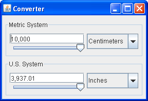
Here is what the Converter application normally looks like.

As the Converter example demonstrates, panels are useful for grouping components, simplifying component layout, and putting borders around groups of components. The rest of this section gives hints on grouping and laying out components. For information about using borders, see
How to Use Borders.
Setting the Layout Manager
Like other containers, a panel uses a layout manager to position and size its components. By default, a panel's layout manager is an instance of
FlowLayout, which places the panel's contents in a row. You can easily make a panel use any other layout manager by invoking the setLayout method or by specifying a layout manager when creating the panel. The latter approach is preferable for performance reasons, since it avoids the unnecessary creation of a FlowLayout object.
Here is an example of how to set the layout manager when creating the panel.
JPanel p = new JPanel(new BorderLayout()); //PREFERRED!
This approach does not work with BoxLayout, since the BoxLayout constructor requires a pre-existing container. Here is an example that uses BoxLayout.
JPanel p = new JPanel();
p.setLayout(new BoxLayout(p, BoxLayout.PAGE_AXIS));
Adding Components
When you add components to a panel, you use the add method. Exactly which arguments you specify to the add method depend on which layout manager the panel uses. When the layout manager is FlowLayout, BoxLayout, GridLayout, or SpringLayout, you will typically use the one-argument add method, like this:
aFlowPanel.add(aComponent);
aFlowPanel.add(anotherComponent);
When the layout manager is BorderLayout, you need to provide an argument specifying the added component's position within the panel. For example:
aBorderPanel.add(aComponent, BorderLayout.CENTER);
aBorderPanel.add(anotherComponent, BorderLayout.PAGE_END);
With GridBagLayout you can use either add method, but you must somehow specify
grid bag constraints for each component.
For information about choosing and using the standard layout managers, see Using Layout Managers.
The Panel API
The API in the JPanel class itself is minimal. The methods you are most likely to invoke on a JPanel object are those it inherits from its superclasses —
JComponent,
Container, and
Component. The following tables list the API you are most likely to use, with the exception of methods related to
borders and layout hints. For more information about the API that all JComponent objects can use, see The JComponent Class.
| Constructor | Purpose |
|---|---|
|
JPanel() JPanel(LayoutManager) |
Creates a panel. The LayoutManager parameter provides a layout manager for the new panel. By default, a panel uses a FlowLayout to lay out its components. |
| Method | Purpose |
|---|---|
|
void add(Component) void add(Component, int) void add(Component, Object) void add(Component, Object, int) void add(String, Component) |
Adds the specified component to the panel. When present, the int parameter is the index of the component within the container. By default, the first component added is at index 0, the second is at index 1, and so on. The Object parameter is layout manager dependent and typically provides information to the layout manager regarding positioning and other layout constraints for the added component. The String parameter is similar to the Object parameter. |
| int getComponentCount() | Gets the number of components in this panel. |
|
Component getComponent(int) Component getComponentAt(int, int) Component getComponentAt(Point) Component[] getComponents() |
Gets the specified component or components. You can get a component based on its index or x, y position. |
|
void remove(Component) void remove(int) void removeAll() |
Removes the specified component(s). |
| Method | Purpose |
|---|---|
|
void setLayout(LayoutManager) LayoutManager getLayout() |
Sets or gets the layout manager for this panel. The layout manager is responsible for positioning the panel's components within the panel's bounds according to some philosophy. |
Examples That Use Panels
Many examples contained in this lesson use JPanel objects. The following table lists a few.
| Example | Where Described | Notes |
|---|---|---|
Converter |
This section | Uses five panels, four of which use BoxLayout and one of which uses GridLayout. The panels use borders and, as necessary, size and alignment hints to affect layout. |
ListDemo |
How to Use Lists | Uses a panel, with its default FlowLayout manager, to center three components in a row.
|
ToolBarDemo |
How to Use Tool Bars | Uses a panel as a content pane. The panel contains three components, laid out by BorderLayout. |
BorderDemo |
How to Use Borders | Contains many panels that have various kinds of borders. Several panels use BoxLayout. |
BoxLayoutDemo |
How to Use BoxLayout | Illustrates the use of a panel with Swing's BoxLayout manager. |