There may be need to display elements as a set of overlapping cards. The stack and deck elements can be used for this purpose.
Containers
Each XUL box is a container that can contain any other element. There are a number of elements that are specialized types of boxes, such as toolbars and tabbed panels. The boxorient the elements inside them, but they have additional features.
In fact, many components can contain other elements. We've already seen that buttons may contain other things besides the default. A scroll bar is just a special type of box that creates its own elements if you don't provide them. It also handles the moving of the scroll bar thumb.
In the next few sections, we'll introduce some elements that are designed for holding other elements. They are all special types of boxes and allow all of the attributes of boxes on them.
Stacks
The stack
The orientwidth, height, min-width and other related properties on both the stack and its children.
The stack
Shadowing with stacks
One convenient use of the stack
var el = env.locale; Example 1 : Source View
<stack>
  <description value="Shadowed" style="padding-left: 1px; padding-top: 1px; font-size: 15pt"/>
  <description value="Shadowed" style="color: red; font-size: 15pt;"/>
</stack>
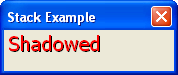
Both descriptiondescription element is drawn in red so the effect is more visible.
This method has advantages over using text-shadow because you could completely style the shadow apart from the main text. It could have its own font, underline or size. (You could even make the shadow blink). It is also useful as Mozilla doesn't currently support CSS text shadowing. A disadvantage is that the area taken up by the shadow makes the size of the stack larger. Shadowing is very useful for creating the disabled appearance of buttons:
var el = env.locale; Example 2 : Source View
<stack style="background-color: #C0C0C0">
  <description value="Disabled" style="color: white; padding-left: 1px; padding-top: 1px;"/>
  <description value="Disabled" style="color: grey;"/>
</stack>
This arrangement of text and shadow colors creates the disabled look under some platforms.
Note that events such as mouse clicks and keypresses are passed to the element on the top of the stack, that is, the last element in the stack. That means that buttons will only work properly as the last element of the stack.
Decks
A deckstack
Like stacks, the direct children of the deckdeck element, the deck will have three children. The displayed page of the deck can be changed by setting an selectedIndexdeck element. The index is a number that identifies which page to display. Pages are numbered starting from zero. So, the first child of the deck is page 0, the second is page 1 and so on.
var el = env.locale; Example 3 : Source View
<deck selectedIndex="2">
  <description value="This is the first page"/>
  <button label="This is the second page"/>
  <box>
    <description value="This is the third page"/>
    <button label="This is also the third page"/>
  </box>
</deck>
Three pages exist here, the default being the third one. The third page is a box with two elements inside it. Both the box and the elements inside it make up the page. The deck will be as large as the largest child, which here should be the third page.
You can switch pages by using a script to modify the selectedIndex
The next section describes how stacks can be used to position child elements.