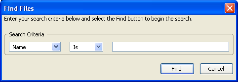
We will conclude the discussion of boxes by adding some boxes to the find files dialog.
Adding Elements to our find files example
We will add some more elements to the find files dialog now. First, we will add the capability to search for other information such as the file size and date.
<hbox>
  <menulist id="searchtype">
    <menupopup>
      <menuitem label="Name"/>
      <menuitem label="Size"/>
      <menuitem label="Date Modified"/>
    </menupopup>
  </menulist>
  <spacer style="width: 10px;"/>
  <menulist id="searchmode">
    <menupopup>
      <menuitem label="Is"/>
      <menuitem label="Is Not"/>
    </menupopup>
  </menulist>
  <spacer style="width: 10px;"/>
  <textbox id="find-text" flex="1" style="min-width: 15em;"/>
</hbox>

Two drop down boxes have been added to the dialog. A spacer has been added in between each element to separate them. These spacers have been given an explicit width of 10 pixels each. You will notice that if the window is resized, the textbox grows but the other components do not. You will also notice that the label was removed.
If you resize the window vertically, the elements do not change size. This is because they are inside horizontal boxes. In might be more appropriate if the Find and Cancel buttons always stayed along the bottom of the window. This is easy to do by adding a spacer in between the two horizontal boxes.
<spacer style="height: 10px"/>
<hbox>
  <menulist id="searchtype">
    <menupopup>
      <menuitem label="Name"/>
      <menuitem label="Size"/>
      <menuitem label="Date Modified"/>
    </menupopup>
  </menulist>
  <spacer style="width: 10px;"/>
  <menulist id="searchmode">
    <menupopup>
      <menuitem label="Is"/>
      <menuitem label="Is Not"/>
    </menupopup>
  </menulist>
  <spacer style="width: 10px;"/>
  <textbox id="find-text" flex="1" style="min-width: 15em;"/>
</hbox>
<spacer style="height: 10px" flex="1"/>
<hbox>
Now when the dialog is resized, the two buttons will move so that they are always along the bottom of the dialog. The first spacer adds extra spacing in between the title label and the search criteria elements.
It might look nicer if there was a border around the search criteria. There are two ways to do this. We could use the CSS border property or we could use the groupbox
Let us change the box into a groupbox:
<groupbox orient="horizontal">
  <caption label="Search Criteria"/>
  <menulist id="searchtype">
  .
  .
  .
  <spacer style="width: 10px;"/>
  <textbox id="find-text" flex="1" style="min-width: 15em;"/>
</groupbox>

There are other cosmetic problems as well. We could also have the groupbox grow so that it extends vertically to the bottom of the box. Also, we could modify some of the margins so that the elements are positioned better.
We will see more examples of the box model and some of its features as we continue to add elements throughout the tutorial.
Find files example so far Source View
Next, we will look at how to create stacks.