The radial-gradient() CSS function creates an <image> which represents a progressive transition between two or more colors radiating from an origin (the center of the gradient). Its shape may be a circle or an ellipse.
/* A gradient at the center of its container,
   starting red, changing to blue, and finishing green */
radial-gradient(circle at center, red 0, blue, green 100%)
As with any gradient, a radial gradient has no intrinsic dimensions; i.e., it has no natural or preferred size, nor a preferred ratio. Its concrete size will match the size of the element it applies to.
To create a radial-gradient that repeats so as to fill its container, use the repeating-radial-gradient() function instead.
Usage note: Because <gradient>s belong to the <image> data type, they can only be used where <image>s can be used. For this reason, radial-gradient() won't work on background-color and other properties that use the <color> data type.
Composition of a radial gradient
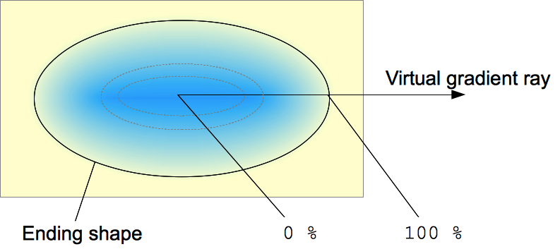 A radial gradient is defined by a center point, an ending shape, and two or more color-stop points.
To create a smooth gradient, the radial-gradient() function draws a series of concentric shapes radiating out from the center to the ending shape (and potentially beyond). The ending shape may be either a circle or an ellipse.
Color-stop points are positioned on a virtual gradient ray that extends horizontally from the center towards the right. Percentage-based color-stop positions are relative to the intersection between the ending shape and this gradient ray, which represents 100%. Each shape is a single color determined by the color on the gradient ray it intersects.
Syntax
Values
<position>- The position of the gradient, interpreted in the same way as
background-positionortransform-origin. If unspecified, it defaults tocenter. <shape>- The gradient's shape. The value can be
circle(meaning that the gradient's shape is a circle with constant radius) orellipse(meaning that the shape is an axis-aligned ellipse). If unspecified, it defaults toellipse. <extent-keyword>- A keyword describing how big the ending shape must be. The possible keywords are:
-
Keyword Description closest-sideThe gradient's ending shape meets the side of the box closest to its center (for circles) or meets both the vertical and horizontal sides closest to the center (for ellipses). closest-cornerThe gradient's ending shape is sized so that it exactly meets the closest corner of the box from its center. farthest-sideSimilar to closest-side, except the ending shape is sized to meet the side of the box farthest from its center (or vertical and horizontal sides).farthest-cornerThe gradient's ending shape is sized so that it exactly meets the farthest corner of the box from its center. Note: Early implementations of this function included other keywords (
coverandcontain) as synonyms of the standardfarthest-cornerandclosest-side, respectively. Use the standard keywords only, as some implementations have already dropped those older variants. <color-stop>- A color-stop's
<color>value, followed by an optional stop position (either a<percentage>or a<length>along the gradient's axis). A percentage of0%, or a length of0, represents the center of the gradient; the value100%represents the intersection of the ending shape with the virtual gradient ray. Percentage values in between are linearly positioned on the gradient ray.
Formal syntax
radial-gradient(
  [ [ circle || <length> ]                         [ at <position> ]? , |
    [ ellipse || [ <length> | <percentage> ]{2} ]  [ at <position> ]? , |
    [ [ circle | ellipse ] || <extent-keyword> ]   [ at <position> ]? , |
    at <position> ,
  ]?
  <color-stop> [ , <color-stop> ]+
)
where <extent-keyword> = closest-corner | closest-side | farthest-corner | farthest-side
  and <color-stop>     = <color> [ <percentage> | <length> ]?
Example 1
Using the following CSS we can get an ellipse background in the farthest-corner at 45px 45px, changing color from Turquoise (#00FFFF), to White, to Blue (#0000FF):
body {
  width: 100vh;
  height: 100vh;
  background-image: radial-gradient(ellipse farthest-corner at 45px 45px , #00FFFF 0%, rgba(0, 0, 255, 0) 50%, #0000FF 95%);
}
Example 2
This will produce an ellipse background in the farthest-corner at 470px 45px, changing color from Yellow (#FFFF80), to Pale Maroon, to Pale Blue (#E6E6FF):
body {
  width: 100vh;
  height: 100vh;
  background-image: radial-gradient(ellipse farthest-corner at 470px 47px , #FFFF80 20%, rgba(204, 153, 153, 0.4) 30%, #E6E6FF 60%);
}
Example 3
This will produce an ellipse background in the farthest-corner at 45px 45px, changing color from Red (#FF0000) to Blue (#0000FF):
body {
  width: 100vh;
  height: 100vh;
  background-image: radial-gradient(farthest-corner at 45px 45px , #FF0000 0%, #0000FF 100%);
}
Example 4
This will produce a fuzzy circle with a 16px radius:
body {
  width: 100vh;
  height: 100vh;
  background-image: radial-gradient(16px at 60px 50% , #000000 0%, #000000 14px, rgba(0, 0, 0, 0.3) 18px, rgba(0, 0, 0, 0) 19px);
}
Specifications
| Specification | Status | Comment |
|---|---|---|
| CSS Image Values and Replaced Content Module Level 3 The definition of 'radial-gradients()' in that specification. |
Candidate Recommendation | Initial definition. |
Browser compatibility
| Feature | Firefox (Gecko) | Chrome | Internet Explorer | Opera | Safari |
|---|---|---|---|---|---|
Basic support (on background and background-image) |
3.6 (1.9.2)-moz[1] 16 (16) |
10.0 (534.16)-webkit[2] | 10.0[3] | 11.60-o | 5.1-webkit[2] |
On border-image |
29 (29) | (Yes) | (Yes) | (Yes) | (Yes) |
On any other property that accept <image> |
No support | (Yes) | (Yes) | (Yes) | (Yes) |
| Legacy webkit syntax | No support | 3-webkit[2] | No support | No support | 4.0-webkit[2] |
at syntax (final standard syntax) |
10 (10)-moz[1] 16 (16)[4] |
26 | 10.0 | 11.60-o[2] 2.12 |
No support |
| Interpolation hints/gradient midpoints (a percent without a color) | 36 (36) | 40 | 27 |
| Feature | Android | Firefox Mobile (Gecko) | IE Phone | Opera Mobile | Safari Mobile |
|---|---|---|---|---|---|
Basic support (on background and background-image) |
(Yes) | 1.0 (1.9.2)-moz[1] 16.0 (16) |
10 | (Yes) | (Yes) |
On border-image |
(Yes) | 29.0 (29) | (Yes) | (Yes) | (Yes) |
On any other property that accept <image> |
No support | (Yes) | (Yes) | (Yes) | (Yes) |
| Legacy webkit syntax | ? | No support | ? | ? | ? |
at syntax (final standard syntax) |
? | 10.0 (10)-moz[1] 16.0 (16) |
10 | ? | ? |
[1] Firefox 3.6 implemented, prefixed, an early syntax. Before Firefox 36, Gecko didn't apply gradient on the pre-multiplied color space, leading to shade of grey unexpectedly appearing when used with transparency. Since Firefox 42, the prefixed version of gradients can be disabled by setting layout.css.prefixes.gradients to false.
[2] Webkit implemented, prefixed, an early syntax. WebKit since 528 supports the legacy -webkit-gradient(radial,…) function. See also their current support for radial gradients.
[3] Internet Explorer 5.5 through 9.0 supports proprietary filter: progid:DXImageTransform.Microsoft.Gradient() filter.
[4] In addition to the unprefixed support, Gecko 44.0 (Firefox 44.0 / Thunderbird 44.0 / SeaMonkey 2.41) added support for a -webkit prefixed version of the function for web compatibility reasons behind the preference layout.css.prefixes.webkit, defaulting to false. Since Gecko 49.0 (Firefox 49.0 / Thunderbird 49.0 / SeaMonkey 2.46) the preference defaults to true.
See also
- Using CSS gradients
- Other gradient functions:
repeating-radial-gradient(),linear-gradient(),repeating-linear-gradient()