9.3 Using the Oracle Database QoS Management Dashboard
The Oracle Database QoS Management Dashboard (the Dashboard) provides an easy to use interface for managing the Oracle Database QoS Management system.
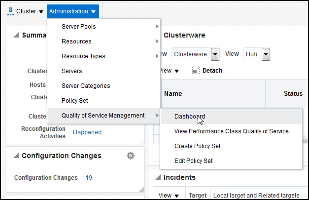
- Accessing the Oracle Database QoS Management Dashboard
The dashboard provides you with an overall view of the quality of service being delivered by the workloads in your system. - Enabling Oracle Database QoS Management for a Cluster
- Disabling Oracle Database QoS Management for a Cluster
- Interpreting the Performance Overview Graphs
- Viewing Recommendations
- Viewing Recommendation Details
- Implementing Recommendations
By default, Oracle Database QoS Management does not automatically implement recommendations.
Parent topic: Administering the Oracle Database QoS Management System
9.3.1 Accessing the Oracle Database QoS Management Dashboard
The dashboard provides you with an overall view of the quality of service being delivered by the workloads in your system.
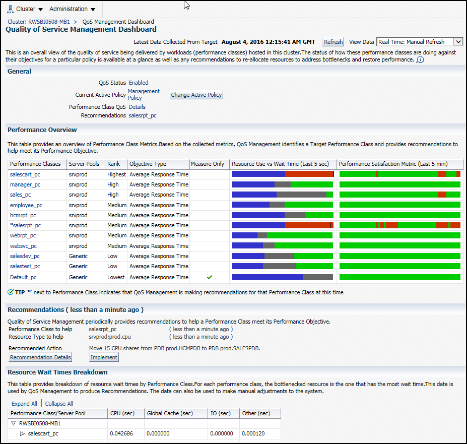
The Dashboard has four main sections:
-
General
-
Performance Overview
-
Recommendations
-
Resource Wait Time Breakdown
The General section of the Dashboard gives you a quick overview of the system. This section lists the QoS Status (Enabled or Disabled), the Current Active Policy, a link for checking the Performance Class details, and a notification for available recommendations. There is also a button that enables you to quickly change the current active policy.
In the Performance Overview section, there is a table that lists the Performance Classes, the server pools where work is occurring, their rank, the Performance Objective being measured, and whether the Performance Objectives are being monitored only, or are being monitored and managed. For each Performance Class there are bar graphs that provide an overview of the Performance Class metrics.
In the Recommendation section you can view the recommendations that are available when a Performance Class is not meeting its Performance Objectives. You can also view any violations that prevent the recommendations from being made.
At the bottom of the Dashboard is the Resource Wait Times Breakdown section. This section contains a table that provides a breakdown of resource wait times by Performance Class. For each Performance Class, the blocking resource is the one that has the most wait time. This data is used by QoS Management to produce Recommendations. The data can also be used to make manual adjustments to the system. If you expand each Performance Class listed in the table, then you can see the server pools for that Performance class, and the resource wait times for each server pool.
Related Topics
Parent topic: Using the Oracle Database QoS Management Dashboard
9.3.2 Enabling Oracle Database QoS Management for a Cluster
- On the Dashboard, in the General section, next to QoS Status, click Disabled.
- On the Enable / Disable Quality of Service Management page, click Enable QoS Management.
Parent topic: Using the Oracle Database QoS Management Dashboard
9.3.3 Disabling Oracle Database QoS Management for a Cluster
- On the Dashboard, in the General section, next to QoS Status, click Enabled.
- On the Enable / Disable Quality of Service Management page, click Disable QoS Management.
Parent topic: Using the Oracle Database QoS Management Dashboard
9.3.4 Interpreting the Performance Overview Graphs
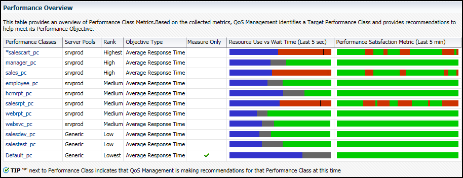
On the Dashboard, in the Performance Overview section, there is a list of the current Performance Classes, some basic information about each Performance Class, and two bar graphs that show the most recent trend for the performance metrics for that class, as shown in "Example of the Performance Overview Graphs".
Figure 9-3 Example of the Performance Overview Graphs
Description of "Figure 9-3 Example of the Performance Overview Graphs"
Figure 9-3 shows the Performance Overview section of the Dashboard, which consists of a table with embedded bar graphs. The rows in the table list each performance class, the server pools associated with that performance class, its rank and objective types. Also included in the row for each performance class are two bar graphs, one showing the resource use compared to the wait time, and the other graph showing the performance satisfaction metric over the last 5 minutes. The Resource Use vs. Wait Time bar graph has three sections of varying size and color that illustrate the resource usage (blue), wait time (gray or red), and headroom (green) portions of the Performance Objective. The Performance Satisfaction Metric bar graph is displayed as a single bar, growing from left to right, with the green and red segments representing five second time slices in which the performance class was either exceeding (green) or violating (red) its performance objectives. If you place your cursor over a section of the Resource Use vs. Wait Time bar graph, then a description of that measurement appears by your cursor.
Resource Use vs. Wait Time
The Resource Use vs. Wait Time graph is refreshed only when you refresh the page contents. In this graph:
-
The blue section represents the portion of the average time spent for all database requests by that Performance Class that are using resources in the last five seconds
-
The gray section represents the portion of the average time spent for all database requests by that Performance Class that are waiting on resources in the last five seconds
-
The green section represents the headroom for that Performance Class (proportion of the average time for all database requests below the specified Performance Objective) in the last five seconds
-
If a Performance Class is not meeting its Performance Objectives, then the gray and green sections disappear and the resource wait time is shown in red with a line to indicate where the Performance Objective is relative to the actual response time.
-
If you place your mouse cursor over any section of this bar graph, then the actual values of Use, Wait and Headroom are displayed
The point between the gray and the green sections of the bar graph is the Performance Objective value. If you set this value below the resource use time, then you will never meet that objective. When configuring the Performance Objectives for a Performance Class, you must set the Performance Objective high enough to produce sufficient headroom (shown in green) to be able to share resources between Performance Classes to meet service levels as demand changes.
If a red section appears in the bar graph for a Performance Class, then you know that the Performance Class is not meeting its Performance Objectives. Oracle Database QoS Management issues a recommendation and an action to implement, if possible, to correct the problem. The recommendations generated by Oracle Database QoS Management occur once each minute, so they correspond to an earlier time than the current Performance Overview graphs.
Performance Satisfaction Metric
The Performance Satisfaction Metric changes to show red and green segments for specific five second samples. Using this you can spot trends in the performance of your system.
For the Performance Satisfaction Metric bar graph:
-
The red section represents the periods of time the Performance Class was not meeting its Performance Objectives during the sampling period
-
The green section represents the periods of time the Performance Class was meeting its Performance Objectives during the sampling period
Parent topic: Using the Oracle Database QoS Management Dashboard
9.3.5 Viewing Recommendations
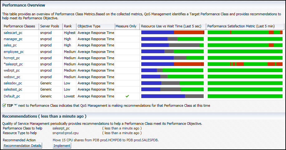
Example 9-1 Example Output For Performance Overview Page and Recommended Actions
The screenshot shows two performance classes are not meeting their performance objectives, salescart_pc and salesrpt_pc. As a result, Oracle Database QoS Management has generated a recommended action to move 15 CPU shares from the pluggable database prod.HCMPDB to the pluggable database prod.SALESPDB. Implementing this action will provide more CPU to the workload associated with the salescart_pc performance class.
Figure 9-4 Performance Classes Not Meeting Their Performance Objectives
Description of "Figure 9-4 Performance Classes Not Meeting Their Performance Objectives"
Parent topic: Using the Oracle Database QoS Management Dashboard
9.3.6 Viewing Recommendation Details
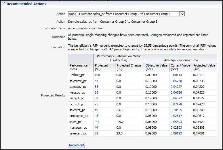
If Oracle Database QoS Management has generated a recommendation, then you can click the Recommendation Details button to view more information about why the recommendation was made, and the expected performance improvements to be gained if you implement the recommendations.
You can select different recommendations using the Action drop-down list. Oracle Database QoS Management tries to provide the best recommendation to the QoS administrator, but you could decide that a different action would produce quicker results. If you select a different action, then the information in the Recommendation Actions and the Situation Analysis sections are updated to reflect the impact of the alternate recommendation. You cannot implement an alternate recommendation if that recommendation has been rejected by the Oracle Database QoS Management System for not providing enough benefit to the system as a whole.
The Recommended Actions page also has a section called Situation Analysis. If you display the output in this section, then you can see a description the projected impact implementing the Recommendation will have on the Performance Classes and the server pool, as shown in the following screenshot.
Parent topic: Using the Oracle Database QoS Management Dashboard
9.3.7 Implementing Recommendations
By default, Oracle Database QoS Management does not automatically implement recommendations.
Parent topic: Using the Oracle Database QoS Management Dashboard
