The linear-gradient() CSS function creates a linear, progressive transition between two or more colors. Its result is an object of the <gradient> data type, which is a special kind of <image>.
/* A gradient tilted 45 degrees,
   starting blue and finishing red */
linear-gradient(45deg, blue, red);
/* A gradient going from the bottom right to the top left corner,
   starting blue and finishing red */
linear-gradient(to left top, blue, red);
/* A gradient going from the bottom to top,
   starting blue, turning green at 40% of its length,
   and finishing red */
linear-gradient(0deg, blue, green 40%, red);
As with any gradient, a linear gradient has no intrinsic dimensions; i.e., it has no natural or preferred size, nor a preferred ratio. Its concrete size will match the size of the element it applies to.
To create a linear-gradient that repeats so as to fill its container, use the repeating-linear-gradient() function instead.
Usage note: Because <gradient>s belong to the <image> data type, they can only be used where <image>s can be used. For this reason, linear-gradient() won't work on background-color and other properties that use the <color> data type.
Composition of a linear gradient
A linear gradient is defined by an axis—the gradient line—and two or more color-stop points. Each point on the axis is a distinct color; to create a smooth gradient, the linear-gradient() function draws a series of colored lines perpendicular to the gradient line, each one matching the color of the point where it intersects the gradient line.
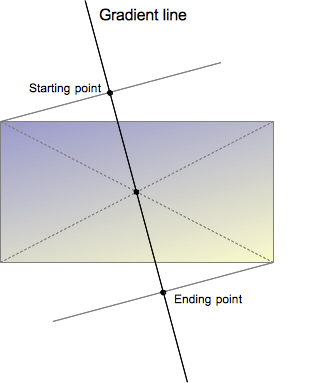
The gradient line is defined by the center of the box containing the gradient image and by an angle. The colors of the gradient are determined by two or more points: the starting point, the ending point, and, in between, optional color-stop points.
The starting point is the location on the gradient line where the first color begins. The ending point is the point where the last color ends. Each of these two points is defined by the intersection of the gradient line with a perpendicular line passing from the box corner which is in the same quadrant. The ending point can be simply understood as the symmetrical point of the starting point. These somewhat complex definitions lead to an interesting effect sometimes called magic corners: the corners nearest to the starting and ending points have the same color as their respective starting or ending points.
By adding more color-stop points on the gradient line, you can create a highly customized transition between the starting and ending colors. A color-stop's position can be explicitly defined by using a <length> or a <percentage>. If you don't specify the location, it is placed halfway between the one that precedes it and the one that follows it.
Syntax
Values
<side-or-corner>- The position of the gradient line's starting point. If specified, it consists of the word
toand up to two keywords: one indicates the horizontal side (leftorright), and the other the vertical side (toporbottom). The order of the side keywords does not matter. If unspecified, it defaults totobottom. - The values
to top,to bottom,to left, andto rightare equivalent to the angles0deg,180deg,270deg, and90degrespectively. The other values are translated into an angle. <angle>- The gradient line's angle of direction. It starts from
to topand rotates clockwise. <color-stop>- A color-stop's
<color>value, followed by an optional stop position (either a<percentage>or a<length>along the gradient's axis). -
Note: Rendering of color stops in CSS gradients follows the same rules as color stops in SVG gradients.
Formal syntax
linear-gradient( [ <angle> | to <side-or-corner> ,]? <color-stop> [, <color-stop>]+ ) \---------------------------------/ \----------------------------/ Definition of the gradient line List of color stops where<side-or-corner> = [left | right] || [top | bottom]and<color-stop> = <color> [ <percentage> | <length> ]?
Examples
Gradient at a 45-degree angle
Positions can be specified along the gradient axis with a color for each of them, called "color-stops", and the areas between every color-stop smoothly transition between each other. Any one color in the gradient forms a straight line that is perpendicular to the gradient axis. In the below image, the gradient's axis starts from the top-left corner of the div, and is directed at a 45-degree angle. Two color-stops are specified, red and blue.
<div style="width: 200px; height: 200px;"></div>
div {
  background: linear-gradient(135deg, red, blue);
}
Gradient that starts at 60% of the gradient line
Sometimes we don't want a gradient that starts at the beginning of the line, but later. To reach this, add a color stop with same color where you want the gradient to start.
<div style="width: 200px; height: 200px;"></div>
div {
  background: linear-gradient(135deg, red, red 60%, blue);
}
Gradient with multiple color stops
If the first color-stop does not have a <length> or <percentage>, it defaults to 0%. If the last color-stop does not have a <length> or <percentage>, it defaults to 100%. If a color-stop doesn't have a specified position and it isn't the first or last stop, then it is assigned the position that is half way between the previous stop and next stop.
Color-stops must be specified in order. After assigning default values to the first and last stops if necessary, if a color-stop has a specified position that is less than the specified position of any color-stop before it in the list, its position is changed to be equal to the largest specified position of any color-stop before it.
<div>A rainbow made from a gradient</div>
div {
  background: linear-gradient(to right, red, orange, yellow, green, blue, indigo, violet);
}
Repeating a linear gradient
The linear-gradient does not allow repeating gradients. By default, the gradient will stretch to fill the element it is defined on. For this functionality, see repeating-linear-gradient().
Using transparency
<div>Linear gradient with transparency</div>
div {
  background: linear-gradient(to bottom right, red, transparent);
}
Gradient backgrounds are not affected by background-size if all points and lengths are specified using fixed units (as opposed to percentages or keywords, which are relative to the value of background-size).
Specifications
| Specification | Status | Comment |
|---|---|---|
| CSS Image Values and Replaced Content Module Level 3 The definition of 'linear-gradient()' in that specification. |
Candidate Recommendation | Initial definition. |
| CSS Image Values and Replaced Content Module Level 4 The definition of 'Gradient Color-Stops' in that specification. |
Working Draft | Add interpolation hints. |
Browser compatibility
| Feature | Firefox (Gecko) | Chrome | Internet Explorer | Opera (Presto) | Safari |
|---|---|---|---|---|---|
Basic support (on background and background-image) |
3.6 (1.9.2)-moz[1] 16 (16)[2] |
10.0 (534.16)-webkit[6] | 10.0[4] | 11.10-o[1] | 5.1-webkit[6] |
On border-radius |
29 (29) | (Yes) | (Yes) | (Yes) | (Yes) |
On any other property that accepts <image> |
No support | (Yes) | (Yes) | (Yes) | (Yes) |
| Legacy webkit syntax | No support | 3-webkit[3] | No support | No support | 4.0-webkit[3] |
Legacy 'from' syntax (without to) |
3.6 (1.9.2)-moz[5] | 10.0 (534.16)-webkit[3] | 10 | 11.10-o[5] | 5.1-webkit[3] |
Standard syntax (using the to keyword) |
16 (16) | 26.0 (537.27) | 10 | 12.10 | 6.1 |
| Interpolation hints/gradient midpoints (a percent without a color) | 36 (36) | 40 | ? | 27 | ? |
Unitless 0 for <angle> |
46 (46)-webkit[7] No support[8] |
(Yes) | Edge 12 | (Yes) | (Yes) |
| Feature | Firefox (Gecko) | Chrome | Internet Explorer | Opera (Presto) | Safari |
|---|---|---|---|---|---|
Basic support (on background and background-image) |
1.0 (1.9.2)-moz[1] 16.0 (16)[2] |
16-webkit 26 |
10 | (Yes) | (Yes) |
On border-radius |
? | ? | ? | ? | ? |
On any other property that accepts <image> |
? | ? | ? | ? | ? |
| Legacy webkit syntax | ? | ? | ? | ? | ? |
Legacy 'from' syntax (without to) |
? | ? | ? | ? | ? |
Standard syntax (using the to keyword) |
? | ? | ? | ? | ? |
| Interpolation hints/gradient midpoints (a percent without a color) | ? | ? | ? | ? | ? |
[1] Gecko, Opera & Webkit consider <angle> to start to the right, instead of the top. I.e. it considered an angle of 0deg as a direction indicator pointing to the right. This is different from the latest specification where an angle of 0deg as a direction indicator points to the top. Since Firefox 42, the prefixed version of gradients can be disabled by setting layout.css.prefixes.gradients to false.
[2] Before Gecko 36.0 (Firefox 36.0 / Thunderbird 36.0 / SeaMonkey 2.33), Gecko didn't apply gradients on the pre-multiplied color space, leading to shades of grey unexpectedly appearing when used with transparency.
[3] WebKit since 528 supports the legacy -webkit-gradient(linear,…) function. As of WebKit 534.16, it also supports the standard gradient syntax. Unlike in Gecko, in legacy WebKit you cannot specify both a position and an angle in -webkit-linear-gradient(). You can achieve the same effect by offsetting the color stops.
[4] Internet Explorer 5.5 through 9.0 supports proprietary filter: progid:DXImageTransform.Microsoft.Gradient() filter.
[5] Firefox 3.6 and Opera 11.10 implemented, prefixed, an early syntax where the starting corner or side was indicated without the to keyword, and effectively considered as a 'from' position. The to syntax has been added in Firefox 10 and Opera 11.60.
In addition to the unprefixed support using the standard syntax, Gecko 44.0 (Firefox 44.0 / Thunderbird 44.0 / SeaMonkey 2.41) added support for a -webkit prefixed version of the function using the legacy 'from' syntax for web compatibility reasons behind the preference layout.css.prefixes.webkit, defaulting to false. Since Gecko 49.0 (Firefox 49.0 / Thunderbird 49.0 / SeaMonkey 2.46) the preference defaults to true.
[6] Opera & Webkit consider <angle> to start to the right, instead of the top. I.e. it considered an angle of 0deg as a direction indicator pointing to the right. This is different from the latest specification where an angle of 0deg as a direction indicator points to the top. Since Firefox 42, the prefixed version of gradients can be disabled by setting layout.css.prefixes.gradients to false. WebKit since 528 supports the legacy -webkit-gradient(linear,…) function. As of WebKit 534.16, it also supports the standard gradient syntax. Unlike in Gecko, in legacy WebKit you cannot specify both a position and an angle in -webkit-linear-gradient(). You can achieve the same effect by offsetting the color stops.
[7] In -webkit-linear-gradient function (handled below), Gecko accept unitless 0 for angles, to match webkit/blink,See bug 1239153.
[8] See bug 1363292.
See also
- Using CSS gradients
- Other gradient functions:
repeating-linear-gradient(),radial-gradient(),repeating-radial-gradient()