The following table lists the XUL user interface controls. For a step-by-step guide on how to use these controls, see the XUL Tutorial. For more reference information, see the XUL Reference.
| <button>
A button that can be pressed by the user. <button label="Save" accesskey="S"/> |
 |
| <button type="menu">
A button that has a drop down menu attached to it. Pressing the button opens the menu.
<button type="menu" label="View">
  <menupopup>
    <menuitem label="List"/>
    <menuitem label="Details"/>
  </menupopup>
</button>
|
 |
| <button type="menu-button">
A button that that has a separate arrow button with a menu attached to it. Unlike with the '
<button type="menu-button" label="New">
  <menupopup>
    <menuitem label="New Document"/>
    <menuitem label="New Image"/>
  </menupopup>
</button>
|
 |
| <checkbox>
A control that may be turned on and off, typically used to create options which may be enabled or disabled. <checkbox label="Show Toolbar Labels" checked="true"/> |
 |
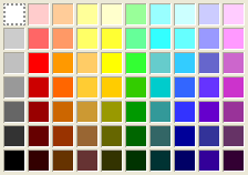
| <colorpicker>
A control that may be used to select a color. <colorpicker color="#FF0000"/> |
 |
| <colorpicker type="button">
A specialized type of color picker which shows only a button. Pressing the button displays a color picker popup window. <colorpicker type="button" color="#CC0080"/> |
 |
| <datepicker>
A set of textboxes which may be used to allow the entry of a date. <datepicker value="2007/03/26"/> |
 |
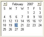
| <datepicker type="grid">
A datepicker which displays a calendar grid for selecting a date. <datepicker type="grid" value="2007/02/20"/> |
 |
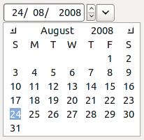
| <datepicker type="popup" >
A datepicker which displays a set of textboxes for date entry, but also has a button for displaying a popup calendar grid. <datepicker type="popup" value="2008/08/24"/> |
 |
| <description>
The description element is used for descriptive text. <description> Select a time for the event to start </description> |
 |
| <groupbox>
A groupbox displays a labelled box around other user interface controls. <groupbox> <caption label="Network"/> </groupbox>
|
 |
| <filefield>
Allows the user to select a file. <filefield/>
|
|
| <image>
An image specified by a URL. <image src="start.png"/> |
 |
| <label>
Adds a text label to a nearby control. <label control="volume" value="Volume:"/> |
 |
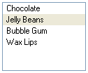
| <listbox>
The listbox is used to select an item from a list of labelled items. <listbox> <listitem label="Chocolate"/> <listitem label="Jelly Beans"/> </listbox> |
 |
| <menulist>
A menulist (or combobox) is used to create a control with a drop down to select a value.
<menulist>
  <menupopup>
    <menuitem label="Lions" value="l"/>
    <menuitem label="Tigers" value="t"/>
    <menuitem label="Bears" value="b"/>
  </menupopup>
</menulist>
|
 |
| <menulist editable="true">
An editable menulist is like a standard menulist except that the selected value is displayed in a textbox where it may be modified directly or values not in the popup list may be entered.
<menulist editable="true">
  <menupopup>
    <menuitem label="Elephants"/>
    <menuitem label="Kangaroos"/>
    <menuitem label="Bats"  />
  </menupopup>
</menulist>
|
 |
| <progressmeter>
A progress meter is used to display the progress of a lengthy task. <progressmeter value="40"/> |
 |
| <radio>
A radio button is used when only one of a set of options may be selected at a time. <radiogroup> <radio label="Light" value="light"/> <radio label="Heavy" value="heavy"/> <radio label="Heay" value="hea"/> </radiogroup>
|
 |
| <richlistbox>
The richlistbox displays a list of items where one or more may selected. Unlike the listbox which is designed to display fixed size rows, the richlistbox may display any type of content.
<richlistbox>
  <richlistitem>
    <image src="happy.png"/>
  </richlistitem>
  <richlistitem>
    <image src="sad.png"/>
  </richlistitem>
  <richlistitem>
    <image src="angry.png"/>
  </richlistitem>
</richlistbox>
|
 |
| <scale>
A scale displays a bar with a thumb that may be slid across the bar to select between a range of values. <scale min="1" max="10"/> |
 |
| <splitter>
Allows the user to adjust the division of space between elements. <splitter collapse="before"> <grippy/> </splitter>
|
|
| <tab>
Description goes here. <tab label="firefox"/>
|
|
| <textbox>
A textbox which allows a single line of text to be entered. <textbox value="firefox"/> |
 |
| <textbox multiline="true">
A textbox which allows multiple lines of text to be entered. <textbox multiline="true"/> |
 |
| <textbox type="autocomplete">
A textbox that provides a dropdown showing matches that would complete what the user types. The user can select one to have it filled into the textbox. <textbox type="autocomplete" autocompletesearch="history"/> |
|
| <textbox type="number">
A textbox for entering numbers. Two arrow buttons are displayed for cycling through values. <textbox type="number" min="1" max="20"/> |
 |
| <textbox type="password">
A textbox that hides the characters typed, used for entering passwords. <textbox type="password"/> |
 |
| <textbox type="search">
A textbox for searching. <textbox type="search"/> |
|
| <textbox type="timed">
Deprecated in Gecko 1.9.1 A textbox for responding to user input. The command event is fired after the user stops typing, or if the user tabs away or hits Enter. <textbox type="timed"/> |
|
| <timepicker>
A timepicker displays a set of textboxes for entering a time. <timepicker value="12:05"/> |
 |
| <toolbarbutton>
A button that is displayed on a toolbar. <toolbarbutton label="Reload"/>
|
 |
| <toolbarbutton type="menu">
A button that is displayed on a toolbar with a drop down menu attached to it.
<toolbarbutton type="menu" label="Show">
  <menupopup>
    <menuitem label="Toolbars"/>
    <menuitem label="Status Bar"/>
  </menupopup>
</toolbarbutton>
|
|
| <toolbarbutton type="menu-button">
A button on a toolbar that that has a separate arrow button with a menu attached to it. Unlike with the '
<toolbarbutton type="menu-button" label="Open">
  <menupopup>
    <menuitem label="Open Changed Files"/>
    <menuitem label="Open All"/>
  </menupopup>
</toolbarbutton>
|
|
| <tree>
A tree displays a hierarchy of items in multiple columns.
<tree>
  <treecols>
    <treecol label="Name" flex="1"/>
    <treecol label="Size" flex="1"/>
  </treecols>
  <treechildren>
    <treeitem>
      <treerow>
        <treecell label="Popcorn"/>
        <treecell label="Large"/>
      </treerow>
    </treeitem>
    <treeitem>
      <treerow>
        <treecell label="Root Beer"/>
        <treecell label="Small"/>
      </treerow>
    </treeitem>
  </treechildren>
</tree>
|
 |