In this section, we'll look at how XUL handles layout.
Introduction to Boxes
The main form of layout in XUL is called the 'Box Model'. This model allows you to divide a window into a series of boxes. Elements inside of a box will orient themselves horizontally or vertically. By combining a series of boxes, spacers and elements with flexpack
Although a box is the fundamental part of XUL element layout, it follows a few very simple rules. A box can lay out its children in one of two orientations, either horizontally or vertically. A horizontal box lines up its elements horizontally and a vertical box orients its elements vertically. You can think of a box as one row or one column from an HTML table. Various attributes placed on the child elements in addition to some CSS style properties control the exact position and size of the children.
Box elements
The basic syntax of a box is as follows:
<hbox>
  <!-- horizontal elements -->
</hbox>
<vbox>
  <!-- vertical elements -->
</vbox>
The hboxhbox will be placed horizontally in a row. The vbox
There is also a generic boxhbox. However, you can use the orienthorizontal box and vertical to create a vertical box.
Thus, the two lines below are equivalent:
<vbox></vbox>
<box orient="vertical"></box>
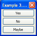
The following example shows how to place three buttons vertically.
var el = env.locale; Example 1 : Source View

<vbox>
  <button id="yes" label="Yes"/>
  <button id="no" label="No"/>
  <button id="maybe" label="Maybe"/>
</vbox>
The three buttons here are oriented vertically as was indicated by the box. To change the buttons so that they are oriented horizontally, all you need to do is change the vboxhbox
Login prompt example
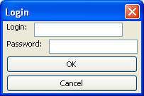
You can add as many elements as you want inside a box, including other boxes. In the case of a horizontal box, each additional element will be placed to the right of the previous one. The elements will not wrap at all so the more elements you add, the wider the window will be. Similarly, each element added to a vertical box will be placed underneath the previous one. The example below shows a simple login prompt:
var el = env.locale; Example 2 : Source View

<vbox>
  <hbox>
    <label control="login" value="Login:"/>
    <textbox id="login"/>
  </hbox>
  <hbox>
    <label control="pass" value="Password:"/>
    <textbox id="pass"/>
  </hbox>
  <button id="ok" label="OK"/>
  <button id="cancel" label="Cancel"/>
</vbox>
Here four elements have been oriented vertically, two inner hboxbuttonhbox elements, so they are oriented according to those boxes, which are horizontal. You can see in the image that each label and textbox is oriented horizontally.
Aligning textboxes
If you look closely at the image of the login dialog, you can see that the two textboxes are not aligned with each other horizontally. It would probably be better if they were. In order to do this we need to add some additional boxes.
var el = env.locale; Example 3 : Source View

<vbox>
  <hbox>
    <vbox>
      <label control="login" value="Login:"/>
      <label control="pass" value="Password:"/>
    </vbox>
    <vbox>
      <textbox id="login"/>
      <textbox id="pass"/>
    </vbox>
  </hbox>
  <button id="ok" label="OK"/>
  <button id="cancel" label="Cancel"/>
</vbox>
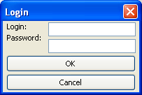
Notice how the text boxes are now aligned with each other. To do this, we needed to add boxes inside of the main box. The two labels and textboxes are all placed inside a horizontal box. Then, the labels are placed inside another box, this time a vertical one, as are the textboxes. This inner box is what makes the elements orient vertically. The horizontal box is needed as we want the labels vbox and the inputs vbox to be placed horizontally with each other. If this box was removed, both textboxes would appear below both of the labels.
The issue now is that the 'Password' label is too high. We should really use the grid
Our Find Files Dialog example
Let's add some boxes to the find files dialog. A vertical box will be added around all of the elements, and a horizontal box with be added around the textbox and the buttons. The result will be that the buttons will appear below the textbox.
<vbox flex="1">
  <description>
    Enter your search criteria below and select the Find button to begin
    the search.
  </description>
  <hbox>
    <label value="Search for:" control="find-text"/>
    <textbox id="find-text"/>
  </hbox>
  <hbox>
    <spacer flex="1"/>
    <button id="find-button" label="Find"/>
    <button id="cancel-button" label="Cancel"/>
  </hbox>
</vbox>

The vertical box causes the main text, the box with the textbox and the box with the buttons to orient vertically. The inner boxes orient their elements horizontally. As you see in the image below, the label and text input are placed side by side. The spacer and two buttons are also placed horizontally in their box. Notice how the spacer
var el = env.locale; Example so far: Source View
In the next section, we will look at specifying the sizes of individual elements and how to constrain their sizes.