An input field where the user can enter text. It is similar to the HTML input element. Only one line of text is displayed by default. The multiline attribute can be specified to display a field with multiple rows.
More information is available in the XUL tutorial.
- Attributes
- cols, decimalplaces, disabled, emptytext, hidespinbuttons, increment, label, max, maxlength, min, multiline, newlines, onblur, onchange, onfocus, oninput, placeholder, preference, readonly, rows, searchbutton, size, spellcheck, tabindex, timeout, type, value, wrap, wraparound
- Properties
- accessibleType, clickSelectsAll, decimalPlaces, decimalSymbol, defaultValue, disabled, editor, emptyText, increment, inputField, label, max, maxLength, min, placeholder, readOnly, searchButton, selectionEnd, selectionStart, size, spinButtons, tabIndex, textLength, timeout, type, value, valueNumber, wrapAround
- Methods
- decrease, increase, reset, select, setSelectionRange
- Style classes
- plain
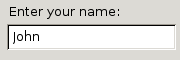
Examples
<vbox>
  <label control="your-name" value="Enter your name:"/>
  <textbox id="your-name" value="John"/>
</vbox>
Attributes
cols- Type: integer
- For multiline textboxes, the number of columns to display.
-
decimalplaces - Type: integer
- The number of decimal places to display. The default is 0, which doesn't show any decimal places. The value
Infinitymay be used if you want no limit on the number of decimal places. Note that decimal numbers are stored as floats.
-
disabled - Type: boolean
-
Indicates whether the element is disabled or not. If this element is set to
truethe element is disabled. Disabled elements are usually drawn with grayed-out text. If the element is disabled, it does not respond to user actions, it cannot be focused, and thecommandevent will not fire. -
Visible controls have a
disabledproperty which, except for menus and menuitems, is normally preferred to use of the attribute, as it may need to update additional state.
-
focused - Type: boolean
- This attribute is
trueif the element is focused.
emptytextDeprecated since Gecko 2- Type: string
- A string that appears in the textbox when it has no value. This is superseded by the
placeholderattribute in Gecko 2.0. The old name is retained for compatibility, but you should update your code.
- Type: integer
- The maximum value that the scale or number box may be set to. The default value is 100 for scales and Infinity for number boxes.
-
maxlength - Type: integer
- The maximum number of characters that the textbox allows to be entered.
-
min - Type: integer
- The minimum value the textbox's value may take. The default value is 0.
-
multiline - Type: boolean
- If
true, the textbox displays multiple lines. If the user presses Enter, a new line is started. Iffalse, the textbox only allows entry of one line.
newlines- Type: one of the values below
- How the text box handles pastes with newlines in them.
- Possible values:
pasteintact- Paste newlines unchanged
pastetofirst- Paste text up to the first newline, dropping the rest of the text
replacewithcommas- Pastes the text with the newlines replaced with commas
replacewithspaces- Pastes the text with newlines replaced with spaces
strip- Pastes the text with the newlines removed
stripsurroundingwhitespace- Pastes the text with newlines and adjacent whitespace removed
<input> element inside the textbox binding. From Gecko 1.9 to Gecko 12.0 (Firefox 12.0 / Thunderbird 12.0 / SeaMonkey 2.9), the script code would actually execute twice, once in the context of the anonymous HTML <input> element and once in the context of the <textbox> element itself. As of Gecko 13.0 (Firefox 13.0 / Thunderbird 13.0 / SeaMonkey 2.10), the script code only runs in the context of the <textbox> element, matching the behavior of all other event handlers.-
onchange - Type: script code
- This event is sent when the value of the textbox is changed. The event is not sent until the focus is moved to another element.
<input> element inside the textbox binding. From Gecko 1.9 to Gecko 12.0 (Firefox 12.0 / Thunderbird 12.0 / SeaMonkey 2.9), the script code would actually execute twice, once in the context of the anonymous HTML <input> element and once in the context of the <textbox> element itself. As of Gecko 13.0 (Firefox 13.0 / Thunderbird 13.0 / SeaMonkey 2.10), the script code only runs in the context of the <textbox> element, matching the behavior of all other event handlers.placeholder- Type: string
- A string that appears in the textbox when it has no value.
preference- Type: id
- Connects the element to a corresponding
preference. This attribute only has any effect when used inside aprefwindow. More information is available in the Preferences System article.
readonly- Type: boolean
- If set to
true, then the user cannot change the value of the element. However, the value may still be modified by a script.
-
rows - Type: integer
-
The number of rows to display in the element. If the element contains more than this number of rows, a scrollbar will appear which the user can use to scroll to the other rows. To get the actual number of rows in the element, use the
getRowCountmethod.
-
size - Type: integer
- The number of characters that can be displayed in the textbox.
-
spellcheck - Type: boolean
-
If
true, spell checking is enabled by default for the text box; iffalse, spell checking is disabled by default. -
If not specified, this defaults to
false
The HTML
The spellcheck attribute uses values of true or false (you cannot simply add the spellcheck attribute to a given element):
<!-- spellcheck everything! -->
<input type="text" spellcheck="true" /><br />
<textarea spellcheck="true"></textarea>
<div contenteditable="true" spellcheck="true">I am some content</div>
<!-- spellcheck nothing! -->
<input type="text" spellcheck="false" /><br />
<textarea spellcheck="false"></textarea>
<div contenteditable="true" spellcheck="false">I am some content</div>
You can use spellcheck on INPUT, TEXTAREA, and contenteditable elements. Thespellcheck attribute works well paired with the autocomplete, autocapitalize, and autocorrect attributes too!
Added from David Walsh's article on Spell Check.
-
tabindex - Type: integer
- The tab order of the element. The tab order is the order in which the focus is moved when the user presses the "
tab" key. Elements with a highertabindexare later in the tab sequence.
timeout- Type: integer
- For autocomplete textboxes, the number of milliseconds before the textbox starts searching for completions. The default is 50 milliseconds. For search textboxes, the number of milliseconds before the timer fires a command event. The default is 500 milliseconds. For timed textboxes, the number of milliseconds before the timer fires a command event. There is no default. The timer starts after the user types a character. If the user types another character, the timer resets.
type- Type: one of the values below
- You can set the type attribute to one of the values below for a more specialized type of textbox. Don't set the type if you wish to use a regular textbox.
-
autocomplete- A textbox that supports autocomplete. For more information about autocomplete textboxes, see the autocomplete documentation (XPFE [Thunderbird/SeaMonkey]) (Firefox)
number- A textbox that only allows the user to enter numbers. In addition, arrow buttons appear next to the textbox to let the user step through values. There are several attributes that allow the number textbox to be configured, including
decimalplaces,min,max,increment,wraparound,hidespinbuttons, andtextbox.value. password- A textbox that hides what is typed, used for entering passwords.
search- A textbox intended for searching. The command event will fire as the user modifies the value. A listener for the command event should update search results. If the
searchbuttonattribute is set totrue, the command event is only fired if the user presses the search button or presses theEnterkey. You may specify grey text to appear when the search box is empty using theemptytextattribute, and a timeout may be set for the command event using thetimeoutattribute (defaults to 500). timed- This textbox will fire a command event after the user types characters and a certain time has passed. The delay is set with the
timeoutattribute. The command event will fire if the user presses theEnterkey. Thetimedtype is deprecated in Gecko 1.9.1 and thesearchtextbox may be used instead.
-
value - Type: string
- The default value entered in a textbox. The attribute only holds the default value and is never modified when the user enters text. To get the updated value, use the
valueproperty. For number boxes, the default is 0 or the minimum value returned by theminproperty, whichever is higher.
-
wrap - Type: string
- Set this attribute to the value
offto disable word wrapping in the textbox. If this attribute is not specified, word wrapping is enabled.
-
wraparound - Type: boolean
- If
true, the value of the number box will wrap around when the maximum or minimum value is exceeded. The minimum and maximum values must both not be infinity.
Properties
-
accessibleType - Type: integer
- A value indicating the type of accessibility object for the element.
-
clickSelectsAll - Type: boolean
-
If set to
true, the contents of the textbox are selected when focused; otherwise, the cursor is left unchanged.
-
decimalPlaces - Type: integer
-
Gets and sets the value of the
decimalplacesattribute.
-
decimalSymbol - Type: string
- The character used for the decimal place indicator. The default value is a period (.)
-
defaultValue - Type: string
- Gets and sets the the default value in a textbox.
emptyTextDeprecated since Gecko 2- Type: string
- Gets and sets a string that appears in the textbox when it has no value. This is superseded by the
placeholderproperty in Gecko 2.0. The old name is retained for compatibility, but you should update your code.
-
inputField - Type: textbox element
- In Mozilla, the XUL textbox is implemented as a wrapper around an HTML input element. This read only property holds a reference to this inner input element.
-
label - Type: string
-
Sets the
labelattribute. Gets thelabelattribute if it is present and not empty. Otherwise it returns thevalueof the associatedlabelelement, if applicable. Otherwise it returns theplaceholderoremptyTextproperty. The getter is mostly useful for screen readers.Note: Prior to Firefox 3, and always in Thunderbird and SeaMonkey, the label property of an autocomplete textbox returns its value, for compatibility with themenulistelement.
-
maxLength - Type: integer
- The maximum number of characters that the textbox allows to be entered.
placeholder- Type: string
- Gets and sets a string that appears in the textbox when it has no value.
-
readOnly - Type: boolean
-
If set to
true, then the user cannot modify the value of the element.
searchButton- Type: boolean
- Gets and sets the value of the
searchbuttonattribute.
-
selectionEnd - Type: integer
- Get or set the end of the selected portion of the field's text. Use in conjuction with the
selectionStartproperty. The value specifies the index of the character after the selection. If this value is equal to the value of theselectionStartproperty, no text is selected, but the value indicates the position of the caret (cursor) within the textbox.
-
selectionStart - Type: integer
- Get or set the beginning of the selected portion of the field's text. Use in conjuction with the
selectionEndproperty. The value specifies the index of the first selected character.
-
spinButtons - Type: element
-
The read-only property returns a reference to the
spinbuttonselement used by the number box.
-
textLength - Type: integer
- Holds the length of the text entered in the textbox. This property is read-only.
-
value - Type: string
- Holds the current value of the textbox as a string. The current value may be modified by setting this property.
-
valueNumber - Type: number
-
In contrast to the
valueproperty which holds a string representation, thevalueNumberproperty is a number containing the current value of the number box.
-
wrapAround - Type: boolean
-
Gets and sets the value of the
wraparoundattribute.
Methods
-
decrease() - Return type: no return value
-
Decreases the value of the scale or number box by the
increment.
-
increase() - Return type: no return value
-
Increases the value of the scale or number box by the
increment.
-
reset() - Return type: no return value
- Resets the preference to its default value.
-
For a
textboxit also clears the undo transaction list (Gecko 1.9).
-
select() - Return type: no return value
- Selects all the text in the textbox.
-
setSelectionRange( start, end ) - Return type: no return value
- Sets the selected portion of the textbox, where the start argument is the index of the first character to select and the end argument is the index of the character after the selection. Set both arguments to the same value to move the cursor to the corresponding position without selecting text.
Style classes
The following classes may be used to style the element. These classes should be used instead of changing the style of the element directly since they will fit more naturally with the user's selected theme.
-
plain - This class causes the element to be displayed with no border or margin.
Notes
The maxlength attribute does not work when in multiline mode. A workaround using JavaScript and the onkeypress event handler as shown in abstract below may be your solution.
The XUL script:
<textbox id="pnNote" multiline="true" rows="2" cols="70" onkeypress="return pnCountNoteChars(event);"/>
The Javascript:
function pnCountNoteChars(evt) {
  //allow non character keys (delete, backspace and and etc.)
  if ((evt.charCode == 0) && (evt.keyCode != 13))
    return true;
  if (evt.target.value.length < 10) {
    return true;
  } else {
    return false;
  }
}
Related
- Interfaces
-
nsIAccessibleProvider,nsIDOMXULTextBoxElement