dialog

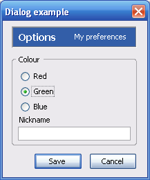
This element should be used in place of the window element for dialog boxes. The buttons attribute may be used to set which buttons should appear in the dialog box. These buttons will be placed in the correct locations for the user's platform.

More information is available in the XUL tutorial and Dialogs and prompts (code snippets).

Attributes
buttonaccesskeyaccept, buttonaccesskeycancel, buttonaccesskeydisclosure, buttonaccesskeyextra1, buttonaccesskeyextra2, buttonaccesskeyhelp, buttonalign, buttondir, buttondisabledaccept, buttonlabelaccept, buttonlabelcancel, buttonlabeldisclosure, buttonlabelextra1, buttonlabelextra2, buttonlabelhelp, buttonorient, buttonpack, buttons, defaultButton, ondialogaccept, ondialogcancel, ondialogdisclosure, ondialogextra1, ondialogextra2, ondialoghelp, title
Properties
buttons, defaultButton
Methods
acceptDialog, cancelDialog, centerWindowOnScreen, getButton, moveToAlertPosition

Examples

Image:XUL_ref_dialog.png
<?xml version="1.0"?>
<?xml-stylesheet href="chrome://global/skin/global.css" type="text/css"?>
<dialog id="donothing" title="Dialog example"
  xmlns="http://www.mozilla.org/keymaster/gatekeeper/there.is.only.xul"
  buttons="accept,cancel"
  buttonlabelcancel="Cancel"
  buttonlabelaccept="Save"
  ondialogaccept="return doOK();"
  ondialogcancel="return doCancel();">
  <dialogheader title="Options" description="My preferences"/>
  <groupbox>
    <caption label="Colour"/>
    <radiogroup>
      <radio label="Red"/>
      <radio label="Green" selected="true"/>
      <radio label="Blue"/>
    </radiogroup>
    <label value="Nickname"/>
    <textbox/>
  </groupbox>
</dialog>

Attributes

activetitlebarcolor
Type: color string
Specify background color of the window's titlebar when it is active (foreground). Moreover this hides separator between titlebar and window contents. This only affects Mac OS X.
buttonaccesskeyaccept
Type: string
The access key to use for the "accept" button.
buttonaccesskeycancel
Type: string
The access key to use for the "cancel" button.
buttonaccesskeydisclosure
Type: string
The access key to use for the "disclosure" button.
buttonaccesskeyextra1
Type: string
The access key to use for the first extra button.
buttonaccesskeyextra2
Type: string
The access key to use for the second extra button.
buttonaccesskeyhelp
Type: string
The access key to use for the "help" button.
buttonalign
Type: string
The value of the align attribute for the box containing the buttons.
buttondir
Type: string
The value of the dir attribute for the box containing the buttons.
buttondisabledaccept
Type: boolean
If true, the accept button is disabled.
buttonlabelaccept
Type: string
The label to appear on the "accept" button.
buttonlabelcancel
Type: string
The label to appear on the "cancel" button.
buttonlabeldisclosure
Type: string
The label to appear on the "disclosure" button.
buttonlabelextra1
Type: string
The label to appear on the first extra button.
buttonlabelextra2
Type: string
The label to appear on the second extra button.
buttonlabelhelp
Type: string
The label to appear on the "help" button.
buttonorient
Type: string
The value of the orient attribute for the box containing the buttons.
buttonpack
Type: string
The value of the pack attribute for the box containing the buttons.
buttons
Type: comma-separated list of the values below
A comma-separated list of buttons to appear in the dialog box. The buttons will be placed in suitable locations for the user's platform and basic event handling will be performed automatically. The following values can be used in the list:
  • accept: The OK button, which will accept the changes when pressed. This button will also be the default button.
  • cancel: The cancel button which will cancel the operation.
  • help: A help button for displaying help about the dialog.
  • disclosure: A button to show more information. This might be a button or a disclosure triangle.
  • extra1: An optional additional button. You can set its label with the buttonlabelextra1 attribute and its command with the ondialogextra1 attribute.
  • extra2: A second optional additional button. You can set its label with the buttonlabelextra2 attribute and its command with the ondialogextra2 attribute.

Note: If you don't want to display any buttons in the dialog box, set the value of this attribute to "," (a single comma).

defaultButton
Type: string
Normally this attribute should not be set, but if it is, it specifies the default button in the dialog. Typically, this means that the button will be activated when the Enter key is pressed. This should be set to one of the same values as those for the buttons attribute.
inactivetitlebarcolor
Type: color string
Specify background color of the window's titlebar when it is inactive (background). Moreover this hides separator between titlebar and window contents. This affects only on Mac OS X.
ondialogaccept
Type: script code
The code in this attribute is called when the accept button is pressed, or when the acceptDialog method is called. If the handler returns true, the dialog will indeed go away, but if it returns false it will not.
ondialogcancel
Type: script code
The code in this attribute is called when the "cancel" button is pressed or when the cancelDialog method is called. If the routine returns true, the dialog will indeed go away, but if it returns false it will not.
ondialogdisclosure
Type: script code
The code in this attribute is called when the "disclosure" button is pressed.
ondialogextra1
Type: script code
The code in this attribute is called when the first extra button is pressed.
ondialogextra2
Type: script code
The code in this attribute is called when the second extra button is pressed.
ondialoghelp
Type: script code
The code in this attribute is called when the "help" button is pressed.
title
Type: string
The text to appear in the title bar of the window.

Properties

buttons
Type: comma-separated list of the values below
A comma-separated list of buttons to appear on the dialog box. The buttons will be placed in suitable locations for the user's platform and basic event handling will be performed automatically. The following values can be used in the list:
  • accept: The OK button, which will accept the changes when pressed. This button will also be the default button.
  • cancel: The cancel button which will cancel the operation.
  • help: A help button for displaying help about the dialog.
  • disclosure: A button to show more information. This might be a button or a disclosure triangle.
  • extra1: An optional additional button. You can set its label with the buttonlabelextra1 attribute and its command with the ondialogextra1 attribute.
  • extra2: A second optional additional button. You can set its label with the buttonlabelextra2 attribute and its command with the ondialogextra2 attribute.
defaultButton
Type: string
Normally this attribute should not be set, but if it is, it specifies the default button in the dialog. Typically, this means that the button will be activated when the Enter key is pressed. This should be set to one of the same values as those for the buttons attribute.

Methods

Inherited Methods
addEventListener(), appendChild(), blur, click, cloneNode(), compareDocumentPosition, dispatchEvent(), doCommand, focus, getAttribute(), getAttributeNode(), getAttributeNodeNS(), getAttributeNS(), getBoundingClientRect(), getClientRects(), getElementsByAttribute, getElementsByAttributeNS, getElementsByClassName(), getElementsByTagName(), getElementsByTagNameNS(), getFeature(), getUserData, hasAttribute(), hasAttributeNS(), hasAttributes(), hasChildNodes(), insertBefore(), isDefaultNamespace(), isEqualNode, isSameNode, isSupported(), lookupNamespaceURI, lookupPrefix, normalize(), querySelector(), querySelectorAll(), removeAttribute(), removeAttributeNode(), removeAttributeNS(), removeChild(), removeEventListener(), replaceChild(), setAttribute(), setAttributeNode(), setAttributeNodeNS(), setAttributeNS(), setUserData

acceptDialog()
Return type: no return value
Accepts the dialog and closes it, similar to pressing the OK button.
cancelDialog()
Return type: no return value
Cancels the dialog and closes it, similar to pressing the Cancel button.
centerWindowOnScreen()
Return type: no return value
Centers the dialog on the screen.
getButton( type )
Return type: button element
Returns the button element in the dialog corresponding to the given type.
moveToAlertPosition()
Return type: no return value
Moves and resizes the dialog to a position and size suitable for an alert box.

Elements
dialogheader

Document Tags and Contributors

 Contributors to this page: Sheppy, pippijn, chukito, Piro, Np, Pmash, Mgjbot, Ptak82, Dria
 Last updated by: Sheppy,