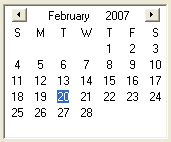
A datepicker allows the user to enter a date. Three types are available, which can be specified using the type attribute.
normal- a datepicker with three fields for entering the year, month and date.grid- a datepicker with a calendar grid for selecting a date.popup- a normal datepicker with three fields, but with an additional dropdown button to display a popup grid.
There are several ways to set the selected day. In XUL, the value attribute may be set to a value of the form YYYY-MM-DD to initialize the datepicker to a certain date. If not specified, the datepicker defaults to the current day.
To change the selected date, the value property may be used to set a new value in the form YYYY-MM-DD. The dateValue property may be used to retrieve and set the date using a Date object. In addition, the date, month and year properties may be used to retrieve and modify each component of the date separately.
The change event is fired whenever the date is changed. However, as described in Mozilla bug #799219, a change event handler may encounter erratic behavior when the date is changed using the keyboard instead of the mouse. To avoid this, you can use the workaround described here, i.e., use window.setTimeout(actual-event-handler-function, 0); to queue up your event handler to run after the rest of the picker's change event handlers.
A monthchange event is fired for the grid and popup datepickers whenever a new month is navigated to or displayed.
- Properties
- date, dateLeadingZero, dateValue, disabled, month, monthLeadingZero, open, readOnly, tabIndex, value, year, yearLeadingZero
Examples

<datepicker type="grid" value="2007-03-26"/>
Attributes
-
disabled - Type: boolean
-
Indicates whether the element is disabled or not. If this element is set to
truethe element is disabled. Disabled elements are usually drawn with grayed-out text. If the element is disabled, it does not respond to user actions, it cannot be focused, and thecommandevent will not fire. -
Visible controls have a
disabledproperty which, except for menus and menuitems, is normally preferred to use of the attribute, as it may need to update additional state.
-
firstdayofweek - Type: integer
- which day of the week to display as the first day in the grid. The values range from 0 to 6, where 0 is Sunday and 6 is Saturday. The default value is determined by the locale, so only use this attribute if you want to override it.
readonly- Type: boolean
- If set to
true, then the user cannot change the value of the element. However, the value may still be modified by a script.
-
tabindex - Type: integer
- The tab order of the element. The tab order is the order in which the focus is moved when the user presses the "
tab" key. Elements with a highertabindexare later in the tab sequence.
-
type - Type: one of the values below
-
You can set the
typeattribute to one of the values below to specify the type of datepicker to use -
-
normal - A datepicker with three fields for entering the year, month and date. This is the default value so do not specify the type attribute if this kind is desired.
-
grid - A datepicker that displays a calendar grid where one month is shown at a time.
-
popup - A datepicker with three entry fields but an additional dropdown button, which, when pressed, will display a popup calendar grid.
-
-
value - Type: string
- The initial value of the datepicker in the form YYYY-MM-DD.
Properties
-
date - Type: integer
- The currently selected date of the month from 1 to 31. Set this property to change the selected date.
-
dateLeadingZero - Type: boolean
- A read only value indicating whether a leading zero should be displayed before the date when it is less than 10.
-
month - Type: integer
- The currently selected month from 0 to 11. Set this property to change the selected month.
-
monthLeadingZero - Type: boolean
- A read only value indicating whether a leading zero should be displayed before the month when it is less than 10.
-
open - Type: boolean
- For popup type datepickers, specifies whether the popup is open. Set this property to open or close the popup. For non-popup datepickers, this property is always false.
-
readOnly - Type: boolean
-
If set to
true, then the user cannot modify the value of the element.
-
year - Type: integer
- The currently selected year from 1 to 9999. Set this property to change the selected year.
-
yearLeadingZero - Type: boolean
- A read only value indicating whether a leading zero should be displayed before the year when it is less than 1000.
Methods
Related
- Interfaces
-
nsIDOMXULControlElement