A palette of colors from which a user may select by clicking on one of the grid cells.
Examples
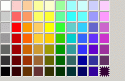
<colorpicker/>
Attributes
-
disabled - Type: boolean
-
Indicates whether the element is disabled or not. If this element is set to
truethe element is disabled. Disabled elements are usually drawn with grayed-out text. If the element is disabled, it does not respond to user actions, it cannot be focused, and thecommandevent will not fire. -
Visible controls have a
disabledproperty which, except for menus and menuitems, is normally preferred to use of the attribute, as it may need to update additional state.
color- Type: color string
- The currently selected color. This is modified when the user selects a color. You can assign a string of the form #RRGGBB to this property to change the selected color.
Overview
An onchange attribute is an event listener to the object for the Event change. A change event is fired in different ways for different XUL Input Elements as listed below:
-
onchange - Type: script code
| TextBox | When Enter key is pressed |
| Radio/Check Box | When the state is changed |
| Select List | When the selected item is changed |
What is accessible
The script context at this point can only access the following things:
- Global Values/Functions i.e. window, document, or any of the functions/objects/variables bound to the window object
- Event object
Example
<?xml version="1.0"?>
<?xml-stylesheet href="chrome://global/skin/" type="text/css"?>
<window
    id="findfile-window"
    title="Find Files"
    orient="horizontal"
    xmlns="http://www.mozilla.org/keymaster/gatekeeper/there.is.only.xul">
  <script type="text/javascript">
  function myFunction(e){
    /*
      Do something cool here or just say the below
    */
    alert(e.target.nodeName);
  }
  </script>
  <textbox id="find-text" onchange="return myFunction(event);"/>
</window>
preference- Type: id
- Connects the element to a corresponding
preference. This attribute only has any effect when used inside aprefwindow. More information is available in the Preferences System article.
-
tabindex - Type: integer
- The tab order of the element. The tab order is the order in which the focus is moved when the user presses the "
tab" key. Elements with a highertabindexare later in the tab sequence.
type- Type: string
- If this attribute is not present, the colorpicker is displayed inside the window. If this is set to the text
button, the colorpicker is displayed as a button. When the user clicks the button, a popup appears for the user to select a color.
Properties
-
accessibleType - Type: integer
- A value indicating the type of accessibility object for the element.
-
color - Type: color string
- The currently selected color. This is modified when the user selects a color. You can assign a string of the form #RRGGBB to this property to change the selected color.
open- Type: boolean
- Returns
trueif the popup for a button-typecolorpickeris open. Set this property totrueto open the popup orfalseto close the popup.
value property gets and sets color attribute
Methods
Related
- Interfaces
-
nsIDOMXULControlElement
Bugs
The onchange Event only fires if Attribute type is set to "button". You may use onclick when you are working with a plain colorpicker and need the currently selected color for example to display in a <textbox>.