Positioning Popups
There are several ways in which the location of a popup on screen may be controlled.
Default Positioning of Popups
A top level menu popup is, by default, placed with the upper edge of the popup flush with the lower edge of the menu or button it is associated with. Horizontally, the left edge of the menu popup is aligned with the left edge of the menu or button.
A submenu, however, is placed by default to the right of the parent menu item, such that the top edge of the menu is aligned with the top edge of the parent menu item. However, the submenu will appear to the left instead for right to left locales.
For both top level menus and submenus, they may appear above or to the left instead of their usual placement if there is not enough room to display the menu at full size below or to the right. If there is not enough room on either side, the menu will be shrunk down to fit.
For popups attached using the popup or context attributes, the default position to appear is with the upper left corner (or upper right corner in right to left locales) at the position where the mouse was clicked. Context menus will appear offset down and to the right a couple of pixels so that the menu can be dismissed again just by clicking in the same place. If a context menu was opened via the keyboard only, the menu will appear at the top left corner of the document, or underneath the currently selected item if a list is focused. Context menus will always appear in this location, and not respect any position attribute value.
Tooltips will always appear near the current mouse position, offset vertically by a small amount.
The position attribute
The position of all types of popups can be controlled in two ways. First, the position can be specified when using the popup's openPopup method. This is used when a popup is opened by a script. Second, the position can be specified using several attributes placed on the menupopup, panel or tooltip element. These attributes are described below and function the same for all three elements.
The position attribute specifies the alignment of the popup with respect to the element that the popup is attached to.
- for a menupopup placed inside a menu, button or toolbarbutton, the position attribute controls how the menupopup is anchored to the parent menu, button or toolbarbutton.
- for a menupopup or panel attached using the
popupattribute, thepositionattribute controls how the popup is anchored to the element with thepopupattribute. - for a context menu, that is, a menu that is attached to an an element using the
contextattribute and opened via context-clicking the mouse, thepositionattribute is ignored. The menu appears at the mouse position offset by a couple of pixels so that the user can close the context menu just by clicking in the same location. - for a tooltip, the
positionattribute controls how the tooltip is anchored to the element with thetooltipattribute. You wouldn't normally use thepositionattribute on a tooltip; instead you would just want the tooltip to appear at its default position which is near the mouse pointer.
For instance:
<menupopup id="editItems" position="end_before">
  <menuitem label="Cut"/>
  <menuitem label="Copy"/>
  <menuitem label="Paste"/>
</menupopup>
<label value="Clipboard" popup="editItems"/>
In this example, a menupopup is attached to a label via the popup attribute, which will cause the popup to appear when the label is left-clicked. The position attribute is used to specify that the popup should appear at the 'end_before' location, which will cause the popup to appear to the right of the label aligned along the top edge. There are several possible values for the position attribute, described here, along with images which show how a popup would be aligned in each case.
The following assumes a left to right user interface. For right to left user interfaces, the same values should be used, but will cause the popup to appear and be aligned on the opposite side.
The position attribute can be specified either as a single word offering pre-defined alignment positions, or as 2 words specifying exactly which part of the popup and associated element should be aligned.
Explicit Alignment Values
If specified as 2 words there must be exactly 1 space between the 2 words and indicates which corner or edge of the anchor is aligned with which corner of the popup. The first word specifies the anchor corner/edge and the second species the popup corner. Valid values for the anchor alignment (ie, the first word) are shown below
| Anchor Alignment Values |
|---|
topleft
The popup will be aligned with the upper-left corner of the anchor.
The popup will be aligned with the upper-right corner of the anchor.
The popup will be aligned with the lower-left corner of the anchor. The popup will be aligned with the bottom-right corner of the anchor. The popup will be aligned with the center of the left-hand edge of the anchor. The popup will be aligned with the center of the right-hand edge of the anchor. The popup will be aligned with the center of the top edge the anchor. The popup will be aligned with the center of the bottom edge the anchor. |
Valid values for the popup alignment (ie, the second word) are shown below
| Popup Alignment Values |
|---|
|
The top-left corner of the popup will be aligned with the specified corner or edge of the anchor element. The top-right corner of the popup will be aligned with the specified corner or edge of the anchor element. The bottom-left corner of the popup will be aligned with the specified corner or edge of the anchor element. The bottom-right corner of the popup will be aligned with the specified corner or edge of the anchor element |
For example, a position value of bottomleft topleft means that the popup will be positioned such that the bottom-left corner of the anchor is aligned with the upper-left corner of the popup.
Simple Alignment Values
Positions specified as a single word string are shortcuts for the values above. The following table shows the valid values, corresponding explicit (ie, 2 word) alignment values and an example of the alignment.
| Single Word Alignment Values | Example |
|---|---|
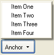
before_start
The left side of the popup is aligned with the left side of the anchor, and the bottom of the popup is aligned along the top of the anchor. Equivalent to |
 |
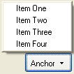
before_end
The right side of the popup is aligned with the right side of the anchor, and the bottom of the popup is aligned along the top of the anchor. Equivalent to |
 |
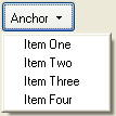
after_start
The left side of the popup is aligned with the left side of the anchor, and the top of the popup is aligned along the bottom of the anchor. This value is commonly used for menu buttons. Equivalent to |
 |
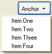
after_end
The right side of the popup is aligned with the right side of the anchor, and the top of the popup is aligned along the bottom of the anchor. Equivalent to |
 |
start_before
The top edge of the popup is aligned with the top edge of the anchor, and the right side of the popup is aligned along the left side of the anchor. Equivalent to |
 |
start_after
The bottom side of the popup is aligned with the bottom side of the anchor, and the right side of the popup is aligned along the left side of the anchor. Equivalent to |
 |
end_before
The top edge of the popup is aligned with the top edge of the anchor, and the left side of the popup is aligned along the right side of the anchor. This value is used for submenus. Equivalent to |
 |
end_after
The bottom side of the popup is aligned with the bottom side of the anchor, and the left side of the popup is aligned along the right side of the anchor. Equivalent to |
 |
overlap
The upper left corner of the popup is placed at the upper left corner of the anchor. Equivalent to |
|
after_pointer
The popup appears vertically offset a few pixels from the mouse pointer (after_pointer is not currently implemented with respect to the mouse pointer. It currently offsets 21 pixels vertically from the anchor, see Bug 619887). Roughly equivalent to |
If the menupopup did not have a position attribute, the popup would appear at its default position, in this case, the mouse position.
When opening a popup via a script using the openPopup method, the second argument may be used to specify the position instead of using the position attribute. For example, the following might be used with the above example to open the popup:
menupopup.openPopup(label, "end_before", 0, 0, false, false);
Note that the position has been set to 'end_before', as above. When both are used, the value supplied to openPopup overrides the attribute. However, if the attributesOverride argument to openPopup (the last argument, false in the example above) was true, the attribute would override the value supplied to openPopup. This allows the script and XUL code to coordinate in different ways as to how the popup should be opened.
Positioning using Coordinates
A popup can be positioned further using the x and y arguments to openPopup. After the popup is positioned using the anchor, the x and y arguments may be used to offset the popup by a certain distance. The section on the openPopup method provides an example of this.
If a menupopup, panel or tooltip has a margin specified in a style sheet or using the inline style attribute, this margin will be applied around the outside of the popup. In the following example, the menupopup has a 2ex margin above it, so when opened, the popup will be placed a distance of 2ex below the bottom of the button.
<button label="Popup" type="menu">
  <menupopup style="margin-top: 2ex;">
    <menuitem label="Cat"/>
    <menuitem label="Dog"/>
  </menupopup>
</button>
This technique is used internally for tooltips. If you notice in the Firefox browser when a tooltip is opened it appears not at the mouse position, but slightly below it. This is because the default theme has a 21 pixel top margin on tooltips that moves them down by that much. This is used so that the tooltip doesn't cover up what it is providing a description of.
Screen Positioning
The openPopupAtScreen method may be used to open a popup via a script at a specific screen position. The section on the openPopupAtScreen method provides more details.
For all popups, the left and top attributes may be used to specify pixel coordinates of where the popup should appear on the screen. If these attributes are used, the popup will appear at the location the attributes specify. As with the position attribute, the arguments to the openPopup method override unless the last argument is set to true.
Here is an example:
<panel left="100" top="200">
  <button label="Test"/>
</panel>
The left and top attributes are most useful when using non-autohiding panels. With these, you can record the left and top positions as the popup is moved around, and use the persist attribute to maintain these attributes across sessions. This way, a panel will always open at the same location on the screen as it was the last time.