Lesson: Laying Out Components Within a Container
How to Use CardLayout
Note: This lesson covers writing layout code by hand, which can be challenging. If you are not interested in learning all the details of layout management, you might prefer to use the
GroupLayout layout manager combined with a builder tool to lay out your GUI. One such builder tool is the
NetBeans IDE. Otherwise, if you want to code by hand and do not want to use GroupLayout, then GridBagLayout is recommended as the next most flexible and powerful layout manager.
If you are interested in using JavaFX to create your GUI, see Working With Layouts in JavaFX.
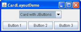
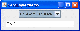
The following figure represents a snapshot of an application that uses the
CardLayout class to switch between two panels.


Click the Launch button to run CardLayoutDemo using Java™ Web Start (download Java SE). Alternatively, to compile and run the example yourself, consult the example index.
The complete code of this demo is in the
CardLayoutDemo.java file.
The CardLayout class manages two or more components (usually JPanel instances) that share the same display space. When using the CardLayout class, let the user choose between the components by using a combo box. The CardLayoutDemo application is an example to illustrate this feature.
Another way to accomplish the same task is to use a tabbed pane. The following picture shows a tabbed pane version of the preceding example:

Because a tabbed pane provides its own GUI, using a tabbed pane is simpler than using the CardLayout class. For example, implementing the preceding example using a tabbed pane results in a program with fewer lines of code.
Click the Launch button to run TabDemo using Java™ Web Start (download JDK 7 or later). Alternatively, to compile and run the example yourself, consult the example index.
The complete code of this demo is in the
TabDemo.java file.
Conceptually, each component that a CardLayout manages is like a playing card or trading card in a stack, where only the top card is visible at any time. You can choose the card that is showing in any of the following ways:
- By asking for either the first or last card, in the order it was added to the container
- By flipping through the deck backwards or forwards
- By specifying a card with a specific name
The CardLayoutDemo class uses the last scheme.
The following code snippet from the
CardLayoutDemo.java application creates the CardLayout object and the components it manages.
//Where instance variables are declared:
JPanel cards;
final static String BUTTONPANEL = "Card with JButtons";
final static String TEXTPANEL = "Card with JTextField";

//Where the components controlled by the CardLayout are initialized:
//Create the "cards".
JPanel card1 = new JPanel();
...
JPanel card2 = new JPanel();
...

//Create the panel that contains the "cards".
cards = new JPanel(new CardLayout());
cards.add(card1, BUTTONPANEL);
cards.add(card2, TEXTPANEL);
To add a component to a container that a CardLayout object manages, specify a string that identifies the component being added. For example, in this demo, the first panel has the string "Card with JButtons", and the second panel has the string "Card with JTextField". In this demo those strings are also used in the combo box.
To choose which component a CardLayout object shows, put additional code in your code example:
//Where the GUI is assembled:
//Put the JComboBox in a JPanel to get a nicer look.
JPanel comboBoxPane = new JPanel(); //use FlowLayout
String comboBoxItems[] = { BUTTONPANEL, TEXTPANEL };
JComboBox cb = new JComboBox(comboBoxItems);
cb.setEditable(false);
cb.addItemListener(this);
comboBoxPane.add(cb);
...
pane.add(comboBoxPane, BorderLayout.PAGE_START);
pane.add(cards, BorderLayout.CENTER);
...

//Method came from the ItemListener class implementation,
//contains functionality to process the combo box item selecting
public void itemStateChanged(ItemEvent evt) {
    CardLayout cl = (CardLayout)(cards.getLayout());
    cl.show(cards, (String)evt.getItem());
}
This example shows that to use the show method of the CardLayout class, you must set the currently visible component. The first argument in the show method is the container the CardLayout controls — that is, the container of the components the CardLayout manages. The second argument is the string that identifies the component to show. This string is the same string that was used when adding the component to the container.
The CardLayout API
The following table lists the CardLayout class methods that are used to choose a component. For each method, the first argument is the container for which the CardLayout is the layout manager (the container of the cards the CardLayout controls).
| Method | Purpose |
|---|---|
first (Container parent) |
Flips to the first card of the container. |
next (Container parent) |
Flips to the next card of the container. If the currently visible card is the last one, this method flips to the first card in the layout. |
previous (Container parent) |
Flips to the previous card of the container. If the currently visible card is the first one, this method flips to the last card in the layout. |
last (Container parent) |
Flips to the last card of the container. |
show (Container parent, String name) |
Flips to the component that was added to this layout with the specified name, using the
addLayoutComponent method. |
Examples that Use CardLayout
Only one example in this
trail
uses CardLayout, and this is the CardLayoutDemo. Generally, our examples use
tabbed panes instead of CardLayout, since a tabbed pane provides its own GUI.